this post was submitted on 28 Jul 2023
940 points (96.4% liked)

Programmer Humor

19480 readers
183 users here now

Welcome to Programmer Humor!

This is a place where you can post jokes, memes, humor, etc. related to programming!

For sharing awful code theres also Programming Horror.

Rules

founded 1 year ago
MODERATORS
 
top 50 comments
sorted by: hot top controversial new old
[–] [email protected] 98 points 1 year ago (5 children)

As an amateur web designer in the 90s and early 2000s, this speaks to me. I stopped web development when CSS became popular and I couldn’t wrap my head around it.

Is there a petition I can sign to scrap all this nonsense modern web progress and go back to that beautiful, dial-up friendly HTML?
[–] [email protected] 74 points 1 year ago (5 children)

I stopped doing frontend work when responsive design became important. Super unpleasant work. Now I'm happier at the backend where I don't have to worry about how my shit looks on the 7 million possible screen sizes people are likely to use. Life is more peaceful here.

[–] [email protected] 40 points 1 year ago (2 children)

Frontend developer here, please save me from my torment, thanks

[–] [email protected] 46 points 1 year ago (1 children)

Have you considered just forcing everyone to access your sites via Internet Explorer 5.5?

[–] [email protected] 14 points 1 year ago (8 children)

and netscape navigator. ah my glory days!

load more comments (8 replies)
load more comments (1 replies)
[–] [email protected] 15 points 1 year ago (3 children)

Alright hang on now - responsive design is about not excluding people based on the device they're using. Many people do everything in their lives from a low end cell phone and cutting them out is a shit thing to do. Responsive design and progressive enhancement are objectively good things.

The tools have gotten better over the past several years, it's not as hard as it used to be.

[–] [email protected] 13 points 1 year ago

? Who said anything about excluding anything or anyone? I'm just saying I don't like the work that has to go into making sure nobody's excluded. In a way, I'm not excluding anyone by excluding everyone now. I quit frontend altogether, left other people to deal with it. At the backend I don't have to worry about what kind of screen the other end might be using to view the JSON string I sent them. You don't get "I just looked at your response headers on my 32:9 monitor that I divided into 9 randomly sized tiles and it looks like shit, please fix" calls when you work backend.

load more comments (2 replies)
[–] [email protected] 8 points 1 year ago (1 children)

Modern frameworks make responsive design easier but yes it is still a lot to wrap your head around. I remember building my hs robotics team website in high school right as responsive design was becoming a thing. "WHAT DO YOU MEAN I HAVE TO NEST A CONTAINER IN A CONTAINER I ALREADY HAVE ONE!!!"

Bless those who came up with flexbox

load more comments (1 replies)
load more comments (2 replies)
[–] [email protected] 38 points 1 year ago (4 children)

Let's just design every website using a table again. Or even better, frames!

[–] [email protected] 33 points 1 year ago (1 children)

Don’t forget image maps!

[–] [email protected] 10 points 1 year ago (7 children)

Laughs in frameset!

Kids nowdays try hard to do with divs what was already possible with framesets.

Also I feel bad every time I remember that was taken away from us!

load more comments (7 replies)
[–] [email protected] 13 points 1 year ago (4 children)

I stand by that iframes had their place, even if the backend devs absolutely hated them.

[–] [email protected] 21 points 1 year ago (1 children)

Running each app component in it's own iframe is perfectly valid microservices architecture change my mind.

load more comments (1 replies)
[–] [email protected] 13 points 1 year ago (2 children)

They still have their place; for example to embed Google Maps or a YouTube video. Generally, whenever you want to embed something from a different website you have no control over, that shouldn't inherit your style sheets, and should be sandboxed to prevent cross site scripting attacks.

load more comments (2 replies)
[–] [email protected] 11 points 1 year ago

Oooh I loved my inline frames.

I was so fucking proud of that. My links down the left side, two inline frames neatly in a box on the right, perfectly designed in two versions. One for 800x600, the other for 1024x768.

I did websites for bands from East Tennessee, one for a weird website for survivors of “satanic ritual abuse”. I thought it was nuts but I made a hundred bucks.

I wouldn’t even know where to start on the modern web. I’m fine with that too. I lost the passion for it when everyone under the sun wanted me to be their free tech support years ago.

I remember when I first started on homestead. Seeing my dangling skeleton gifs and my “under construction” banners made me feel like something. There it was, the World Wide Web, and I had my own place on it. Perpetually under construction.

I used to love browsing geocities and the log in name would be right there in the link. Something like geocities.com/cartman1988

I’d guess the password and change things around on their page to mess with them. “Hmmm, Cartman eh? Let’s try southpark. I’M IN. Time to photoshop dicks on this dude’s face!”

To be a kid again.

Y’all got me all old and nostalgic here. :p

load more comments (1 replies)
[–] [email protected] 10 points 1 year ago

Check out Gemini!

It's an alternative protocol to HTTP with a focus on simplicity and being much harder to abuse for user tracking.

It's still a small community, but growing.

If you miss the internet of the nineties, there's some echoes of it here.

load more comments (2 replies)
[–] [email protected] 58 points 1 year ago (2 children)

The web is beyond bloated.

The heavy reliance on JavaScript has suck the joy out of browsing the web for me

[–] [email protected] 49 points 1 year ago (4 children)

I'd say the over exploitation of JavaScript to leverage tracking, interaction and marketing has helped create the poor experiences we now have on web. The underlying technology when used for creating interactive and helpful UIs is very beneficial

load more comments (4 replies)
[–] [email protected] 38 points 1 year ago (1 children)

May I introduce you to the Gemini project?

It's a new(ish) protocol for sharing interlinked text documents. It's intended to sit between Gopher and HTML in terms of complexity and is deliberately, aggressively simple (some might even say crippled) with the intention that it will be nearly impossible to extend the protocol for surveillance capitalism. It's not trying to replace ye olde WWW, but to provide a human-focused place for text-first, 90's-style sites to live. ...just without the blink tags.

[–] [email protected] 14 points 1 year ago* (last edited 1 year ago) (1 children)

…just without the blink tags.

NOOO! IT IS BROKEN!

How am I build my cool website without a blinking "Thank You For Reading!"???

load more comments (1 replies)
[–] [email protected] 39 points 1 year ago (2 children)

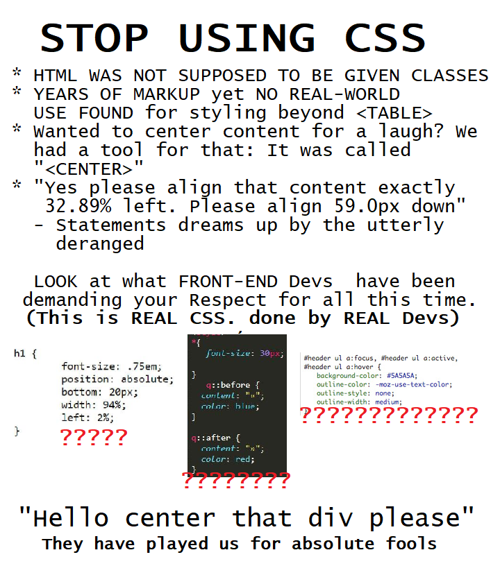
Image Transcription: Meme


STOP USING CSS

* HTML WAS NOT SUPPOSED TO BE GIVEN CLASSES
* YEARS OF MARKUP yet NO REAL-WORLD USE FOUND for styling beyond \
* Wanted to center content for a laugh? We had a tool for that: It was called ""
* "Yes please align that content exactly 32.89% left. Please align 59.0px down"
    - Statements dreams up by the utterly deranged

LOOK at what FRONT-END Devs  have been demanding your Respect for all this time.
(This is REAL CSS. done by REAL Devs)

[Three screenshots of CSS code, each one marked with a number of red question marks. The first screenshot has five question marks and reads as follows:]

h1 {
        font-size: .75em;
        position: absolute;
        bottom: 20px;
        width: 94%;
        left: 2%;
}

[The second screenshot has eight question marks and reads as follows:]

*{
    font-size: 30px;

}
    q::before {
  content: "«";
  color: blue;
]

q::after {
  content: "»";
  color: red;
}

[The third screenshot has sixteen question marks and reads as follows:]

#header ul a:focus, #header ul a:active,
#header ul a:hover {
    background-color: #5A5A5A;
    outline-color: -moz-use-text-color:
    outline-style: none;
    outline-width: medium;
}

[The screenshots end.]

"Hello center that div please"

They have played us for absolute fools


I am a human who transcribes posts to improve accessibility on Lemmy. Transcriptions help people who use screen readers or other assistive technology to use the site. For more information, see here.

[–] [email protected] 19 points 1 year ago (1 children)

This comment was formatted better than the image.

load more comments (1 replies)
[–] [email protected] 16 points 1 year ago
[–] [email protected] 30 points 1 year ago (9 children)

The web killed the Internet.

JavaScript killed the web.

CSS defiled its corpse.

Honestly and without any trace of irony, I wish CSS would die and be replaced by maybe half a dozen new HTML tags to support a few specific responsive design patterns.

CSS runs counter to the concept of HTML. Web design used to be inherently user-centric. The designer was not supposed to have much of a say in how it looked on a client's system, because that was up to the client. The designer only provided high-level hints like "this is a paragraph" or "this is emphasized". The browser decided how a paragraph should be displayed, which fonts to use, etc.

Over time, visual designers clawed more and more control from the user, much to the detriment of the entire rest of the world.

99% of web sites would be better if they conformed to basic semantic markup. Low-level design parameters should not exist on the web.

It's a straight line from CSS to Google's new trusted web bullshit. It's all about wresting control away from the user and giving it to the site designer. Fuck you, site designer. My eyeballs do not belong to you.

[–] [email protected] 59 points 1 year ago (6 children)

lol. lmao. What am I even reading?

The CSS is literally openly served along with the website. One line change in the HTML (in <link ref="stylesheet" .../> allows you to make your own CSS for a site. There's a world of difference between that and "Google's new trusted web bullshit". And you know who sits much closer to Google than HTML and CSS?

Javascript. That's who.

[–] [email protected] 19 points 1 year ago

Have no idea what old mate is even on about. I thought it might have been a parody or copypasta

load more comments (5 replies)
[–] [email protected] 32 points 1 year ago (13 children)

I only disagree with you in that for an application, the application designer should choose what an application looks like.

The argument of if applications should be deployed via web browser is an independent discussion.

load more comments (13 replies)
[–] [email protected] 11 points 1 year ago (1 children)

There is also a bit of a design arms race going on here.

My business has a bloated site with animations, Google fonts, graphic design, etc., etc. Why? Because normie customers expect it and if I don't have it they'll go to a competitor that had a more "designed" website.

If most websites looked as if they were built in the year 2000 we wouldn't lose much functionality and we'd spend much less resources on this stuff...

load more comments (1 replies)
load more comments (6 replies)
[–] [email protected] 27 points 1 year ago* (last edited 1 year ago)

The problem is that HTML was not designed to be a layout description. Your browser was to decide.

So, to force HTML to be a layout description rather than simple markup, we have this mess.

HTML != TeX

[–] [email protected] 27 points 1 year ago (2 children)

I too look forward to all of our websites looking like they're from the 90s upon the abolition of CSS.

[–] [email protected] 13 points 1 year ago

CSS isn't the problem. Let people write their silly lil queries. JS is a hassle and a half though

[–] [email protected] 26 points 1 year ago

you mock but as soon as these rounded corners are gone everything becomes so .... pointy.

[–] [email protected] 22 points 1 year ago

Oh, got that layout looking all nice and modern?

Be a shame if somebody... tried to email it!

[–] [email protected] 20 points 1 year ago* (last edited 1 year ago) (1 children)

The future of HTML is classless, stateless and moneyless! 🏴

load more comments (1 replies)
[–] [email protected] 19 points 1 year ago (2 children)

You're never supposed to use pixels in CSS anyway; you should bare minimum use percentages to account for different screen sizes to make the designs responsive and not look terrible on different screen sizes.

[–] [email protected] 15 points 1 year ago* (last edited 1 year ago) (1 children)

Except margins of inner elements and paddings of course.

load more comments (1 replies)
[–] [email protected] 18 points 1 year ago* (last edited 1 year ago)

Really though it's a shame that so many devs still try to treat the web like print where they have full control over the layout at any given time. Even after the death of Flash and the introduction of smartphones and their need for fluid layouts. Meanwhile concepts like progressive enhancement got left behind.

At least we've got flexbox and grid now.

[–] [email protected] 11 points 1 year ago (2 children)

As a frontend dev I hate frontend. CSS is not even the main issue.

Fuck Jest and having to mock libraries. I'm gonna go backend in Go or something like that ASAP.

[–] [email protected] 12 points 1 year ago (4 children)

You will still need to mock things for tests in Go

load more comments (4 replies)
load more comments (1 replies)
[–] [email protected] 11 points 1 year ago

I'm sure that means something.

[–] [email protected] 10 points 1 year ago (3 children)

laughs and cries in backend dev that knows flexbox.

load more comments (3 replies)
[–] [email protected] 10 points 1 year ago* (last edited 1 year ago) (10 children)

My main issue isn't even that CSS exists, or its current functionalities. It's the expectation that, if you're creating a web page, you must use CSS extensively, and ditch every single "pure" HTML feature that might solve your problem.

On a practical level, what's intrinsically wrong with the center tag? Or tables for alignment? Those might be bad in some situations, but they're rather succinct and simple ways to get what you want.

"But what if in the future..." - address future problems in the future. As soon as they appear - not before or after that.

load more comments (10 replies)
[–] [email protected] 8 points 1 year ago (2 children)

I just use Bootstrap and don't worry about learning CSS. Probably because I suck as CSS.

But if I can use a few Bootstrap classes to make my app 'presentable' and 'professional-looking' and spend my time on what's important...functionality and security...then I'm happy to.

load more comments (2 replies)
load more comments
view more: next ›