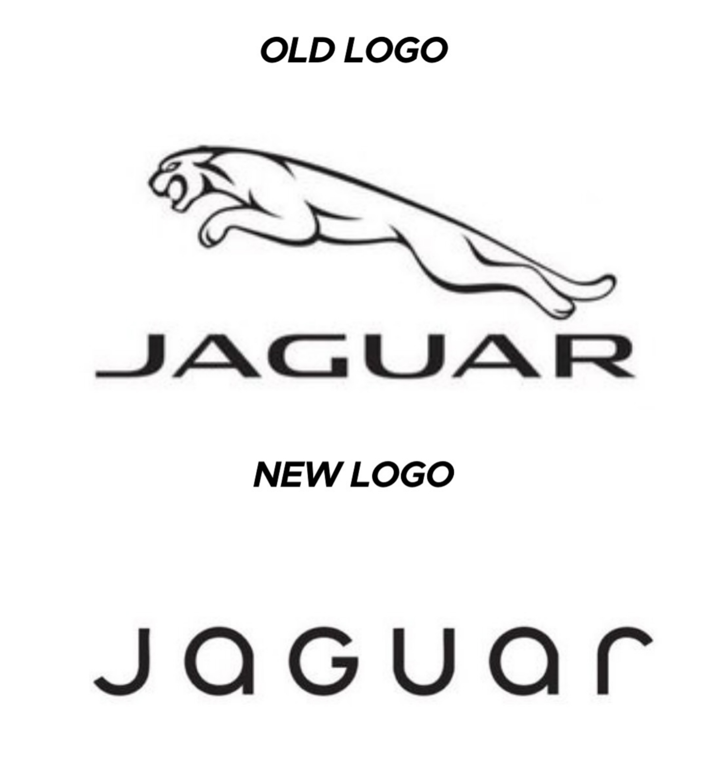
"We're a tech company now!" logo
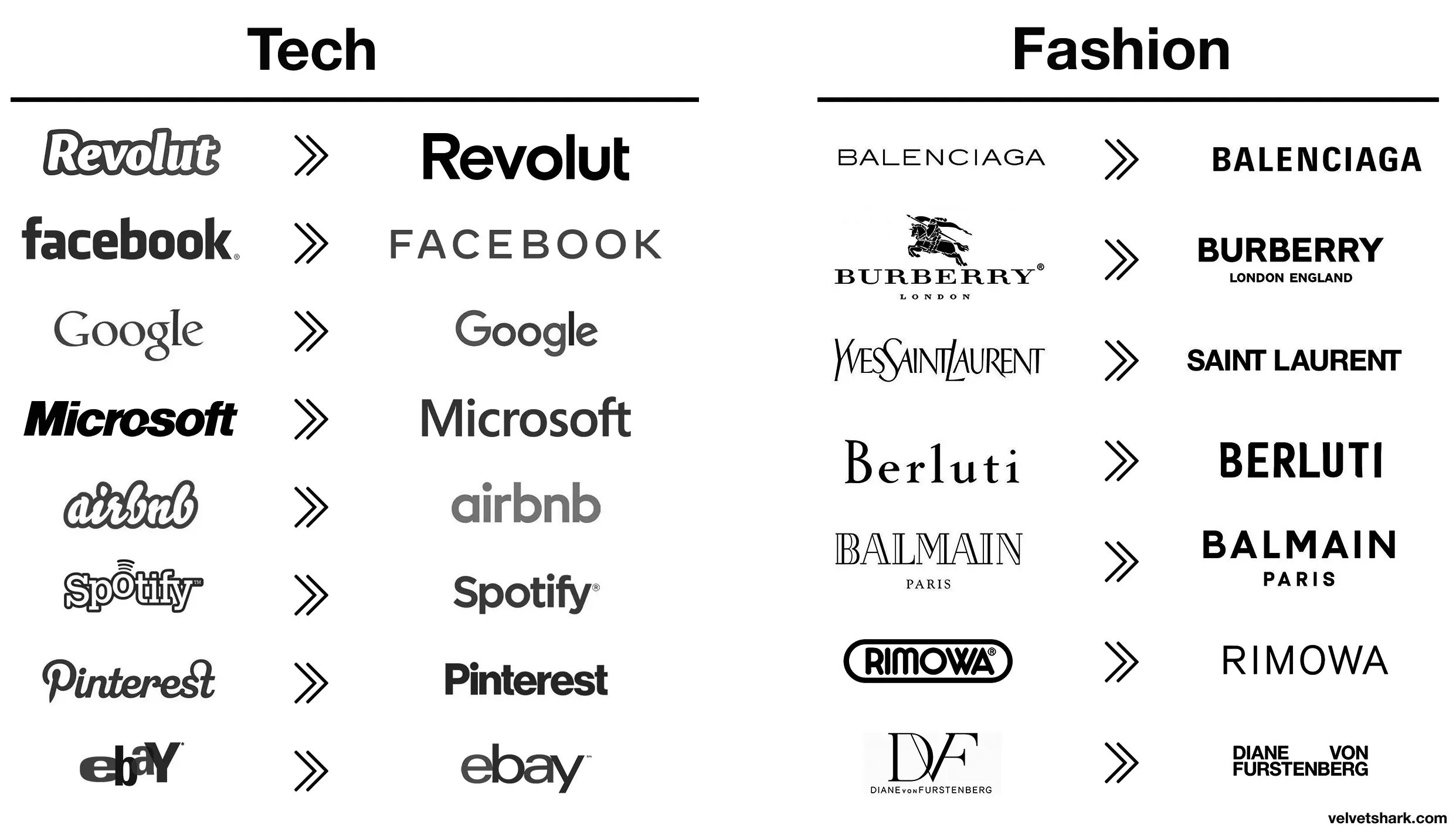
I fucking hate this minimalist design trend more than it is probably reasonable to hate an aesthetic. It's got the personality of unfinished drywall.
Top looks like it belongs on a nice sports car.
Bottom looks like you can find it on a new Multipla.
I would have failed every design class I took in college if I submitted that. Why such wide kerning? Why lower case but upper G? Why so round? Why so completely unreadable at a distance because of micro serifs? There isn't one good design element in this.
>New logo is soulless slop
Every single company
Somewhere in Jaguar HQ, a marketing firm convinced the CxO suite that the most pressing problem facing the company was that the logo was wrong. So, in the interests of the shareholders they write off the goodwill value of the existing brand and dump millions of euro into this.
GUys I'm from 2040 2035, here's Microsoft's logo

MS corporate comms army did a sik job getting across those inscrutable monolith vibes, I bet when it launched they all clapped (even though clapping is in performance reviews)
BONUS: heres Amazon, Faceberg and Nvideo too (yay diversity)
spoiler



It takes a heroic amount of cocaine to make something so devoid of taste and see it through.
Wow, they really took their logo from sexy, fast and expensive looking, to looking like an over priced soft drink?
That's impressive, haha.
JaGUar
/uj Technically this is their new logo:
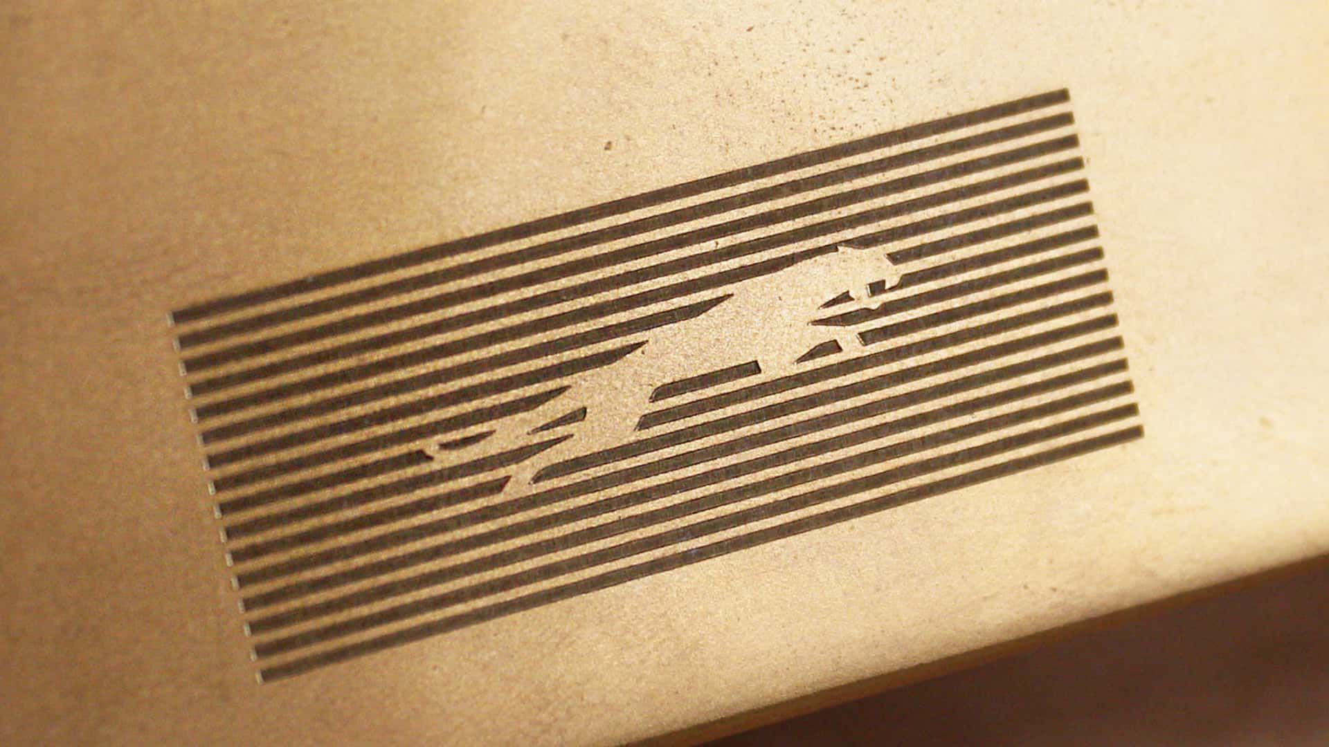
J a G U a r is just their new typeface (I think that’s the name?); and apparently/allegedly is to make the pronunciation closer to UK English, rather than American.
Either way, though - it’s still..
/j
..pReTtY fArKiN’ sToOoPiD.
I love how the new logo could be literally done in less than a minute on fucking microsoft office. They didn't even bother with a cool looking font, just generic curvy shit
They went from luxury car company to mediocre smartphone brand
The font is ugly.
Jaguaren't
I dont understand modern logos principles. How tf is that recognizable. Also animals are fun. Stop getting rid of animals from icons.
You were supposed to remove the text...
Their logo doesn't have a jaguar and their car commercial doesn't have any cars. Fuck it, whatever
Soon there will be no color, no originality.
Just a single font to use everything will be homogeneous and consolidated. Minimal, inoffensive and focused grouped to appeal to everyone and also no one.
Movies, music, games, brands.
JaGUar
A design consultant probably sent Jaguar a six-figure bill for this new logo, you know.
That looks like marketing, let their six-year-old design the logo. Half the letters or lowercase and half are uppercase.
Changing things for sake of changing things. Like Microsoft with every moronic "update".
top 50 comments