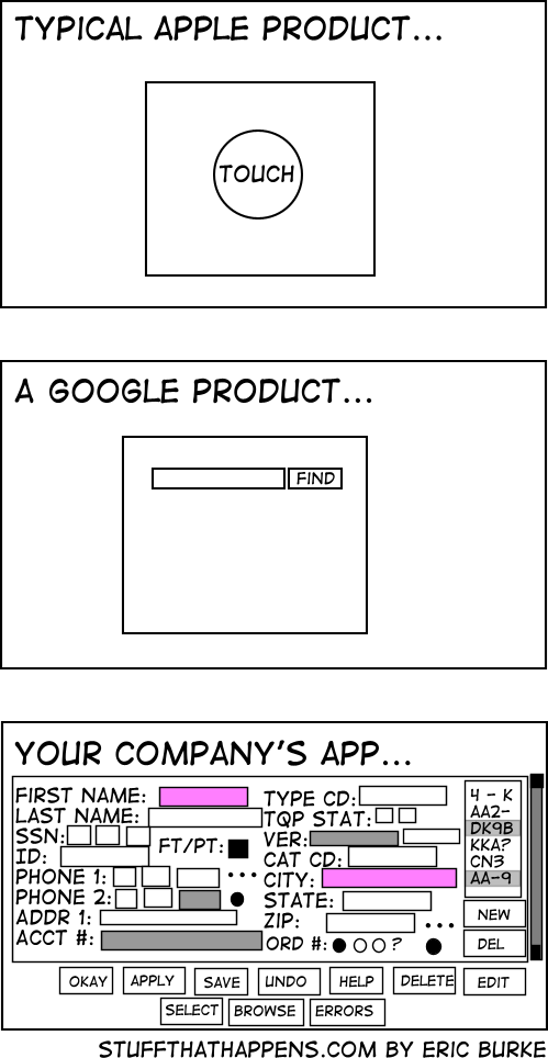
And no, I will not tell you what my company app is.
top 50 comments

sorted by: hot top controversial new old
[–] 115 points 2 years ago (1 child)

Google and apple already know who you are, the company at the bottom doesn't

  • source
  • hideshow 2 child comments
  • [–] 92 points 2 years ago (2 children)

    Wrong, the google product is dead

  • source
  • hideshow 3 child comments
  • load more comments (1 reply)
    [–] 79 points 2 years ago (6 children)

    People at my company are like "why are we wasting screen real estate with white space?" and I imagine they see the last image is an ideal UX

  • source
  • hideshow 9 child comments
  • [–] 38 points 2 years ago (1 child)

    We're currently trying to convince our client, that 4 different levels "mandatory" fields in a form are about two too many.

    The UI they sketched looks like shit, but they think it's absolutely necessary.

  • source
  • parent
  • hideshow 2 child comments
  • load more comments (3 replies)
    [–] 63 points 2 years ago (8 children)

    more checkboxes == more better

  • source
  • hideshow 11 child comments
  • [–] 9 points 2 years ago

    Oh god I know 3rd party encoders like this from from my tape flipping days. They're some sort of dark sorcery you never question. Just press "will try to play or encode" and then make the appropriate sacrifice at your altar.

  • source
  • parent
  • load more comments (5 replies)
    [–] 62 points 2 years ago (5 children)

    Honestly, I'd rather have an ugly app with everything right there than the terrible UX trend that's happening of everything being hidden behind 8-10 different menus just to make the home screen "clean"

  • source
  • hideshow 6 child comments
  • load more comments (4 replies)
    [–] 54 points 2 years ago (1 child)

    If your company is implementing an app that is basically a toggle switch or power button, it'll probably look like the first one. If your company is implementing an internal search engine, it'll probably look like the second one. If anybody is implementing a data entry system meant to be used by trained individuals at a workstation, its gonna look like option three. You might as well complain about a CNC mill being more complicated than a screwdriver, they're different tools.

  • source
  • hideshow 2 child comments
  • [–] 15 points 2 years ago*

    That third screenshot, assuming good keyboard navigation, would likely be a godsend for anyone actually using it every day for regular data entry (well, okay, not without fixes--e.g. the SSN and telephone number split apart as separate text boxes is terrible).

    This same mindset is what led Tesla to replace all their driver friendly indicators and controls with a giant shiny touchscreen that is an unmitigated disaster for actual usability.

  • source
  • parent
  • [–] 51 points 2 years ago (11 children)

    There's a difference between software that's designed to be easy for people that haven't seen it before and software that's meant to be used by someone that's been trained to use it.

  • source
  • hideshow 12 child comments
  • [–] 12 points 2 years ago*

    Yes and no. I did build several in-house enterprise applications and for this I know about this problem. And yes you're right, a lot of the complicated contexts are more complex than searching on Google.

    But! Enterprise software architects have a tendency to make every feature as visible, and also making the apps as feature rich as possible. This comes with high costs.

    I always try to establish a strive with exactly what google delivers.

    Cage the user in his first decision, Filter or action and then show him or her the application with all the features feasible in the chosen context. It is amazing how complexity reduced most of these applications are when you just ask this first question.

  • source
  • parent
  • load more comments (10 replies)
    [–] 40 points 2 years ago (1 child)

    There is a clear difference here: the first software, you pay to use. The last one, you get paid to use it.

  • source
  • hideshow 2 child comments
  • [–] 31 points 2 years ago* (3 children)

    100% this. I used to work at a company that sold software that mechanical engineers used all day, every day in a certain field. Our app looked like the last pic but with better alignment.

    People who are competent want all the things on their screen all at once all the time. They also want keyboard shortcuts.

  • source
  • parent
  • hideshow 4 child comments
  • load more comments (2 replies)
  • [–] 35 points 2 years ago (5 children)

    The honestly prefer the bottom one than the modern 50 step wizards that take 10 seconds for each page to load, and load an ungodly amount of JS scripts.

    A company I worked for was using an ancient bug tracking tool (called Pivotal) that looked like a 90s site. It was so fast and responsive. Later, we moved to something modern. It was 10 times worse, significantly slower and overly complex.

  • source
  • hideshow 6 child comments
  • load more comments (4 replies)
    [–] 34 points 2 years ago

    And you are asked to add more fields and buttons, but the interface was made in a very old version of visual studio and it breaks something every time you open it up in the editor.

  • source
  • [–] 30 points 2 years ago (1 child)
    1. Those apps are simple
    2. Those apps target a wide audience, hence have more budget as a result
    3. Those apps are made by large, well oiled (you'd hope at least) companies. You don't want my honest opinion on most small software development boxes. This industry grew faster than mentors became available for the newbies, so many devs including seniors still don't know what they are doing.
  • source
  • hideshow 1 child comment
  • load more comments (1 reply)
    [–] 29 points 2 years ago (1 child)

    Ngl I prefer said company app rather than "new" stuff which runs on Electron and breaks just from looking at it

  • source
  • hideshow 2 child comments
  • [–] 26 points 2 years ago (2 children)

    "We want to look like Apple" while insisting on every bit of whitespace be filled.

  • source
  • hideshow 3 child comments
  • load more comments (1 reply)
    [–] 25 points 2 years ago (1 child)

    Is this post brought to us by a Service Now developer?

  • source
  • hideshow 2 child comments
  • [–] [S] 13 points 2 years ago (5 children)

    Oh no, my company is going to integrate with Service Now! Should I be scared?

  • source
  • parent
  • hideshow 6 child comments
  • load more comments (4 replies)
  • [–] 24 points 2 years ago* (1 child)

    I'm not really sure why both first name and city are required but I hate oversimplified mobile designs. Whenever a web page loads everything into a big rounded edge middle column I do a little angry exhale.

    I'm an adult with a mouse and keyboard, I don't need giant baby buttons and you can load more than two rows of something at a time ffs.

  • source
  • hideshow 1 child comment
  • load more comments (1 reply)
    [–] 22 points 2 years ago* (1 child)

    This is not true. Literally all of apples computers lack the touch feature on their primary screens.

  • source
  • hideshow 1 child comment
  • load more comments (1 reply)
    [–] 20 points 2 years ago*

    Good.

    You need all that information, but no more. This allows me to efficiently supply it, properly formatted, and to supply no more. Assuming this is using standard widgets instead of reinvented ones, the only better thing would be an API so we can roll our own form or automate.

    The FAANG approach relies on an army of people to do the data entry equivalent of mind reading, or invasiveness, or both, and all so that you have to look at a few less boxes for a minute.

  • source
  • [–] 19 points 2 years ago* (1 child)

    At least it doesn't have ads

  • source
  • hideshow 2 child comments
  • [–] 19 points 2 years ago

    I am getting flashbacks on dealing with SAP "inspired" software that looked worse than that bottom image. I am glad my new company does not use that garbage. It was especially depressing to see how SAP entirely ruined Concur.

  • source
  • [–] 15 points 2 years ago

    Whoever made this has never used Google Cloud Platform.

  • source
  • [–] 14 points 2 years ago (1 child)
  • [–] 13 points 2 years ago*

    Yay, options.

  • source
  • [–] 12 points 2 years ago*

    We have to get permission from Marketing, the CEO, the Pope, and the ghost of Queen Elizabeth 2 to change anything about the layout, so we just jamb in more buttons.

  • source
  • [–] 10 points 2 years ago

    Every few months the layout gets reshuffled as well for no fucking reason.

  • source
  • [–] 8 points 2 years ago (2 children)

    Everyone knows what DK9B is, we don’t need better labels.

  • source
  • hideshow 2 child comments
  • load more comments (2 replies)
    [–] 7 points 2 years ago

    You forgot the ads on google

  • source
  • load more comments
    view more: next ›