123
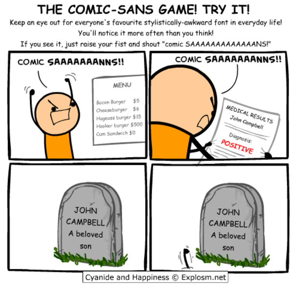
I have a confession to make... I code in Comic Sans
(dtinth.github.io)
i already do that while playing undertale so no losses
Wow, poor comic sans didn’t deserve all the hate it got
I've coded with comic neue https://comicneue.com/ over the last few years. I would definitely recommend it.
That's amazing, I love it. Thanks for linking that!
I will forever believe the comic sans hate is one of the internet's seemingly random circlejerks, like hating Imagine Dragons.
There were legitimate reasons from a design standpoint. It's badly balanced, the spacing is inconsistent...and it was everywhere.
Funny enough, I suspect what makes it a badly designed font might be why some people with dyslexia have an easier time reading with it. The badly balanced, poor spacing, probably made the letters in the font more distinguishable from one another.
If you (or anyone else that's interested) have the time, I think this article, "Why You Hate Comic Sans," goes over all of it pretty well.
I recently read a review of 1990s pop aesthetics, and it was probably intentional for reasons that resonate with us again. In the 90s, with the advent of omnipresent computers, organic, amateurish handwriting became really popular, and I think that's what comic sans is good at looking like.
A dude posted his neofetch on a Linux community and he uses fucking comic sans for his terminal. Probably will rot in hell
I unironically love Comic Mono. I am not dyslexic, I have good eyesight, but I feel like I can read code so much more easily with it versus most other monospaced fonts.
Comic Sans is actually really good for dyslexic people. It's why I usually use Comic Sans or Comic Neue when I print stuff out for my dad.
As long as it's a monospaced font I don't really care what the font is. (Wingdings excluded)
Might give it a try for a day.
I…don’t hate it? Why am I not horribly offended by this?
I think some of the reason might be that Comic sans used to have really bad kerning. But with a mono font it is not really an issue.
I feel the same way. I hate that Iike it and am now going to try it.
Same thoughts here. Went in expecting to hate it instantly and found that it sort of looked nice.
⚠️ I have reported this post to the proper authorities.
Friendship ended with font gatekeeping and dogpiling, accessibility is my new best friend
If you like that, check out Recursive Sans & Mono
I wouldn't pick it over Fira Code but it has a bit of whimsy to it that reminds me of Comic Mono.
Really dig that for a new-wave ui
Oh no now I want to build a whole Arch rice around that font.
...no that's not enough.
we need ComicSansOS
Oh no, I was ready to pick up my pitchfork, but that is super legible. Brb, I need to go take a look at myself in the mirror...
I came here to get mad but comic sans monospaced looks really good. I'm impressed. I might switch my IDE to this.
Reducing the font-size makes it look pretty great.
Yeah but does it have ligatures? That's my hard pass on coding fonts.
Does it support ligatures??
Stumbled into this site while looking through other comments and apparently it was designed for the speech bubbles of a cartoon dog, not sure about the "legible at small sizes" claim - http://www.connare.com/whycomic.htm
This is surprisingly not bad...
Ngl that is really easy on the eyes. Dammit.
I feel like a whole new world has opened its doors to me. I’m using this tomorrow at work.
Look what you have done! I used Operator Mono for Italics. I kind of like this!
Need to give this a go at work tomorrow!
At least you’re using a monospaced one…
I tried that this morning at work, as a joke.
It was still there when I got off.
undefined> Wingdings
After two days, what do you think?
Great to find another Comic Mono user! It's super easy to read. I've been using it in IDEs / Terminal for a while now.
I've even set up Stylus scripts to use it in GitHub and other sites as I find weird going back to the "normal" code fonts.
Seriously, for coding I use daily Fantasque Sans Mono, which is based on Comic Sans. I love it.
Saving that font for my e-reader tablet.
Suuuper legible and fast to read.
It's interesting that you added serifs and monospacing to a sans serif font. It's almost like comic sans but with all the things that make it comic sans removed.
Well it is Comic Mono after all, not Comic Sans Mono :)
My original intention was to come here and proclaim that you're a heretic. Having looked at it for a moment, I think that you're onto something here...
same here... just right now downloading the font, thinking if I don't at least give it a try, I'll forever wonder what it'd be like...
not a crime. i use it for my notepad, it looks weird but its fine for me.
All things programming and coding related. Subcommunity of Technology.
This community's icon was made by Aaron Schneider, under the CC-BY-NC-SA 4.0 license.