▲ 123 ▼ I have a confession to make... I code in Comic Sans (dtinth.github.io) submitted 3 years ago by KerPop47@lemmy.world to c/programming@beehaw.org 83 comments fedilink hide all child comments Seriously, though, Comic Sans was originally designed to be legible at the smallest possible font size, and the lack of hard lines makes it easier to read!
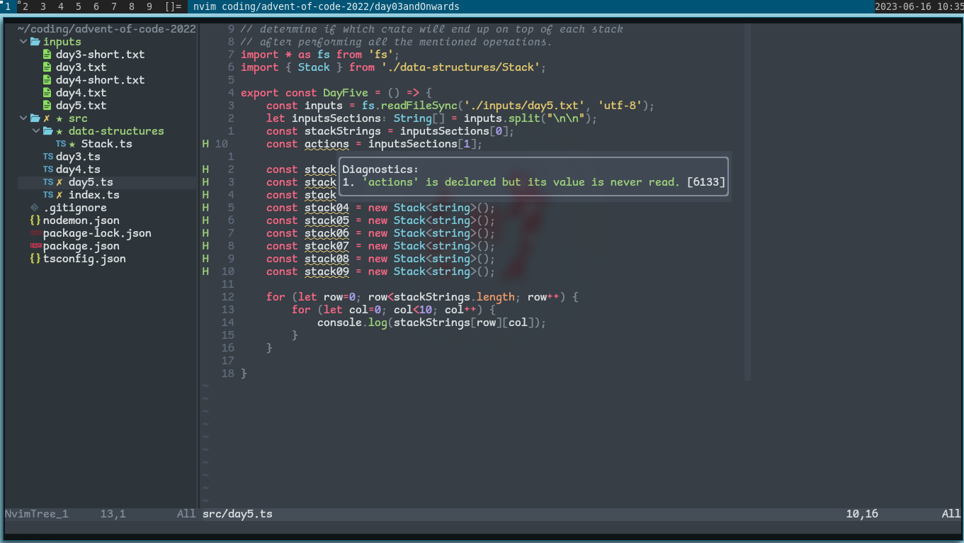
[–] sujeewa@discuss.tchncs.de 2 points 3 years ago (2 children) Look what you have done! I used Operator Mono for Italics. I kind of like this! permalink fedilink source hideshow 2 child comments replies: [–] dill@lemmy.one 0 points 3 years ago (1 child) bro... how did you manage to stain a screenshot permalink fedilink source parent hideshow 1 child comment replies: [–] sujeewa@discuss.tchncs.de 1 point 3 years ago Is it that bad? Now I have IBM Plex installed permalink fedilink source parent
[–] dill@lemmy.one 0 points 3 years ago (1 child) bro... how did you manage to stain a screenshot permalink fedilink source parent hideshow 1 child comment replies: [–] sujeewa@discuss.tchncs.de 1 point 3 years ago Is it that bad? Now I have IBM Plex installed permalink fedilink source parent
[–] sujeewa@discuss.tchncs.de 1 point 3 years ago Is it that bad? Now I have IBM Plex installed permalink fedilink source parent