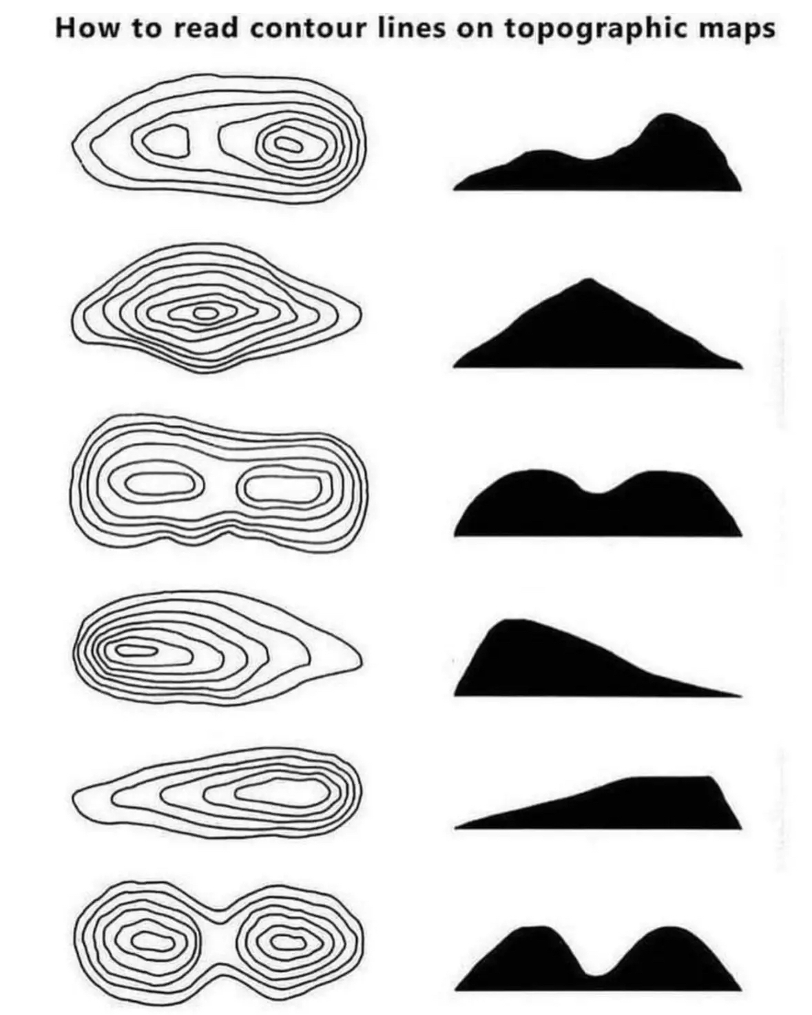
Everything reminds me of her
post
I always found these very intuitive, but I don't know if that's just due to having an analytical mind, or just learning this stuff early. Do people struggle to understand topographic maps?
I think your analytical mind got "typographic" and "topographic" mixed up...
It gives a basic idea, but I think something like Cities:Skylines where you can create maps using a height map and then get the topography lines in a 3d space where you can actively shift the camera around to see them overlaid from any angle would probably help people grasp the idea.
Having said that, I'm now imagining drone footage overlaid with the height maps as an additional resource to standard topographical maps. Would be neat if somebody could create software that could calculate and overlay the height maps in real-time using the drone's altimeter or something.
In the Land Nav portion of PLDC (US Army training for becoming a Sergeant - is called something else now) there were soooooo many people that failed out/had to do it over again, that I was super worried when I did it. Seemed pretty damn easy to me. 🤷
Except all of the hills could be valleys, you need to see the numbers on the contours
If it were a local depression instead of a hill, the lines would be hatch-marked on the side pointing into to depression.
Do you have an example, I either never have seen this or never had a depression on a map
You want an example of local depression just swing by my place anytime
Page 2 under contours: https://pubs.usgs.gov/gip/TopographicMapSymbols/topomapsymbols.pdf
I was expecting boobs for the last one. They’re almost there too.
Yeah, very confusing to see an image like this that isn't a smart-ass meme.
Nature's boobs
Boobies.
Have you considered the following?

Number 3 is basically just my chair if it was soft like a sofa instead of wood
There are depression contour lines for that purpose.
Depression contour lines are what I call my wrinkles
First time I’ve seen that, really don’t think it should’ve been my first time. Thanks!
I’ve always been curious about topographical maps that involve curved or hanging terrain and whether there’s a way to denote the existence of an area beneath. That’s obviously going to be irrelevant 99.9% of the time, but grade school curiosity rarely fades completely.
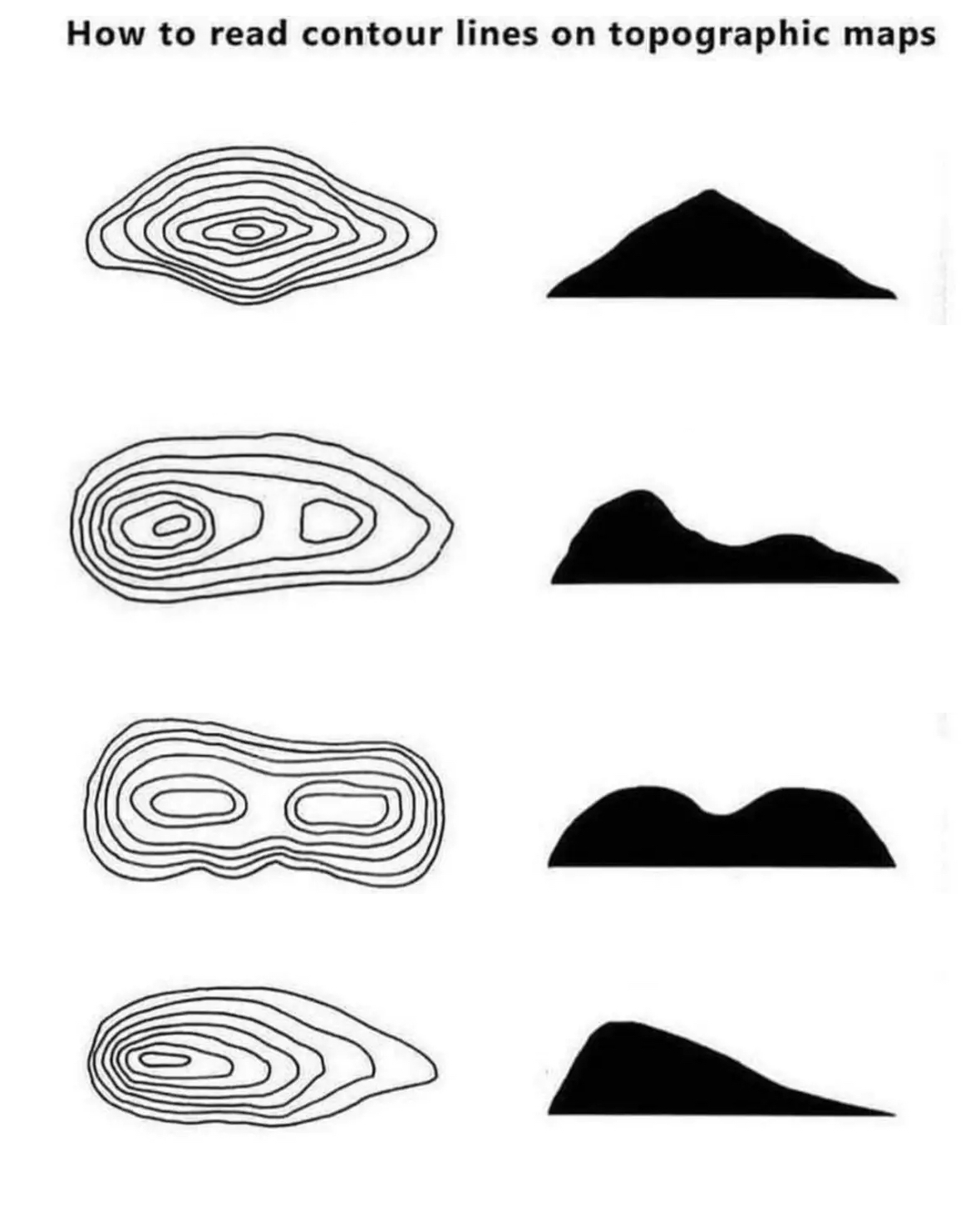
I made an improved condensed version of this that still gets the point across
Those all look vaguely sexual to me.
My brother in Rorschach, you are not alone.
Also it helps to look at water on the map. Water always runs downhill. Runs combine to form creeks, creeks combine to form rivers, rivers pour into oceans and lakes. Water gets bigger on its way downhill. The dead end is a spring, it flows downhill from there
For the second one, do you need that many rings? Would using less still be correct?
Depends on the rest of the map. These are usually set up so the rings mean a certain consistent difference in elevation, say 1ft of 10ft. You don't normally change the spacing partway through the map. If the intervals were 10ft and this was a 20ft peak then you'd obviously have fewer rings than if the intervals were 1ft.
The rings are elevation placements. Less would be "correct in that they'd still signify elevations, it's just less detailed.
For example, the widest ring might be an elevation of 2470ft while the smallest ring might be 2570ft. If there are no rings in between, it's still correct, you're just not getting very detailed. You could easily be looking at a perfect sloap on all sides, like a smooth cone. But place 9 rings in between at 10ft more of elevation each, you've got a much more detailed idea of how a mountain or hill is shaped.
So, correct, but not very useful.
top 50 comments