Hi all,

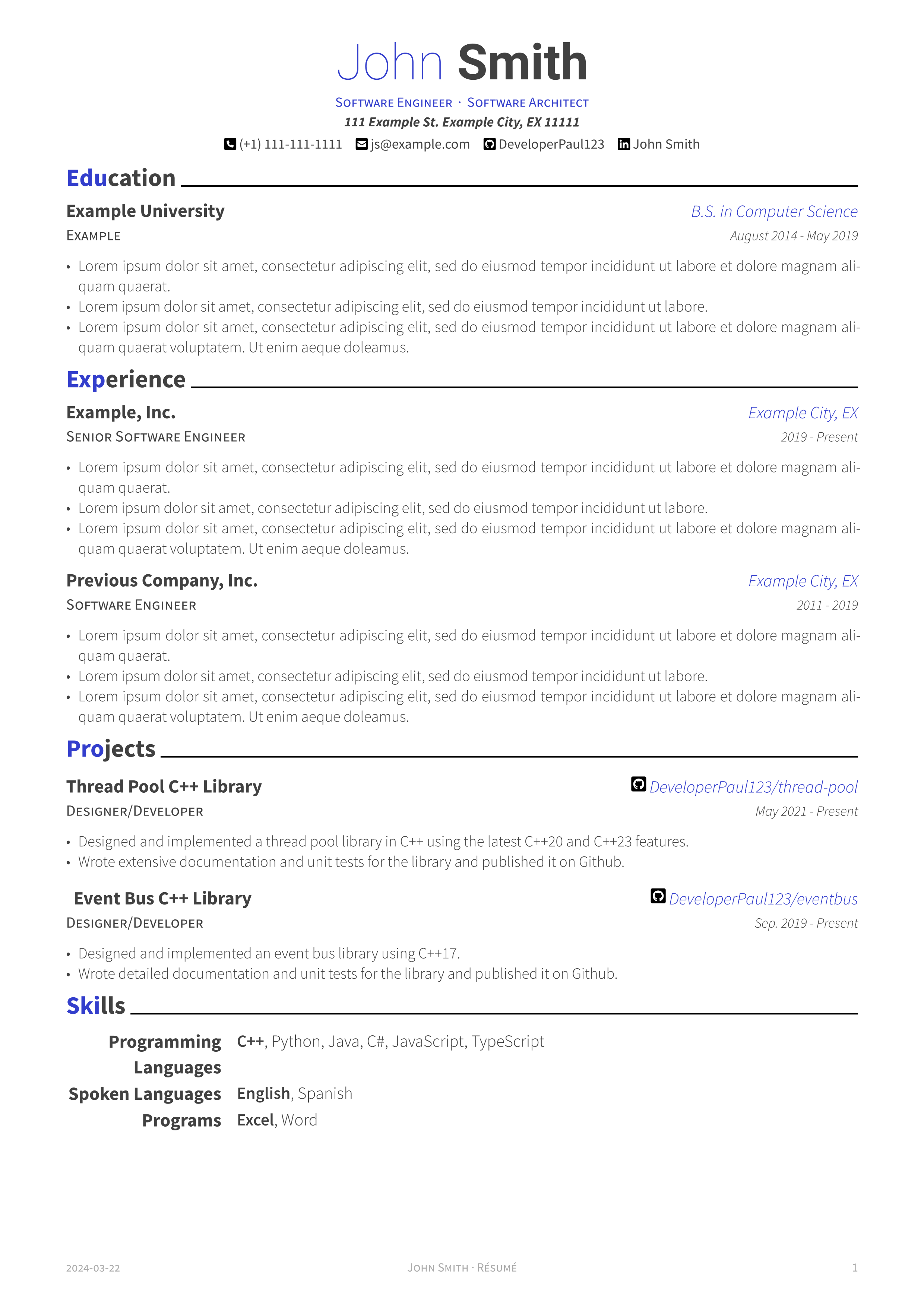
I made this typst template originally to port my personal resume to typst from Latex. It tries to be a faithful port of the Awesome-CV latex template that I was previously using. Hope you find it useful.

https://github.com/DeveloperPaul123/modern-cv

Edit: added missing link
top 50 comments

sorted by: hot top controversial new old
[–] 102 points 2 years ago (10 children)

Please don't color part of a word blue and part of a word black

  • source
  • hideshow 10 child comments
  • [–] [S] 5 points 2 years ago (4 children)

    This is interesting as I simply copied the same styling as the previous template I was using. Would it be better to highlight the entire first word instead of the first n letters?

  • source
  • parent
  • hideshow 4 child comments
  • [–] 11 points 2 years ago (2 children)

    Black only. Either bold or italics if you feel the need to add emphasis.

    Most resumes are parsed by tools and you'll never see fancy formatting anyways.

  • source
  • parent
  • hideshow 2 child comments
  • [–] 44 points 2 years ago (5 children)

    Experience should be listed first. Education last.

  • source
  • hideshow 5 child comments
  • [–] [S] 6 points 2 years ago (2 children)

    Thanks for the feedback! I think this makes sense for those who do have work experience. Do you think this should still be the case for new graduates?

    Also I should note you can easily change the order of things in your own CV.

  • source
  • parent
  • hideshow 2 child comments
  • [–] 5 points 2 years ago

    Yes. Your education is a 5 second skim through, I would not put it at the center page. If you believe you have zero relevant experience, then omit that panel and let’s make the main focus your projects.

  • source
  • parent
  • [–] 32 points 2 years ago

    You forgot to include a link to the project:

    https://github.com/DeveloperPaul123/modern-cv

  • source
  • [–] 26 points 2 years ago

    "C++, Python, Java" truly is the Lorem Ipsum of coding languages

  • source
  • [–] 24 points 2 years ago* (3 children)

    This looks good.

    A few unsolicited nit-picky suggestions;

    • I'm not a big fan of mixing colors in a single word. 'Taky' might the be the right to describe why. I do like the color blue you used - if you're going to do it, make it the whole word. The name should also be consitent. Bold and either black or blue, not black and blue.
    • The light blue and light gray body text is difficult to read. Colors should be solid black, or navy blue. Bright and 'fun' colors are heard to read for some. Assume they're colorblind or will print it on a B&W printer with poor contrast.
    • I like to lead with the job title instead of the company. Where you worked is largely irrevelvant compared to what you've done at those places. It also makes it easy to combine company, city and years in one line.
    • start with previous jobs (unless education was most recent or more relevant to new job). Typically the order is job > skills > education.
    • Avoid italics they can be unnecessarily diffuclt to read

    Engine Mechanic

    Bob's Auto | City, ST | 2017-2021


    Education does not need so many details (if relevant to job, include specific courses and projects). Grad date can be omitted to help obfuscate you're age (a grad from 2024 is probably inexpirenced, while a 1967 grad is going to be retiring soon).

    Two lines is all you need;

    Bob's University, City, ST

    B.S. Computer Science, minor electrical enginnering

  • source
  • hideshow 3 child comments
  • [–] [S] 3 points 2 years ago (1 child)

    I'm working on some of the changes your suggested. Here are screenshots of the adjustments. I'm curious to hear your thoughts. Thanks!

    Here is a monochrome version without colored headers. I also adjusted the default accent color, but this is user configurable as well.

  • source
  • parent
  • hideshow 1 child comment
  • [–] 1 point 2 years ago* (last edited 2 years ago)

    It looks a lot cleaner now.

    The body text seems too light still, but that might be my phone screen. It should be solid black.

    Only One change from here I would strongly recommend making is the blue "city" text black.

    Treat blue and bold text as your 'highlighter', there to help someone quickly navigate to the important sections of the page. City is not important. Your use of varriying font sizes and bullet lists is great for page navigation.

    If I was going to use color, I'd highlight the jobs before the city name/git link.

    The rest is personal taste.

    Personally, I think the blue headers is enough. It might get to too blue if you color job titles as well. You don't need a separate monochrome version, the dark blue will show as black if it happens to be printed in B&W. You should also test print your resume in B&W. I find easier to spot errors on paper.


    Edits as I spot more little things.

    (Also there's an extra space in the second skill name - Event Bus)

    (You also have space to make programming languages one line. At first glace I though you had a blank section for "languages". Could probably just say "programming", but I'm not in that field so maybe that's frowned upon?)

    (In education, you have an example line underneath the university name, what is that line for? I would put the degree in that space, not off to the side. That's technicaly more important that the university it self, but it's probably "improper form" to list that above the uni name. (or whatever some one snoby would say).

    (One last thing, you don't really need your full street address. Its unlikely anyone will mail you a response, and its just as likely you'll have to enter it into the application form anyways. City will suffice.)

    (One last last thing, if you're going to give yourself titles at the top, you better show them in your expirence section. (I know this is just an example template and I am being incredibly picky) but I don't see architect anyware in the actual resume. That communicates to me you're just calling yourself related titles hoping one sticks)

  • source
  • parent
  • [–] 10 points 2 years ago (1 child)

    Can you please post the repo of your template for people who are interested?

  • source
  • hideshow 1 child comment
  • [–] 5 points 2 years ago (3 children)

    I was using a template like this several months ago, (in typst) I think someone had already ported awesomecv beforehand.

  • source
  • hideshow 3 child comments
  • [–] [S] 2 points 2 years ago (2 children)

    Oh really? I couldn't find a port of this before. Do you happen to have a link?

  • source
  • parent
  • hideshow 2 child comments
  • [–] 2 points 2 years ago (1 child)

    Several of the ones listed on awesome-typst are similar, notably:

    Not to knock the work you have done though

  • source
  • parent
  • hideshow 1 child comment
  • [–] [S] 2 points 2 years ago

    Ahh yes, I tend to forget about these "awesome" lists. Thanks for the links.

    It seems that Brilliant CV is a direct port of the same latex template I used to use as well. The developer references it as well in the README. I do think my template is a bit easier to use and is more up to date with the latest typst version but there are some really nice templates on there.

  • source
  • parent
  • [–] 5 points 2 years ago (1 child)

    This is great! How would you describe your experience creating this template? I've been wondering about porting the modern-cv template from LaTeX myself.

  • source
  • hideshow 1 child comment
  • [–] [S] 5 points 2 years ago

    Overall it was pretty nice honestly. Especially coming from Latex. Creating a template in Latex was very difficult but in typst it's way more intuitive (at least to me) and it's easy to control every aspect of the text and its layout.

  • source
  • parent
  • [–] 4 points 2 years ago* (last edited 2 years ago) (15 children)

    Somewhat unrelated question:

    How do you list experience based on projects under single employer with timeline?

    Right now I have it like this:

    • Consultant

      Employer - 2020 - 2023

      • Developer - June 2023 to August 2023
        • Description 1
        • Description 2
      • Analyst - March 2021 - May 2022
        • Description 1

    I havent found any resume template that can handle this (nested experience) automatically

  • source
  • hideshow 15 child comments
  • [–] [S] 3 points 2 years ago (3 children)

    I put this together in a few minutes using my template. Does this address what you meant?

    Here's the typst code:

    #import "@preview/modern-cv:0.1.0": *
    
    #show: resume.with(
      author: (
          firstname: "Person", 
          lastname: "Lastname",
          email: "email@email.com", 
          phone: "111-111-1111",
          github: "DeveloperPaul123",
          linkedin: "LinkedIn Name",
          address: "111 Road Dr. City, Place 111111",
          positions: (
            "Software Engineer",
            "Software Architect"
          )
      ),
      date: datetime.today().display()
    )
    
    = Experience
    
    #resume-entry(
      title: "Company, Inc.",
      location: "Place, Earth",
      date: "2022 - 2023"
    )
    
    #secondary-justified-header(
      "Developer",
      "June 2023 to August 2023"
    )
    
    #resume-item[
      - #lorem(10)
      - #lorem(11)
    ]
    
    #secondary-justified-header(
      "Analyst",
      "March 2021 - May 2022"
    )
    
    #resume-item[
      - #lorem(10)
      - #lorem(11)
    ]
    
  • source
  • parent
  • hideshow 3 child comments
  • load more comments (3 replies)
  • [–] 4 points 2 years ago* (2 children)

    That's awesome, I spent a day fighting with Latex to edit awesomecv without causing errors or breaking the template. Really hope Typst takes off.

    I can only see the image though, not the link to your project

  • source
  • hideshow 2 child comments
  • [–] [S] 1 point 2 years ago

    Thanks!

    I added the link now and yes, I really hope typst takes off as well. I've been using it pretty extensively where I can at work and my personal life and it's so much easier than Latex. I haven't done anything too complicated yet so we'll see how it goes.

    Also I added the missing link 😅

  • source
  • parent
  • [–] 2 points 2 years ago (2 children)

    Where can I borrow the template?

  • source
  • hideshow 2 child comments
  • [–] 2 points 2 years ago

    This CV does not exist .com

  • source
  • [–] 2 points 2 years ago

    I am also in the single pager, latex CV club. I ended up splitting into two columns though like -

                     NAME
                contact deets
    -----------------------------------------
    bio                   |    current workplace
    skills                |    old workplace (senior)
    education             |    old workplace (midlevel)
    projects              |    first workplace
    
  • source
  • [–] 2 points 2 years ago* (last edited 2 years ago) (2 children)

    As a manager who sometimes hires, I can't say that I would ever particularly care about the education section for the types of roles I hire for, let alone put it first and foremost.

    Also, personally, my own CV combines my role's duties and its achievements/projects together for each of the jobs I've had, with a primary focus on the recent.

  • source
  • hideshow 2 child comments
  • I haven't had a single page resume in over a decade, I think you usually want to have more for SEO purposes. A lot of places filter by keywords.

  • source
  • load more comments
    view more: next ›