1460
Anon notices what they've taken from us
(sh.itjust.works)
This is a place to share greentexts and witness the confounding life of Anon. If you're new to the Greentext community, think of it as a sort of zoo with Anon as the main attraction.
Be warned:
If you find yourself getting angry (or god forbid, agreeing) with something Anon has said, you might be doing it wrong.
This goddamn camera built into my screen instead of above the screen pisses me off so fucking much. So often I have to move a picture down to read the top of it.
IT'S BLOCKING MY MEMES GOD FUCKING DAMMIT MY MEMES
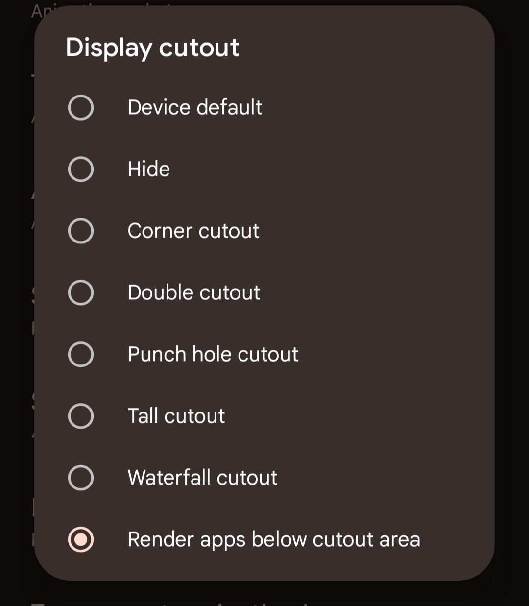
Hey man, I know this is a rant, but in case you didn't know there should be a setting to resize things to make a black bar at the top. Google it for your phone, but for samsung it's something like "full sceeen apps".
Just looked. Not a thing for pixel 6A :(
Googled it, try this
https://mashtips.com/hide-display-notch-and-cutouts-on-pixel/
Holy crap that did it! Thank you!!
That seems like a weird thing to want. You'll have less screen space because the notification area is now using your useable screen area instead of being up in the unusable dead space.
MY. MEMES.
Not actually how it works. There's two options. One of them has the notifications in the "dead space", but the content never gets eaten up.
(Pinging @[email protected] , just in case you didn't know about this!)
I wouldn't use this myself. Most apps are designed so content fits underneath the camera hole so nothing gets eaten, and even if it does get eaten, the camera is so small that it's not an issue for me
Edit: this is what you have to enable, by the way.

People look at me like I'm fucking insane when I get as upset about the blighted notch on my screen as I do. This screen technically has more real estate than my Razer Phone 2 back in 2018 did, but between the obnoxiously tall aspect ratio and the fucking notch, it has like 75% of the usable screen space. You know what was really nice? Watching TV shows on my RP2, with the 6" screen, all of which was used for the video. You know what sucks? Having a half inch of black bars on either side of the screen so that the 16:9 aspect ratio video can fit on the 18:9 aspect ratio screen. And it's even more ass than that, because the top and bottom of the video look like shit because the screen wraps around the fucking sides.
If the FBI could hear what I have to say about the engineers at samsung, I would have been arrested years ago
I drift through this world in a mood of indifference, frequently moving into disgust.
But at times I read a comment like this and see that there is still beauty in the world. I love you.
I'm sorry but I think we should just be friends
You don't need a navbar if you switch to gesture controls
That's another thing they ruined! Oneplus had amazing gestures, but then Google enforced using their gestures only, and they're so much worse! I especially hate that back is swiping in from an edge, which is in conflict with every side drawer and cropping tool in every app ever!
Yeah, I have the most problems with it in Thunder. I avoided using gestures for so long but they've grown on me.
With Oneplus gestures back was swiping up from the bottom left or right. So much better. And the screen-off-gestures with drawing the pause symbol for play/pause or < or > for jump back/forward in a podcast or song. I miss them.
Fuck gestures, gice me back my buttons
If you're talking about physical buttons, please no. Gesture navigation is an incredibly useful feature for those with short fingers like myself, who have problems with reaching the "Recents" button without weirdly tilting the phone and then stretching their thumb to the point that it gets painful over time. And while it's technically possible to use gesture navigation on phones with physical buttons, it would definitely be weird. Not to mention that it's also wasted space, because physical buttons obviously can't just disappear when needed like on-screen buttons do, so you can have a bigger and more efficiently used screen. There are a lot of things that are dumb to remove from phones, pyhsical navigation buttons, in my opinion at least, are not one of them. I can't even think of an advantage physical buttons would have over on-screen buttons.
If you meant that you want to keep the option for on-screen button navigation, I'm all for it. Can't hurt to have more options :)
Well i meant physical buttons but i also think phone displays should be 5 inches, 5.5 at absolute most. Also, by the by, the main advantage of physical buttons is a) useabilty while gloved or with wet/dirty hands and b) being able to know precisely what button you're on by touch
I don't think this is a common use case for most people, but I can see how that might come in handy for some, so you've got some good points.
Thx. It's more about versatility in my eyes. A smartphone should be, above all else, practical. So a perfect phone for me would be something like Fairphone but with a 3,5mm jack, physical front buttons, and 2 cameras on the back (wide and normal/narrow lens). Mby additional sensors like a barometer, assuming that can be scaled down or done digitally/electronically.
How often do you come across tall pictures? Most pictures sit well below the camera for me
At least a couple times a day