1936
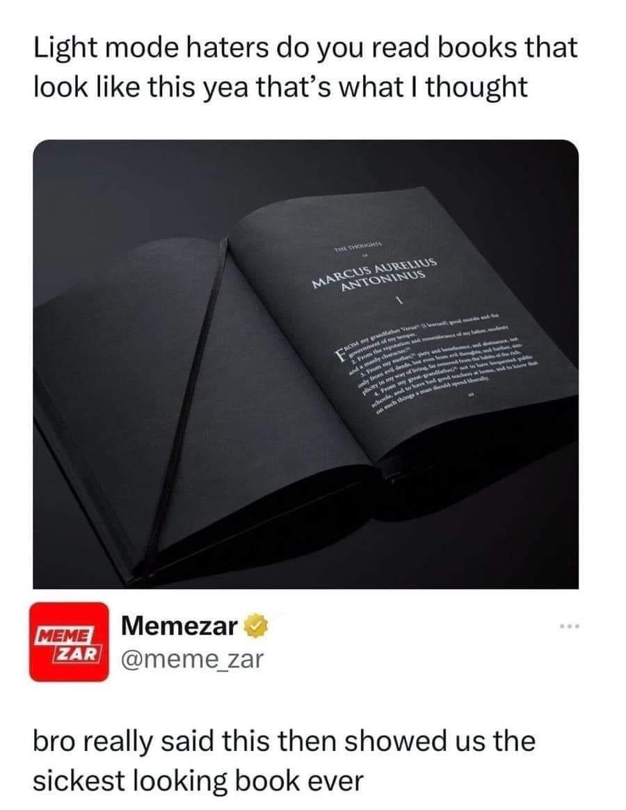
Physical dark mode
(startrek.website)
Welcome to /c/funny, a place for all your humorous and amusing content.
Looking for mods! Send an application to Stamets!
Keep it civil. We're all people here. Be respectful to one another.
No sexism, racism, homophobia, transphobia or any other flavor of bigotry. I should not need to explain this one.
Try not to repost anything posted within the past month. Beyond that, go for it. Not everyone is on every site all the time.
Other Communities:
/c/TenForward@lemmy.world - Star Trek chat, memes and shitposts
/c/Memes@lemmy.world - General memes
It’s just easier to read light on dark, for so many. According to this, I should find light mode more accessible; but for myself and my legally blind friend, we find light on dark much easier to read and navigate.
Not all dark modes are created equal. Some dark modes use a color theme that is illegible for people with color blindness. Many dark modes don't have enough contrast for the legally blind. Now, properly well designed dark themes with accessibility in mind will be more readable. But for some people with certain forms of blindness, black letters over white are more readable than what some apps and webpages implement as a dark mode.
That’s fascinating! Where can I learn more about this?
Thank you so much! I’ve astigmatism, and dark mode is definitely more easy to read, for me!