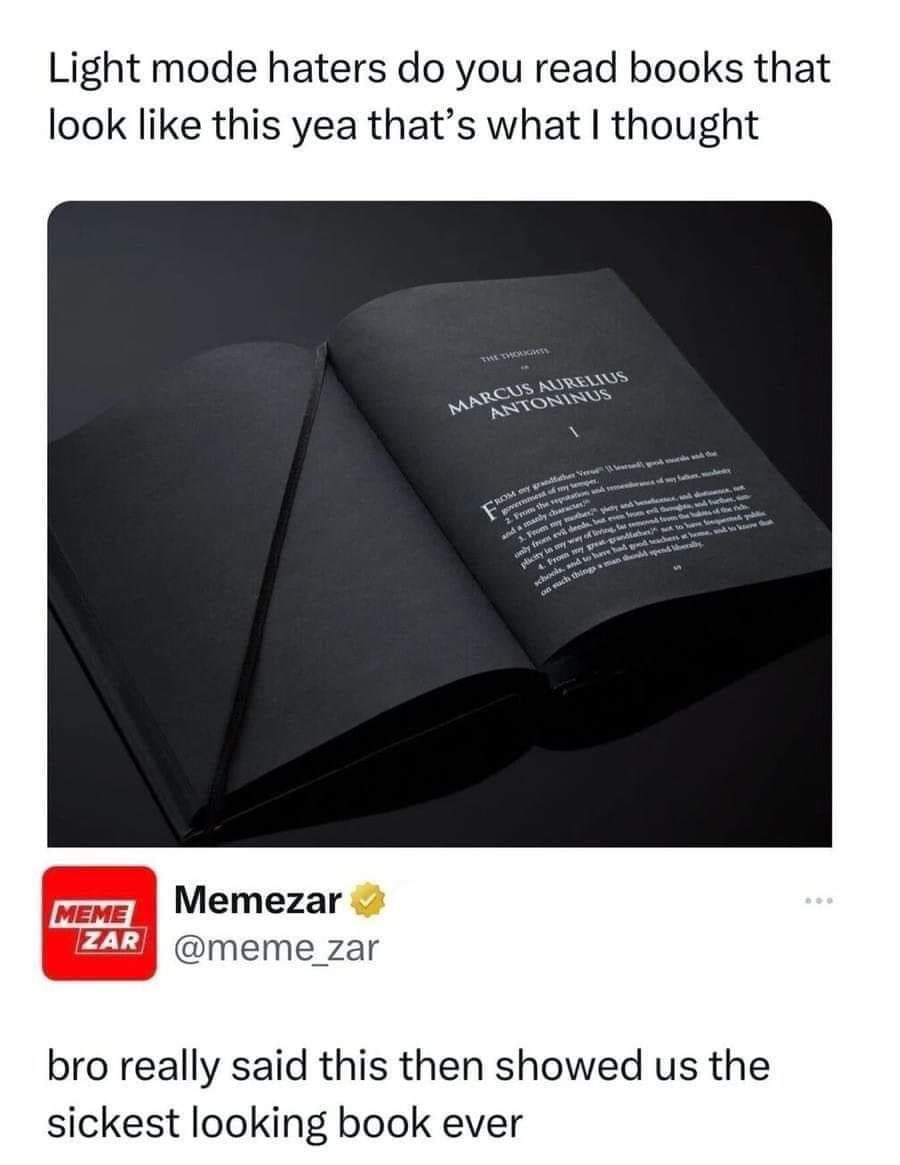
Not all dark modes are created equal. Some dark modes use a color theme that is illegible for people with color blindness. Many dark modes don't have enough contrast for the legally blind. Now, properly well designed dark themes with accessibility in mind will be more readable. But for some people with certain forms of blindness, black letters over white are more readable than what some apps and webpages implement as a dark mode.