241

LucasArts? 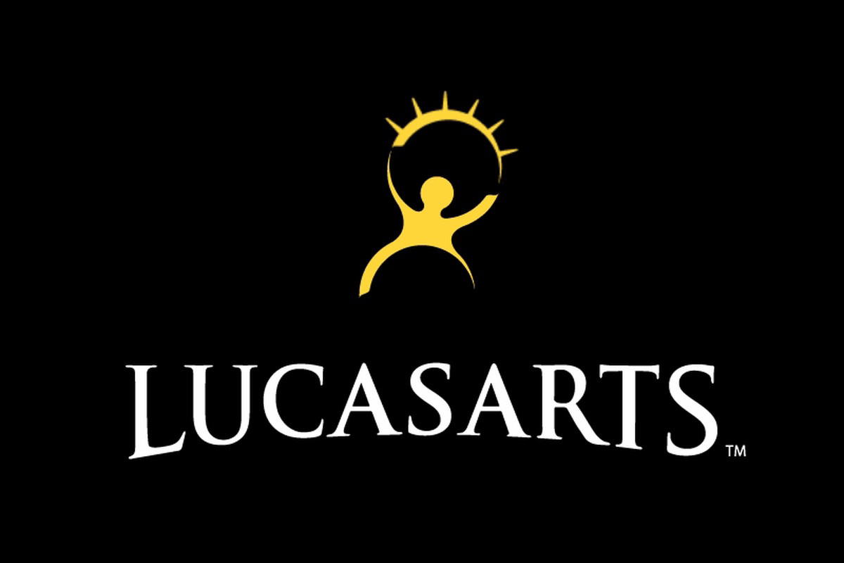
This but the pre-2005 version of the logo was also my first thought.
Man those games were a staple of my childhood
Looks like Jira or Confluence.

Poor OP dreaming about Jira
I'd say more like night terror if it's anything to do with Atlassian
Could be much worse… could be Azure DevOps.
Don't forget to submit a Jira(Jai-rah)
From the comments, I think that the general answer is: We all recognize it, because a lot of different places used a logo sorta like this in the 90s.
And we can't pin it down exactly, because a lot of different places used a logo sorta like this in the 90s.
And being the 90s, a lot of that was never on the internet in the first place.
It rings very strong bells for me, and I don't think the reason is one that (at the time of this comment) has already been posted... But I can't for the life of me remember what it was for.
Reminds me of the old LucasArts logo but that wasn’t stars, it was a sun or the top of an eyelid with lashes.
This is exactly what I was reminded of! I think its gotta be this
Good find, to me it’s this logo, which was used from 2005-2013 across a lot of popular games. Logo
It's a charity of some kind I think, or some kind of educational thing. Can't remember if it's 90s or 2000s.
I’m getting a similar vibe. Maybe a PBS/Edutainment production company whose logo popped up in the post credits?
Or the logo of some publishing company that showed up on their worksheets or handouts? A standardized test logo?
Educational initiative is what is ringing a bell for myself also!
I was thinking like a heart healthy, ad council type thing that was put on cereal boxes.
I think this is what I was thinking of.

Could it be Knowledge Adventure? I played some of the JumpStart games growing up.
I think this type of logo was commonly used in the 90ies early 2000, but with slight variations. My scool's logo (in the EU) looked similar. that's why it seems so familiar to most of us.
The problem is that there are a million logos from the 90s that have the same stylized "separate head". I'm attempting to attach an image to show off some examples. While I absolutely feel like I recognize the logo you've posted, I think it could be an amalgamation of many of them.
The image doesn't appear to show up in lemmy so hopefully this link works.
I definitely remember it, but I can't place it either.
Maybe we are all misremembering the old LucasArts logo, but I could swear I distinctly remember those stars, not the burst-arc.
I think Olympics some time
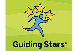
That reminds me of the old Hannaford (and other Food Lion brands) guiding stars logo. It's something they'd put around the store, particularly on shelf tags. The person looks to be running right and there are only three stars. Might explain why you remember it, but can't place it.
My first thought was Aramark
I feel like I remember those hips more than anything. Not sure what that says about me, but it's certainly a distinct feature from all of the logos I've found while searching for this one.
Those hips don't lie.
I distinctively remember it. Person is blue, stars are gold. Some versions of the logo had a gold band over the person.
I'm fairly sure I've seen it recently, likely at a department store.
yes! Wasn’t it blue?
This! I remember the colors being something like a blue background and the person in a lighter blue or a white background with a blue person. Stars were definitely separate
The name Creative Arts or similar is bouncing around my brain but damn if google, bing or ddg can help.
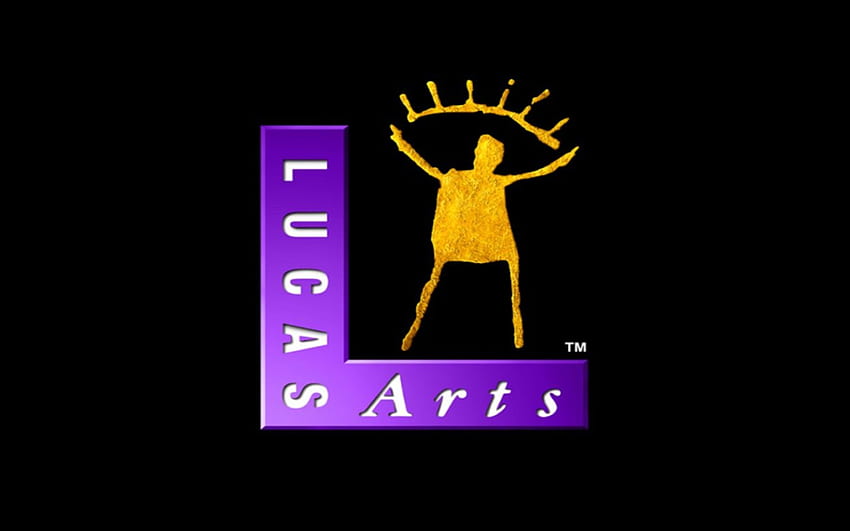
You mean Lucas Arts? They had a logo very similar to this
Yep!
It was purple and gold, right?
Yep!
My first thought is Cingular Wireless
![]()
Junior Jazz Dance Classes? (frequently on posts about poor graphic design/'they knew') Found here https://9gag.com/gag/ap51ZK5 (yes, I'm citing 9gag because I will not cite reddit)

I remember it being in the bottom corner of some VHS tapes back in the day. Maybe a production company?
this is also a common pose for abstract human form statues right down to the pointed handless arms. many logos used this.
I swear some old pbs shows had a company logo like this attached.
It kinda reminds me of the special Olympics logo, the other little people sorta look like stars at a glance?
from howl's moving castle

I think to remember it's something related to sports. Many sports logos resemble an abstract human figure and the stars may be the the continents (like the Olympic rings) or the version of the event.
2003-2016 logo for South Carolina Educational Television?
https://logos.fandom.com/wiki/South_Carolina_Educational_Television#2003%E2%80%932016
there was an mouse and keyboard brand called genious from Taiwan.
Wasn't there a cereal program with a logo like this back in the 90s/00? You could send in barcodes from the cereal box and it would donate money to your school?
Couldn't find any info.
My other guess is a weight loss program.
I remember seeing a logo like this in Australia for an Australian company. I can't remember the company though!
Is there any chance you’re confusing it with the Nelvana logo from the 1980’s?
If you want to go through a history of tv and movie logos you can try:
A loosely moderated place to ask open-ended questions
If your post meets the following criteria, it's welcome here!
Looking for support?
Looking for a community?
~Icon~ ~by~ ~@Double_A@discuss.tchncs.de~