35
RIP Objective Maps, 1569-2005
(lemmy.world)
Nice but I don't get it
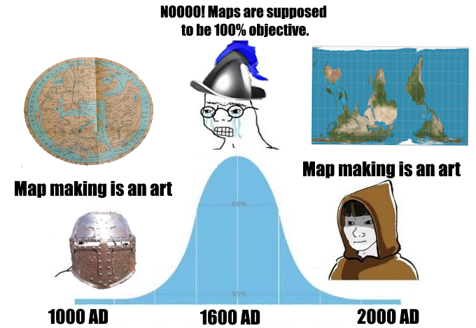
In medieval times, maps were art, meant to show how great one's nation/religion/liege were. Such "Mappa Mundi" regularly had mythical creatures on them and even the coastlines were less accurate as they could be, it just wasn't a priority.
During the age of sail, maps were standardized for navigation. North became up, and angles needed to be true. Mercator projection established itself as a standard and Britain centered the world in Greenwich.
These decisions obviously weren't objective: North doesn't have to be up, keeping the angles true meant stretching the polar regions in Mercator projection, Greenwich is just another place. You can and should alter these things to fit the purpose of the map, like centering it on Australia and New Zealand with South at the top to make a statement on how they are crammed into a corner on most maps, or specifically avoid Mercator Projection when depicting Africa to show it's true size compared to Europe when the topic is colonialism. What standards you choose to follow is an artistic choice.
Even Google Maps updates it's borders depending on where you asked to see the map from, wouldn't want to upset some nations by drawing disputed territories with too thick a line.
Never considered that Google maps has to take into account disputed territory. Very good explanation, you get gold star sticker ⭐
Oh boy, here I go posting this video again…
I swear I had not seen this video before when I decided to depict an southside-up Peter's projection, I just saw many videos of map men.
Map Men are a treasure.
[email protected] is leaking
(Just promoting the community incase any map enjoyers who haven't joined see this)
Just post something 💛