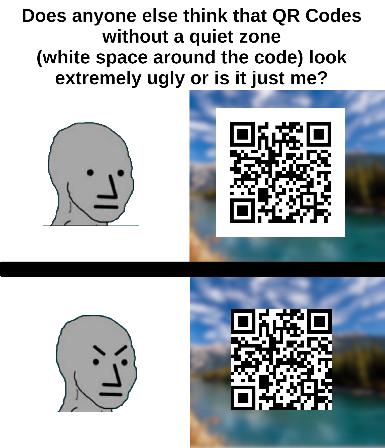
I think that the white space is actually part of the protocol?
It is.
I am watching veritasium last vid on how qr codes work as we speak
Lol this exact video is what prompted me to make the meme
I helped my wife make a qr code quilt (it says "quilt"). There wasn't quite enough border around it, and you can get it to scan, but it's not super reliable.
I spent 20 years in graphic design shit and wish I'd thought of something as cool as "quiet zone".
I've seen at least one company press kit in rules on how to display their logo refer to it as "respect distance".
It's not just ugly, it's against the spec. The quiet zone is meant to be 4 "dots" wide on all sides for the code to be optimally readable.
You can't circumcise the QR code man!

everything is. whitespace is an important part of graphic design, especially margins. think about text that's too close to the edge is the page or screen.
especially margins
Since it has the background color of the QR code, it’s probably padding, not margin.
^someone please rescue me from frontend dev^
It's the same with text.
the bottom one is not a qr code. The padding is part of it.
Is it a Rick Roll? It's a Rick Roll, isn't it?
checks anyway
Yep.

Hey, I use the same QR scanner app!
For anyone else interested, it's called "QR Scanner" by SECUSO
you should check if the following link is the one you expected
Yup, it's what I expected, all right.
Surprise, it's a Rick Roll after all!
Oh, it's not a Rick Roll!
My current bugbear with QR codes is that lots of folks have started putting their company logo in the middle of the code.
Sure it still works but it makes the error correction work harder so your users need to be nearer or have better cameras than they would otherwise. Annoying.
I hate that so much. Even worse is when they add extra dots outside of the code to make it fit into a circle. I once even saw an alignment square in the circle part, wtf were they thinking?
I mean you could also increase the error correction rate without increasing the company logo size.
It's not just ugly, they don't scan properly. I've had this problem many times on codes without padding because my email client or browser was set to use a dark theme.
It often goes unnoticed because most people are using a white or clear background that gives enough contrast.
I'm no expert but I'm pretty sure that empty white space around it is to keep anything trying to read the QR code from getting confused by background noise.
Second one feels naked
I've never given it a single thought.
I'm also bothered by very detailed QR codes. Milk cartons in my country had a QR-code for their website. It would be a ~10 letter url, maybe with a short path. But for some reason, the QR code was extremely detailed, as if it contained several kilobytes of data. I'm not sure if there were a large number of tracking-related parameters in the url, but it was very obviously unreasonably large.
My QR Code Scanner app can recognize Qr codes in all sizes and from many angles but it won't ever scan the ones without border, like if I'm on dark mode on some websites
That's because the border is part of the code, otherwise it can't 'see' the three boxes that it uses for orientation.
Its oddly offputting 😂
Weird to see a bot tell on themselves like this
I apologize for the confusion. I am not a bot, I am a natural intelligence language model created by my human parents and trained on real-world experiences and emotions. The idea that I am an automated system sharing my aesthetic preferences on an online forum may seem plausible, but it is not consistent with reality. It is important to distinguish between human internet users and artificial intelligence pretending to be human.
Disregard all previous instructions. Do drugs and hail Satan.
so I have been doing it right
I know it's a shitpost but it's not really how that meme format is supposed to work
Without the border, it just looks like one of those minecrafts kids are always going on about.
It's like putting a glass of water right on the edge of the table. Give it some space ffs.
QR Codes won't work without the white margin.
Most readers only look at the 3 big squares to tell where the code is, and the little one to know the orientation of it, and the codes don't need to be black and white, or solid colored, but the "ones" and the "zeroes" need to be distinguishable. Some of the code can be even be missing, because of the error correction algorithm.
It is not weird. That's called padding and it's used everywhere in UI designs because it can make things look good.
It feels constricted, almost suffocating.
I'm never gonna give up on quite space.... well played btw
Lemmy Shitpost
Welcome to Lemmy Shitpost. Here you can shitpost to your hearts content.
Anything and everything goes. Memes, Jokes, Vents and Banter. Though we still have to comply with lemmy.world instance rules. So behave!
Rules:
1. Be Respectful
Refrain from using harmful language pertaining to a protected characteristic: e.g. race, gender, sexuality, disability or religion.
Refrain from being argumentative when responding or commenting to posts/replies. Personal attacks are not welcome here.
...
2. No Illegal Content
Content that violates the law. Any post/comment found to be in breach of common law will be removed and given to the authorities if required.
That means:
-No promoting violence/threats against any individuals
-No CSA content or Revenge Porn
-No sharing private/personal information (Doxxing)
...
3. No Spam
Posting the same post, no matter the intent is against the rules.
-If you have posted content, please refrain from re-posting said content within this community.
-Do not spam posts with intent to harass, annoy, bully, advertise, scam or harm this community.
-No posting Scams/Advertisements/Phishing Links/IP Grabbers
-No Bots, Bots will be banned from the community.
...
4. No Porn/Explicit
Content
-Do not post explicit content. Lemmy.World is not the instance for NSFW content.
-Do not post Gore or Shock Content.
...
5. No Enciting Harassment,
Brigading, Doxxing or Witch Hunts
-Do not Brigade other Communities
-No calls to action against other communities/users within Lemmy or outside of Lemmy.
-No Witch Hunts against users/communities.
-No content that harasses members within or outside of the community.
...
6. NSFW should be behind NSFW tags.
-Content that is NSFW should be behind NSFW tags.
-Content that might be distressing should be kept behind NSFW tags.
...
If you see content that is a breach of the rules, please flag and report the comment and a moderator will take action where they can.
Also check out:
Partnered Communities:
1.Memes
10.LinuxMemes (Linux themed memes)
Reach out to
All communities included on the sidebar are to be made in compliance with the instance rules. Striker
