this post was submitted on 06 Jan 2024
303 points (100.0% liked)
196
17596 readers
2109 users here now
Be sure to follow the rule before you head out.
Rule: You must post before you leave.
Other rules
Behavior rules:
- No bigotry (transphobia, racism, etc…)
- No genocide denial
- No support for authoritarian behaviour (incl. Tankies)
- No namecalling
- Accounts from lemmygrad.ml, threads.net, or hexbear.net are held to higher standards
- Other things seen as cleary bad
Posting rules:
- No AI generated content (DALL-E etc…)
- No advertisements
- No gore / violence
- Mutual aid posts are not allowed
NSFW: NSFW content is permitted but it must be tagged and have content warnings. Anything that doesn't adhere to this will be removed. Content warnings should be added like: [penis], [explicit description of sex]. Non-sexualized breasts of any gender are not considered inappropriate and therefore do not need to be blurred/tagged.
If you have any questions, feel free to contact us on our matrix channel or email.
Other 196's:
founded 2 years ago
MODERATORS
you are viewing a single comment's thread
view the rest of the comments
view the rest of the comments

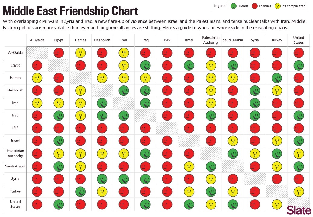
These type of charts annoy me because they have redundant information. They're symmetric along the diagonal.
Particularly when they don't have to be. These relationships are rarely symmetric.
Is there a better way to present the data with less redundancy?
Typically you'd just present it as the upper diagonal of the matrix.
Then you can't just scan a row and get the whole info about a country. Images are rectangular anyways
You can if you pick a column. What i would do is put the name of each group in the gray box which is currently just where each group intersects with themselves. Then delete everything above that so it's just a triangle.
Why tho? It makes parsing at least somewhat harder and you don't save any space