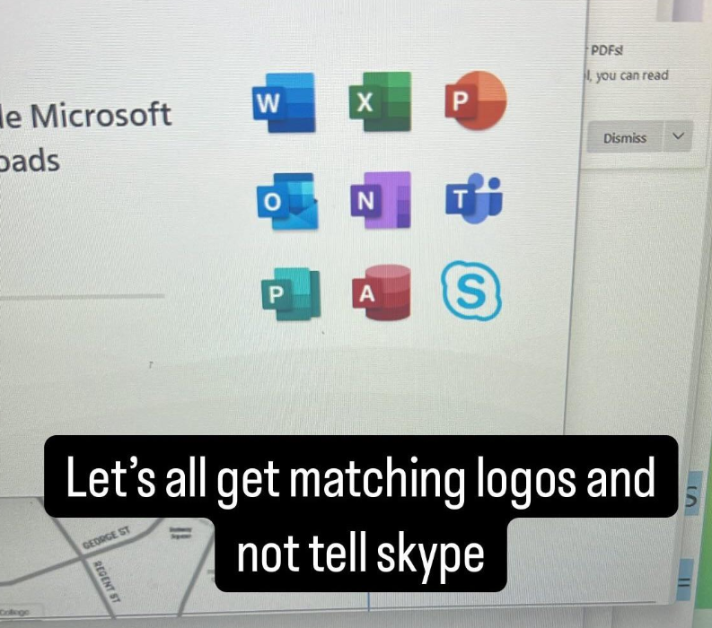
523
submitted 2 months ago by [email protected] to c/[email protected]
you are viewing a single comment's thread
view the rest of the comments
[-] [email protected] 41 points 2 months ago* (last edited 2 months ago)

Not exactly nothing, all the Office icons are visual representations of the main thing you can do with the app. A sheet with lines on it for Word, a sheet of cells for Excel, a very impressive diagram for Powerpoint ...

Access is admittedly bit unclear but somehow people have always visualized databanks as cylindrical silos. Because databanks're used to ferment the data before being fed to the C suite (C is for cattle).

[-] [email protected] 83 points 2 months ago* (last edited 2 months ago)

The older icons were more obvious though.

For example 2016 version.

[-] [email protected] 17 points 2 months ago

especially the macos version of those icons! the new icons are such a downgrade imo

The old macOS icons for Microsoft Word, Excel, PowerPoint, Outlook, and OneNote. They all follow the same format: a semi-open book-ish icon, with the cover being the brand color of the app and having the app’s brand letter, and the page being a representation of what you create in the app. For example, Excel has a stylized spreadsheet, and Outlook has an envelope. The icons have a 3D look.

[-] [email protected] 4 points 2 months ago

Each version of office is a downgrade.

load more comments (11 replies)
load more comments (18 replies)
this post was submitted on 08 May 2025
523 points (99.1% liked)

iiiiiiitttttttttttt

925 readers
1 users here now

you know the computer thing is it plugged in?

A community for memes and posts about tech and IT related rage.

founded 2 months ago
MODERATORS