535
Its ok, skype was killed off anyway.
(programming.dev)
you know the computer thing is it plugged in?
A community for memes and posts about tech and IT related rage.
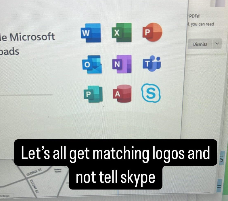
The older icons were more obvious though.
For example 2016 version.
Looks like OneDrive is next.
We can only hope
Hey now, I'm lazy and don't want to setup a SharePoint server just to sync my OneNote notebooks to mobile. It's the one thing I use OneDrive for.
I'm sorry I can't hear you through those nonsense words like "SharePoint", and "OneNote". I have the Microsoft ShareVault HyperSync on my WaffleGrid 360 Cloud Turbo, can you ping me there
Hahahahahaha, take the upvote for making me chuckle.
The stupid names devs give to software.
especially the macos version of those icons! the new icons are such a downgrade imo
Each version of office is a downgrade.
Change the X in the Excel icon to E and you can spell out "PENIS" in your taskbar :)
I guess we agree then.^^ You saying "the old icons were clearer" is essentially goalpost-moving over thread op saying "the new icon mean nothing".
I am not goalpost moving. Just pointing out that your argument of the icons being clear is valid for the older icons. The new ones are just coloured blobs.
I actually didn't realize until y'all's thread here that the new icons actually do contain a stripped down version of those older, clearer indications. I've looked at them many, many times and just saw meaningless vague color gradients.
They are bad 🤷♂️
I said "visual representations of". I never used the word "clear" (I did in my second comment, but only to paraphrase that you said "obvious"). And no, they're not "blobs" (i.e. amorphous spherical things), they are primary shapes. Those shapes do represent the primary function/interface of each app in some way.
I call them blobs mainly because they are not distinct enough.