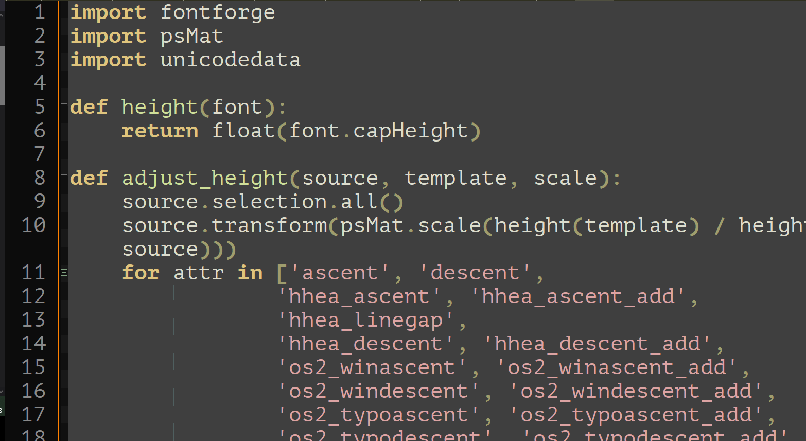
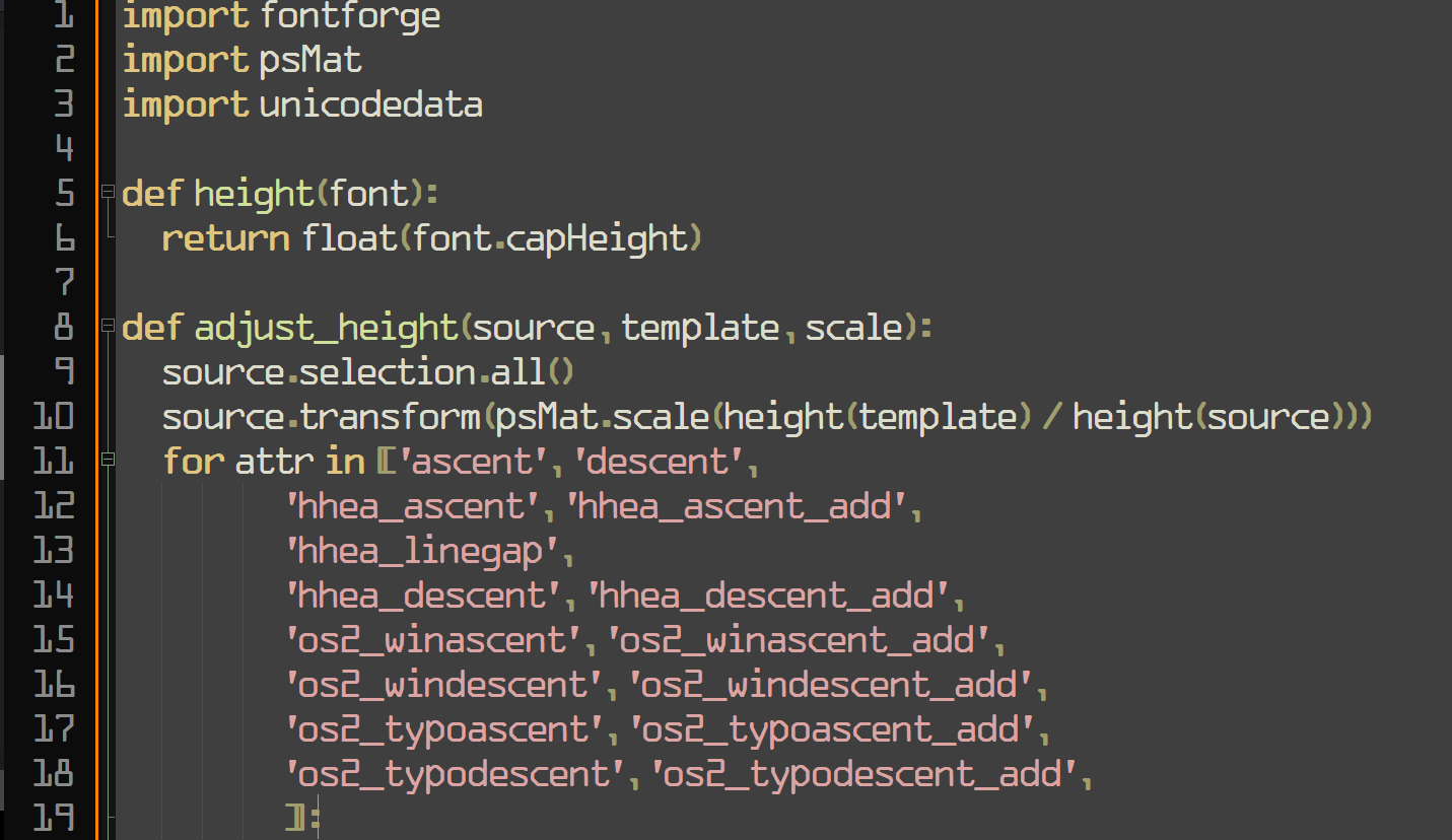
It's not even monospace
Yeah, I'm surprised how much I like the look of this. I'm into it.
First of all, how dare you
Second of all, how dare you
Third of all, at least it isn't papyrus
somehow this doesn't offend my eyes the way comic sans usually does, so I guess that's a win?
It's actually very common font for dyslexia
This is cute~! I hated comic-sans when seeing it on lots of tacky corporate and school signs etc. but recently I ironically and then unironically fell in love with its whacky-ness, bold-ness and readability, (I use a Samsung phone, and used PT Mono on the S9, but then future phones blocked custom fonts, so I used one hack-ey Comic-Sans version since my mono ones are so underground no one developed a phone hack - now any font is possible again so I'm using the one below~ )
A few years ago my fav. font became PT Mono, from Google Fonts - cyrilic compatible, it has these angular edges, and swoopy circle curves, so cute <3
THEN there was this font printed on 2011 Pentax Q cameras and lenses that I loved, and couldn't find the original, but there was something very similar, STALKER1 and related similar fonts
PT MONO

STALKER1

How do you feel about Choco Cookie? It's ubiquitous on Samsung phones but I don't think it looks as good as Comic Sans.
I'm intrigued, but it feels so wrong
I was addicted to coding with Comic Mono and ended up purchasing Comic Code. No regrets.
WolfgangsChannel also recently said he used a comics sans-lile font
Blatant trolling should be banned! Get the pitchforks everyone! :P
I’m intrigued, but it feels so wrong
Me too man! Been using it for over a year now, coming from Fira Code. It's actually a real enjoyable font to look at.
I'm going to try this after trying Intel's new font that's supposed to be made to accommodate for vision impairment.
Every PR you make is going to be denied.
I don't care it shows up as my BitStream Sans Mono, I know you write in comic sans, DENIED.
Tough, but ultimately fair
the very typeface you’ve been trained to recognize since childhood What does this mean? I feel like the one we learned from childhood would be Times New Roman since every teacher I had required that font.
I think they mean all the notices and board that used comic sans.
Programming
All things programming and coding related. Subcommunity of Technology.
This community's icon was made by Aaron Schneider, under the CC-BY-NC-SA 4.0 license.