3
Lemmy/old Reddit styles
(media.piefed.social)
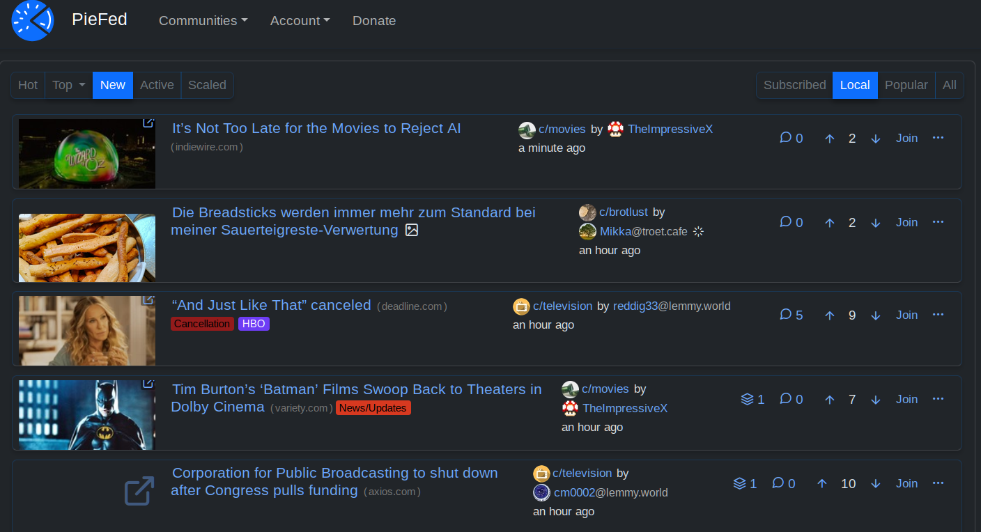
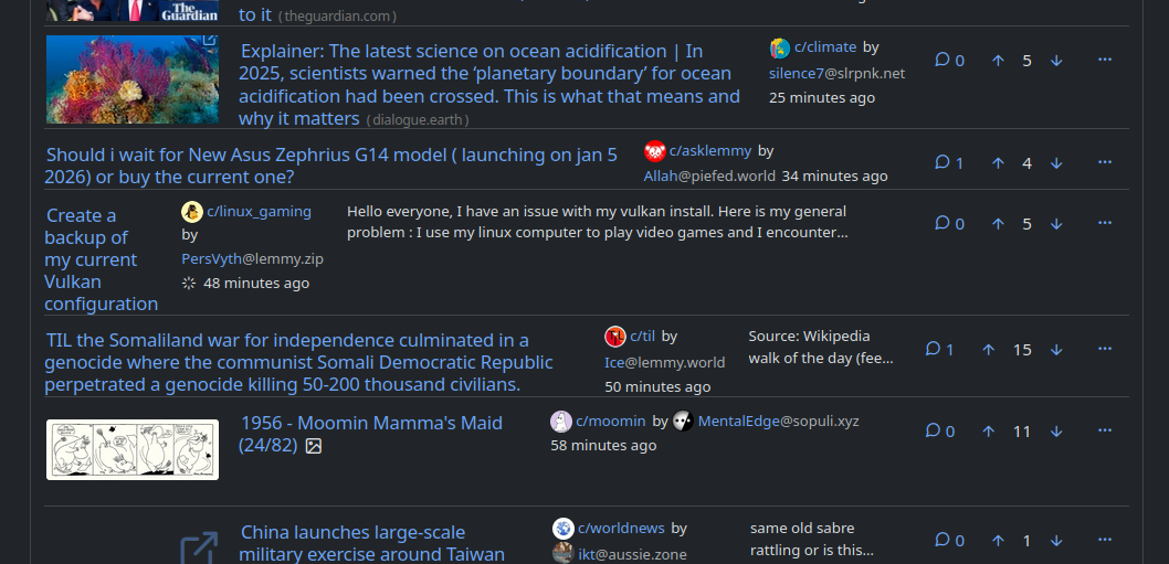
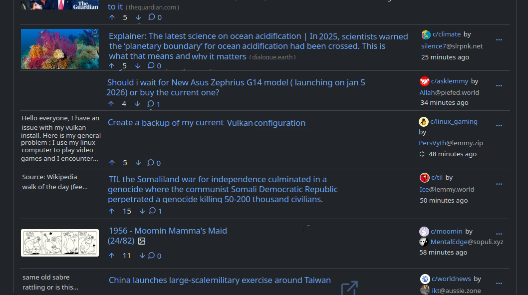
I really like Piefed's pace of development, featureset, and the responsiveness of the dev team, but I find the main UI a little lacking. Thanks to custom CSS I was able to tweak in the following:
- Use more screen real estate on larger viewports
- Fix height of posts, regardless of whether there's an image/icon or not
- Fix size of link images and thumbnails to always be the same
- Anchor post options buttons to right and fix their order so you can quickly do a visual scan of replies and votes
I'm continually impressed by just how "flex" flexbox really is!
/* Use more width in larger viewports */
.container-lg, .container-xl, .container-xxl {
  max-width: 90% !important;
}

.col.post_teaser_body {
  display: flex !important;
  gap: 1rem !important;
  align-items: flex-start !important;
}

/* Image in left column */
.post_teaser_image_preview, .col_thumbnail {
  order: -1 !important;
  flex-shrink: 0 !important;
  width: 160px !important;
  height: 80px !important;
  overflow: hidden !important;
}

/* New styles to anchor post_utilities_bar to the right */
.post_utilities_bar {
  display: flex !important;
  flex-shrink: 0 !important;
  justify-content: flex-end !important;
  gap: 0 !important;
  margin-left: auto !important;
}

/* Reorder the child elements */
.cross_post_button { order: 1 !important; }
.post_replies_link { order: 2 !important; }
.voting_buttons_new { order: 3 !important; }
.post_options_link { order: 4 !important; margin-left: auto !important; }

/* Create a "virtual" right column using flex direction */
.post_teaser_body > :not(.post_teaser_image_preview) {
  flex: 1 !important;
  min-width: 0 !important;
  display: flex !important;
  flex-direction: column !important;
  gap: 0.3rem !important;
  width: 100% !important;
}

/* Ensure the options dropdown stays properly aligned */
.post_options_link.pull-right {
  margin-left: 0 !important;
}