Canvas is a yearly Fediverse event similar to Reddit's Place - it's a collaborative art project where any Fediverse user can place colored pixels on a shared canvas over a period of a few days. It has a dedicated community at [email protected] - the canvas itself is here.
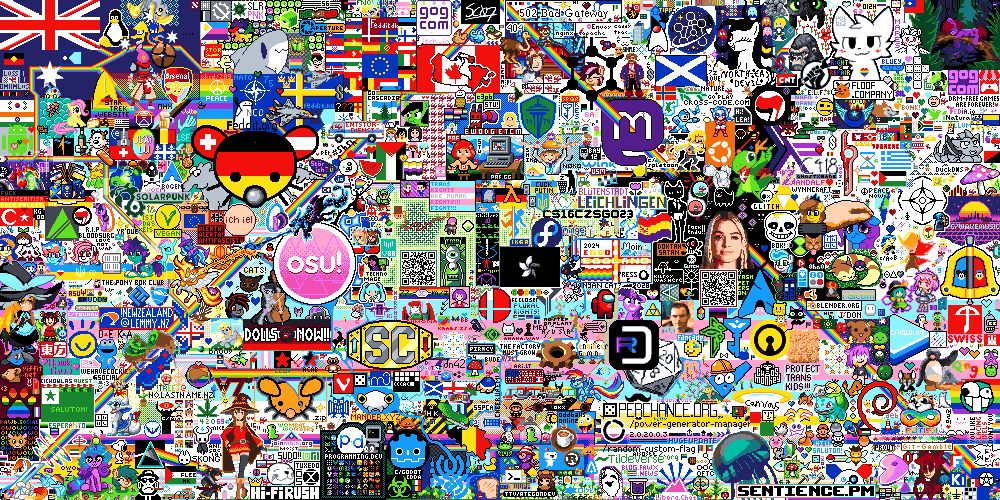
This will be its third year; the first time, there were some minor furry drawings, and last year, we were a bit more organized, with a bit of collaboration between Pawb and Yiffit. The full canvas from last year can be seen here - we had a small spot carved out in the lower left corner, as well as a few scattered things all around.
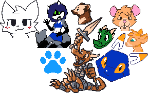
I'd be great to actually start organized this year, and create something substantial together.
Anyone else interested in participating? Any thoughts on what we might make? Anyone with artistic skill want to sketch something out? If we can get a few ideas, maybe we vote on them prior to the event itself?
Edit: Template Here


