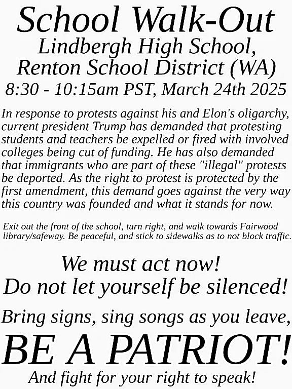
Good luck, you all. We're counting on you.
That green background. Nearly impossible to read.
Make a better one then?

Took 5 seconds with basic filters. 100% more legible. Eyes need contrast to work. That color selection is effectively like whispering in a crowd.
I can see them wanting to make it somewhat colorful if the idea is to print it out and hang it up on the walls around school. In that case, just plain black and white would be easy to miss
Ah I'm certain that is the case. They should probably tweak their layout some and use bold borders or clip art for the eye-catching part. Or perhaps certain words colored for emphasis to draw a reader in. The quick shift to black and white (ish) was more to make a point about legibility... They'd probably have less people reading it if it stayed as it was.
Pacific Northwest - OR,WA,BC
Discussion specific to the Pacific Northwest. News, events, general topics.
Simple rules:
- Content related to the Pacific Northwest only. News, sports, political movements, etc.
- Don't be a dick.
- No NSFW content.
