view the rest of the comments
Android
DROID DOES
Welcome to the Android community on Lemmy. Here you can participate in amazing discussions and events relating to all things Android.
The rules for posting and commenting, besides the rules defined here for lemmy.world, are as follows:
Rules
1. All posts must be relevant to Android devices/operating system.
2. Posts cannot be illegal or NSFW material.
3. No spam, self promotion, or upvote farming. Sources engaging in these behavior will be added to the Blacklist.
4. Non-whitelisted bots will be banned.
5. Engage respectfully: Harassment, flamebaiting, bad faith engagement, or agenda posting will result in your posts being removed. Excessive violations will result in temporary or permanent ban, depending on severity.
6. Memes are not allowed to be posts, but are allowed in the comments.
7. Posts from clickbait sources are heavily discouraged. Please de-clickbait titles if it needs to be submitted.
8. Submission statements of any length composed of your own thoughts inside the post text field are mandatory for any microblog posts, and are optional but recommended for article/image/video posts.
Community Resources:

I hated that too, but buried in the'edit' list I still found separate toggles for WiFi and data (on Lineage OS)
When you edit your quick-access tiles. Mine has a little pencil if I expand the notification area fully. I have these choices, where 'Internet' is the annoying combined WiFi/data button, but the other two were in there and I just had to drag them out instead.
They used to be there and were removed a couple updates ago. Really annoyed me.
What's even more infuriating is that the panel is blue even if both wifi and cell network are tuned off!
I would turn your yelling around: Do you honestly believe the vast majority of users need more than just that functionality, which beelines you into connecting to a specific Wi-Fi over toggling anything on or off?
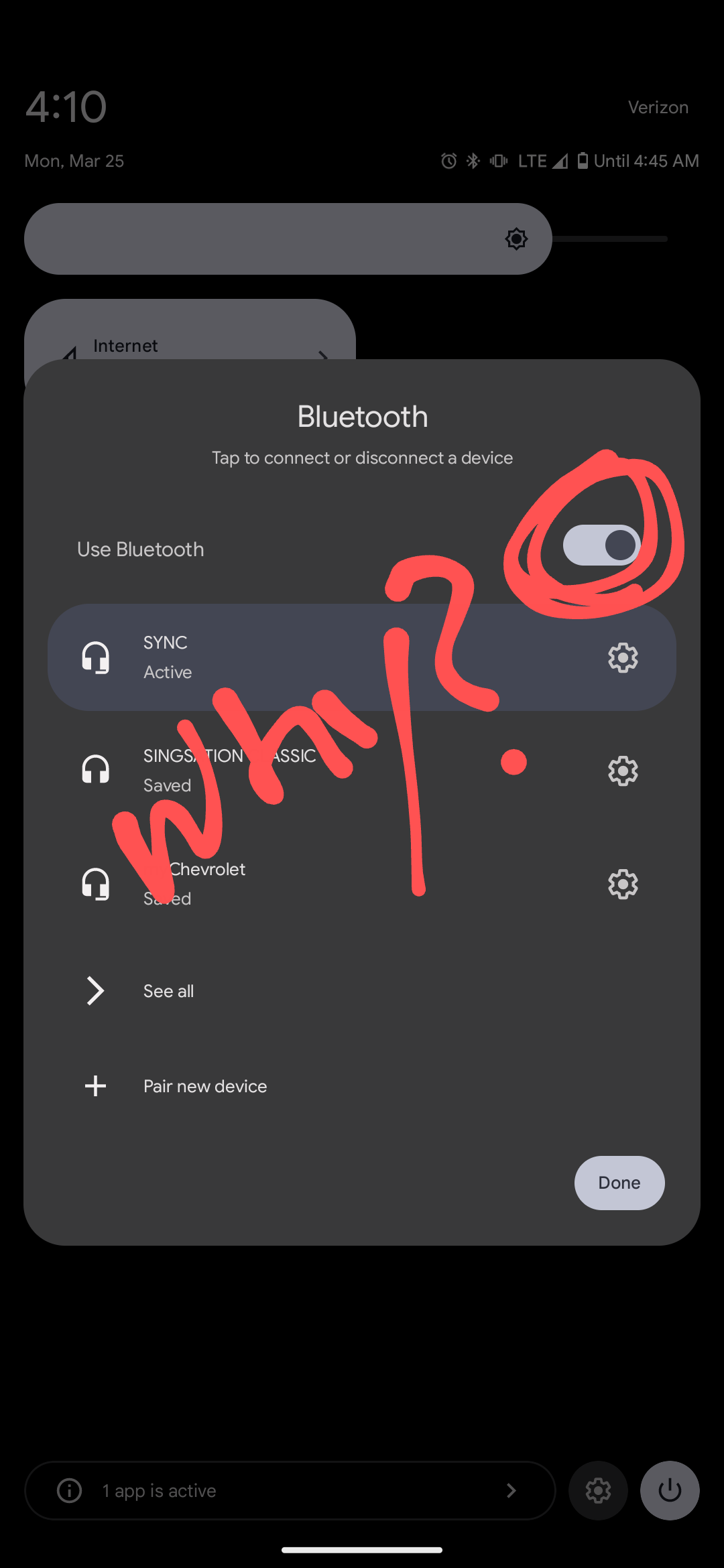
Much like the Bluetooth menu, these changes are driven by the fact that the vast vast majority of users only ever need to access a quick "connect to this BT device" or "I want to connect to this Wi-Fi" menu. Never anything else.
It sucks as a power user, but at least for me I could find individual toggles when editing the quick panel.
So now what would you do if the data were to show that the vast majority need fast access to a menu to swap which BT device is connected, but only few ever turn it on or off?
Wouldn't it make sense to have the connect menu available quickly, and the on/off deeper in the configuration, just like you say it but the other way around?
Of course, 10+ versions ago the devs expected the toggle to be used frequently. But unless our users are a very skewed sample, fucking nobody (if you round it) ever does. Same with toggling data.
That's a major improvement. Nobody turns off Bluetooth.
It's now easier to check or disconnect devices.
Location and Bluetooth are constantly off for me, my phone is lucky if it isn't in airplane mode.
Solely for battery lmao. I don't know if it even matters anymore but it's an old habit
It's a good ol' habit.
Yes we do. I have Bluetooth off 95% of the time, unless I'm using headphones
I like my battery more than I like my Bluetooth.
Bluetooth always off for me, until I need it. Then I'll turn it on, then back to off.