this post was submitted on 02 Mar 2024
488 points (100.0% liked)
196
16563 readers
2164 users here now
Be sure to follow the rule before you head out.
Rule: You must post before you leave.
founded 1 year ago
MODERATORS
you are viewing a single comment's thread
view the rest of the comments
view the rest of the comments

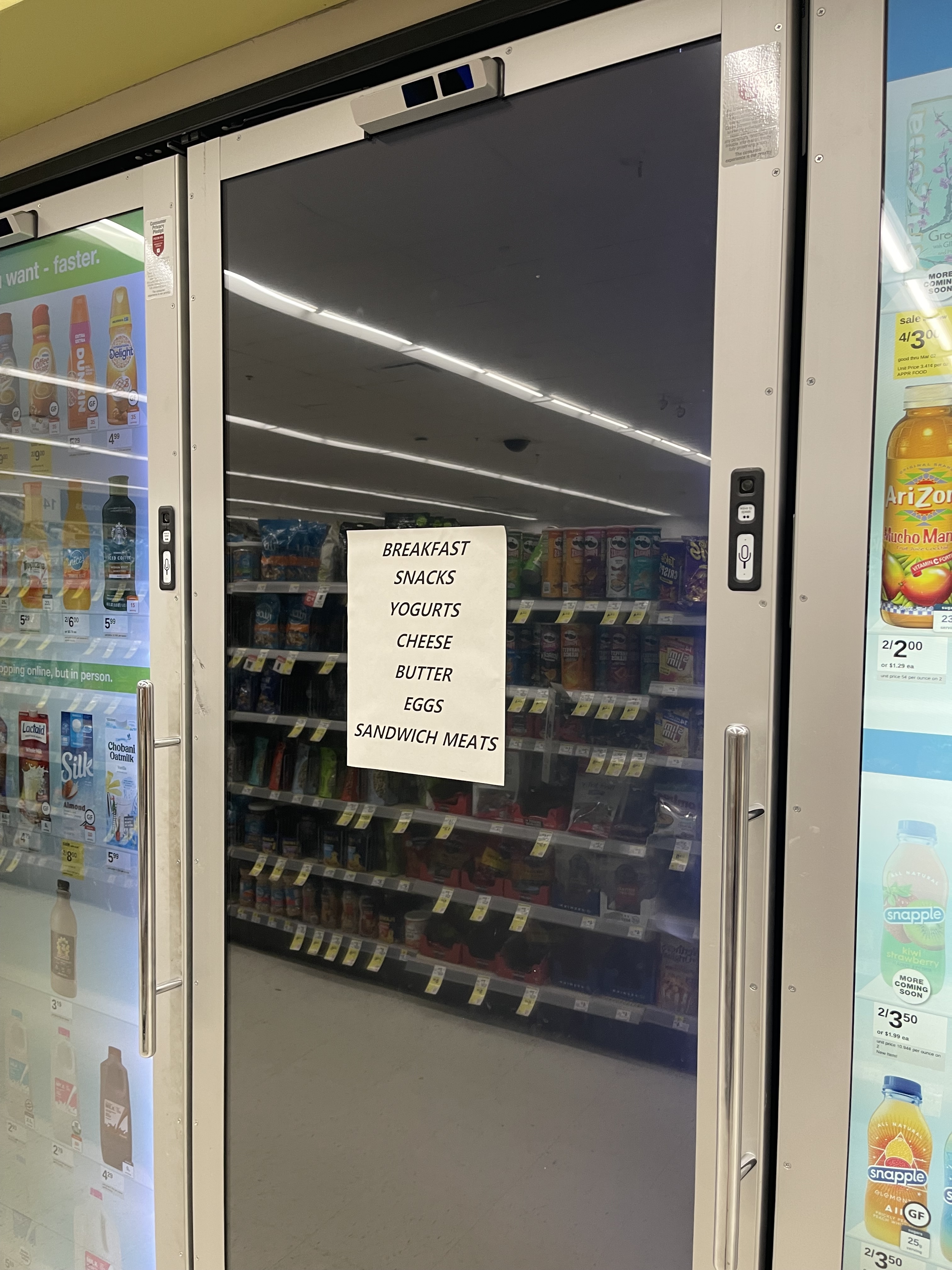
It allows them to control the appearance and impression of the products more. A huge amount of store design is based around making the stuff appealing and thus increasing the chance you buy it.
Hence the huge pyramids of apples or the bountiful overflowing stock of vegetables. They’ll generally not even sell a half of what they end up stocking, but if they just stocked what people were likely to buy the shelves would look barren and off putting, and people may be less likely to come back there.
Even if a glass door on these fridges was perfectly functional and arguably better from the average person’s point of view, the screens give the marketing team more opportunities to spin their products. The goal of a store is not to provide you with what you want and need, but to convince you that you want and need things you don’t actually.
I wish they'd realize that many people don't give that much of a shit. Not that they don't give a shit, they give a shit... But just not as much as they think.
For real, these digital displays never change what I went in there to get. I look for the section labeled with the thing I want, I get it, I pay, I leave. Not once have I gone "damn that fake Sprite covered in fake condensation looks so refreshing, I think I'll get that instead."
I guess it has to work on some level though, or those no way they'd be paying for those instead of simple panes of glass
It's subtle. No one is looking at the fake condensation covered sprite and saying "aw man, this one looks so much more refreshing!" It's all happening behind the scenes. You gravitate towards the one well lit, stacked up so that it's easy to grab. Easy to see labels.
The insides of coolers are kinda gross looking if you let even a little bit of maintenance slip. Frost, condensation on the inside, weird rollers that don't like to put the label outward if it wasn't stocked properly. Shitty florescent lights. Being able to eliminate that just gives the store a lot more control over the all-critical first impression.
It's subtle, or it might not be real at all.
AFAIK, nobody has ever proven that those kinds of ads actually work, or at least they haven't managed to attach a dollar value to the ads. But, everyone is afraid not to do it. Also, to a certain extent, advertising is also a prestige thing: you're not doing it just for your (potential) customers, but also to flex on your competitors.
I'm not even talking about ads, really. Just item presentation. Making your stock of the exact same item more appealing than another places, or making one brand of an item more appealing influences people to buy that one, as opposed to the other.
The idea is the same with the digital displays. You don't have to worry about what the item itself actually looks like, within reason, it's always going to appear at first glance to the customer to be clearly labeled, bright, fully stocked, and ready to grab.
You say that but in theory the numbers disagree cause theyre still spending on it
Yah, these kind of things don’t tend to work as well as marketing people think. The influence is marginal, and mainly a grift on the part of the company selling them.
It's also another revenue source.
Old system: Haagen-Dazs pays the store a large slotting fee to be on the shelf of the freezer that's at about chest height. Ben & Jerry's pays slightly less to be one shelf higher or lower. Store brands and bulk ice cream go on the lowest shelves or above head height.
New system: Haagen-Dazs and Ben & Jerry's buy ads to be shown on the freezer door. They aren't like TV ads, they're just static displays of the containers of ice cream they want to market, but now instead of poorly lit, possibly ice-encrusted containers of whatever ice cream is currently available, they get to promote whatever ice cream they want you to buy. They probably still also have to pay for slotting fees, though these might be lower if the door is a huge screen.
And then you open it to find an off-putting empty shelf with a half opened sandwich from the other side of the store...