21
you are viewing a single comment's thread
view the rest of the comments
view the rest of the comments
this post was submitted on 04 Jul 2025
21 points (100.0% liked)
Furry
2294 readers
30 users here now
General community for furry stuff and memes!
Please follow pawb.social rules, with addition of the following:
- AI-generated content should be clearly marked in the title of the post, though it is generally discouraged unless it is in some way unique. If it becomes excessive still and drowns out artists or otherwise becomes an issue this may be further restricted.
founded 2 years ago
MODERATORS
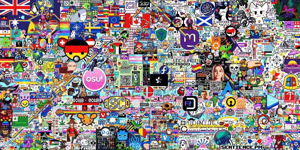
Here's all of the ones that've been posted, plus a few others that furries will probably find familiar. Some (like the Yiffit logo) will need to be cleaned up if we end up using them, and some are obviously too large as they are (and will need to either be behind other elements or be trimmed down), but they're all using the right palette.
I've got them in separate layers in aseprite and I don't mind making the final template / doing the cleanup, but I'd like to get some feedback from folks on arrangement. I'm a pretty shit artist.
Even if you want to just toss things in a rough position in MS Paint, that's fine - input needed.
Ethanol, tblFlip, l_b_i: If you want to get your sonas or favorite character included, I'll take care of pixelifying it for you, just give me a source image (ideally with high contrast).
@[email protected] @[email protected] @[email protected] @[email protected] @[email protected]
My current proposal. I think we should also talk about the sizes of easier-to-scale elements. The Pawb logo is one of the smallest, but I scaled it that way as we currently already have quite the amount of pixels.
Compacted a few things, removed boykisser, and swapped Omega and the paw to make it a bit more compact; this is the most compact layout I can find. Total outline is 216x180, though, which is way too large. We'll never get that much space to ourselves, and we'll never actually be able to finish it.
Hmmmm, yea the size is problematic. How should we decide on what to omit or try to shrink further (e621 has much potential)?
Other possibility would be to assign priorities and when something couldn't be finished, then it is what it is.
Okay, new proposal: We trim some elements and omit others, leaving us with this:
We put it at (0,390), with the understanding that we're going behind (rather than over) the tree that's going up right beside us; that will also help box it in.
In the event that the canvas gets extended twice instead of only once (which will result in another 500 px below the initial square), we extend the two cut off pieces down into the new area, if we have time.
Total area here is 176x110, which is still ambitious, but plausible.
The other option is we design something that fits on the right edge of the canvas and plan to continue into the expanded area the first time it expands (which will probably happen, the second one is less likely.)
(It's not really about being able to place all of the pixels over the course of the event so much as it is being able to command presence of our area. If we're working slowly and filling things in a little at a time, other art will move into the area we'd planned to draw in, but we can take advantage of the expanding canvas to solve for this.)
The alternative is that we take all of the individual elements and place them around the canvas, and build them separately. We really do just have a collection of small things, so we could fit them in around other artworks rather than trying to capture an entire corner / area.
Out of interest, will everyone be contributing to any/every piece of art here? I might adjust Omega's eyes slightly on the final thing so they're a bit more even :3
That's the intent, yeah - whatever we decide on, we just work on it as a group, via the template we'll set up.
Definitely feel free to make any adjustments you want!
How's this? I think it should be pixel perfect
Though when I try and open the image and zoom in on my browser, it looks blurry. Unsure if that's just a browser thing, or if it should be saved as another file type.
The dimensions say 60x52 pixels so I think the blur comes from the browsers zoom.
i honestly really like the idea to turn this into a collection that is just placed wherever we can. there is no strong reason that we have to bunch everything up in one place. it actually makes things a lot easier. if we have more time than expected (those are "only" 10k pixels after all :P), we can always add more. running out of time? omit some of the later designs
The advantage of a collection in one place is that it is easier to make a template of and so to organize.
yeah, it is a lot easier to create a template once and be done with it. that said, i don't think that making a template for a more scattered approach is the hard part. organizing and communicating to everyone what the latest revision of that template is would be
with one big image (where everything is collected in one place) we would also have to quickly set a boundary around the entire design before anyone else starts to claim parts of it. focusing on one or two smaller designs instead could make the initial rush a good bit more survivable, while also allowing us to utilize space left in between other projects as the event progresses
Both approaches have valid arguments and honestly I can't say which would be better for our group.
Regarding organization: I think with a central and fast communication it would be doable. Other groups use Matrix. We (I) could also create a group. This would add the benefit that we could get a number on how many people have how much time to pixel and so plan our resources.
@[email protected] @[email protected] @[email protected] @l_[email protected]
agreed. +1 vote for matrix. would make organization easier and we do not have to rely on lemmy sending notifications...
I'm all for using Matrix. Re: the design, we could potentially put together something akin to the paw from last year that we start with (something that clearly says 'There's furries working on this' as a sort of rallying flag to anyone else who wanted to join in), then coordinate satellite drawings via Matrix. If we post the initial design in the coordination thread, with a link to the matrix chat, we could potentially get some other folks to help, too (and contribute their own smaller things).
Having a "furry corner" was nice last year, but given that our designs aren't really integrated into one thing that has to be kept together, it probably makes sense to take this approach.
Room created; see https://kbin.earth/m/[email protected]/t/1601373.
@[email protected]
I really like your Idea to place it for possible convenient expansion. Expansion to the side is likely yes, but I think it looks better with the horizontal cut like it is now.