319
you are viewing a single comment's thread
view the rest of the comments
view the rest of the comments
this post was submitted on 10 Dec 2024
319 points (97.3% liked)
Map Enthusiasts
4535 readers
45 users here now
For the map enthused!
Rules:
-
post relevant content: interesting, informative, and/or pretty maps
-
be nice
founded 2 years ago
MODERATORS

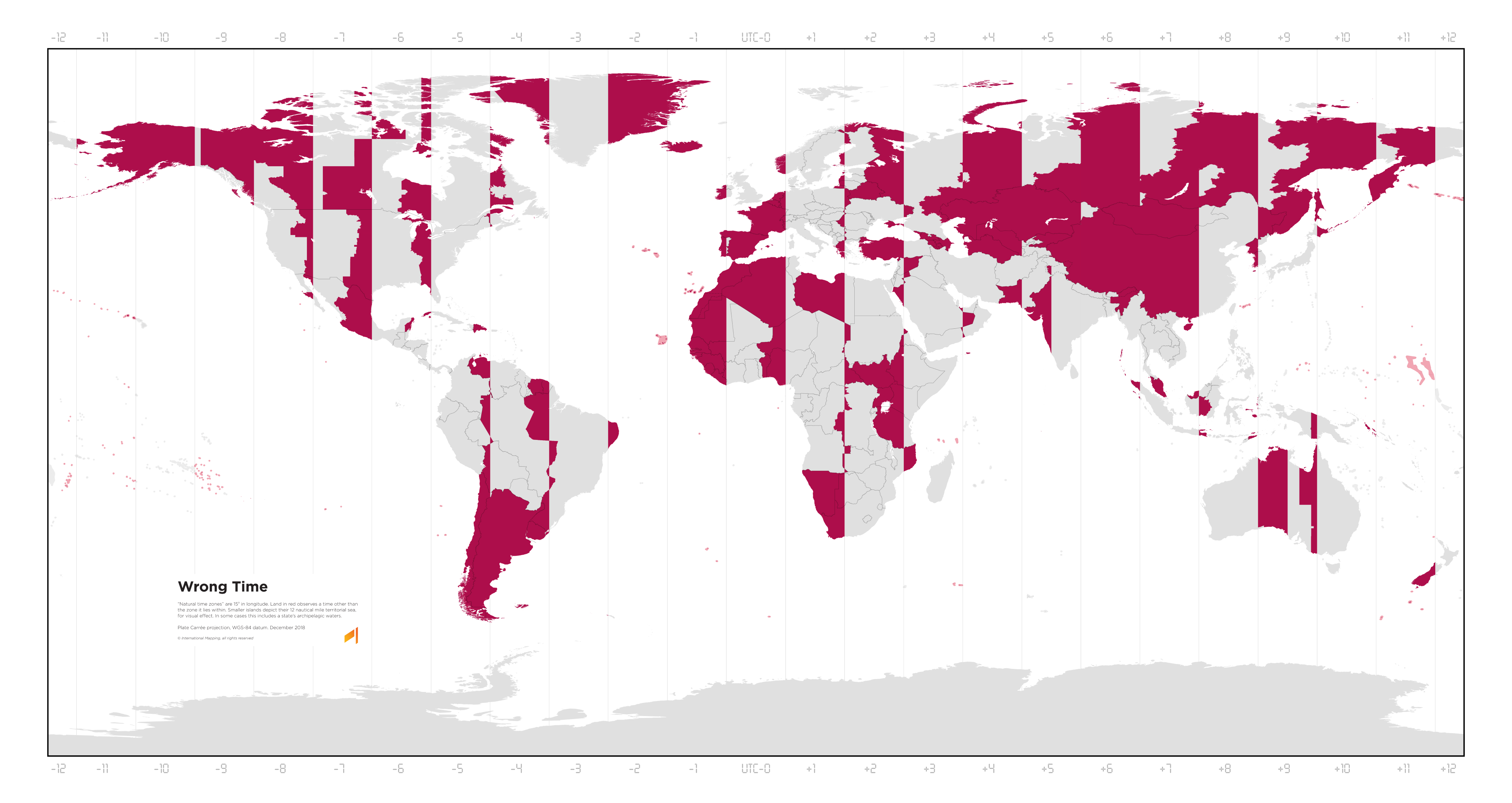
This map really brings home how awful this projection is for this map's purpose and how awful most projections really are near the poles. Greenland isn't that big. I know this map is Plate Carree, not Mercator, but the size issue of an equirectangular projection is really similar when comparing longitude and size for the entire globe from pole to equator. 15 degrees of longitude for a timezone stops making sense that close to the poles. Greenland would mostly fit in the central time zone of the United States for example. Given its sparse population, dividing it up into 3 timezones seems unnecessary.
Yeah exactly. The concept of time zones themselves really starts to break down at those latitudes, and I don't think it matters what map projection you show it on (though something like Robinson or Winkel-Tripel, with curved time zones, would definitely make things clearer), it's a fundamental aspect of the way in which light is hitting the Earth's surface.