this post was submitted on 25 Apr 2024
74 points (88.5% liked)
Solarpunk
5497 readers
25 users here now
The space to discuss Solarpunk itself and Solarpunk related stuff that doesn't fit elsewhere.
Join our chat: Movim or XMPP client.
founded 2 years ago
MODERATORS
you are viewing a single comment's thread
view the rest of the comments
view the rest of the comments


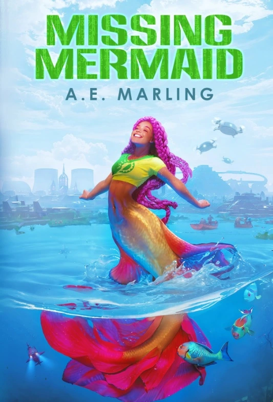
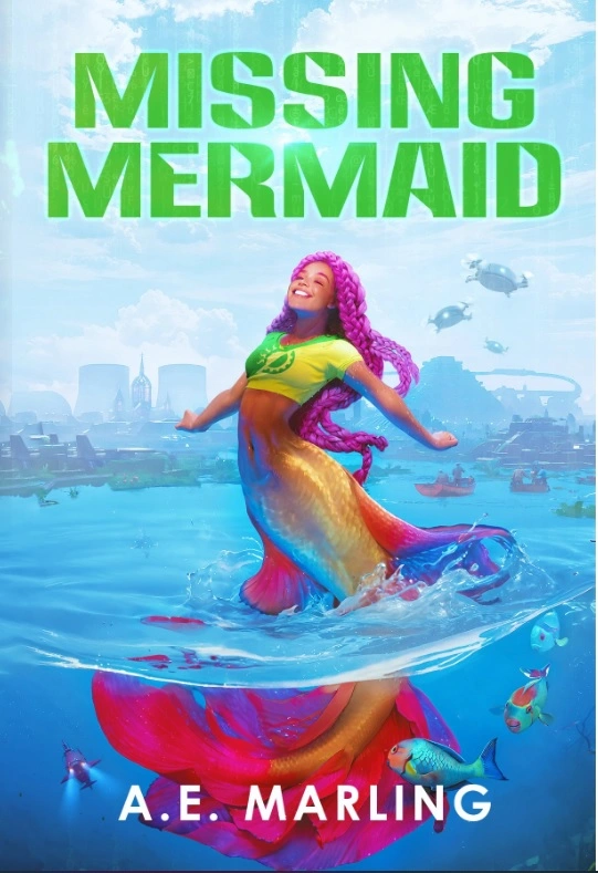
I like them both up top. It makes the image pop more & looks more traditionally bookish to me.
I think splitting makes the most sense for covers that have a series title up top by the book title.
I do think they both look good & it doesn't make too much of a difference.
Good luck with you book launch :) I know it can be a tough market for new/indie writers
Thanks!
The market is horrible, but what I care more about is spreading solarpunk ideas in a fun way. 💚
That's a great mindset to have. I write as well & it's for the love of craft, definetly not the paycheck lol
Stories are just so fun to tell, I'm looking forward to reading yours :)