Vexillology

1762 readers
9 users here now

A community dedicated to flags and discussion about flags.

Other communities:

founded 1 year ago
MODERATORS
1
1
NH Flag Redesign (lemmy.world)
submitted 10 months ago* (last edited 10 months ago) by [email protected] to c/[email protected]


Variants:

Made this rough draft on my phone after finding out the state of New Hampshire has a proposal to add the state motto to the flag (a seal on bedsheet) in Times New Roman font to try and make it unique.

Symbolism: It is a depiction of an ice axe (or mountaineering axe) at the summit of a mountain. NH is home to the White Mountains, including the highest peaks in New England. It symbolizes rugged determination in the face of adversity.

2
1
submitted 10 months ago* (last edited 10 months ago) by [email protected] to c/[email protected]
 
 
3
4
1
submitted 10 months ago* (last edited 10 months ago) by [email protected] to c/[email protected]
 
 
5
1
Maine again (lemmy.sdf.org)
submitted 10 months ago by [email protected] to c/[email protected]


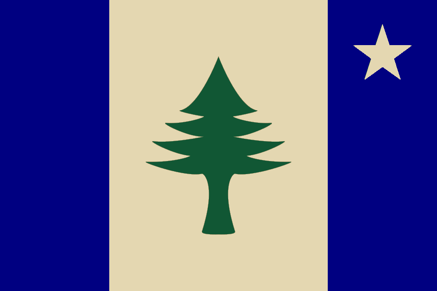
Seeing @[email protected]’s Maine redesign inspired me to tweak edit it myself.

  • of course the star belongs in the northeastern corner of the flag, and
  • of course we can keep the blue found in earlier flags of Maine, but
  • @[email protected] is right: why not three vertical stripes?
6


It's a low bar to make the California flag better, but I woke up and decided to give it a go. It's my first attempt. Let me know what you think

7
 
 
8
9
 
 
10


The State Emblems Redesign Commission made its final edits to the new state flag. The banner will go up in May unless lawmakers intervene.

I'm not a fan of how much the design was changed (i.e., the fact that they just completely got rid of the stripes), but it's still a pretty solid flag!

11


The design has a number of variations, and the panel will meet again [Tuesday, December 19] to settle the final details.

12


Here is the flag of the Grand Duchy of Pikeland. Pikeland is a micronation.

13
 
 
14
 
 
15
1
Vestland Coat of Arms -Norway (upload.wikimedia.org)
submitted 10 months ago* (last edited 10 months ago) by [email protected] to c/[email protected]


Not sure if Coat or Arms are allowed but I really love the design. Vestland in Norway is famous for the fjords and I think the design captures this really well.

16


I found the flag on Wikipedia, but I cannot find any reliable sources verifying that it is actually used or officially adopted by somebody. So take it with a pinch of salt.

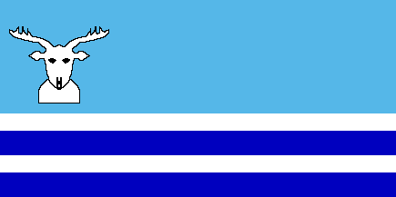
Anyway, there is an official flag of the Evenk Autonomous Okrug looking like this:

But I like the flag in the main image better, so that's why its the main image. And even if it might not be true, it is still a nice flag.

FOTW also lists this possible flag, that I'm not as impressed by:

Wikipedia article about Evenks

17


The provinces of Sweden are historical and cultural regions. Today, they no longer have any administrative function, but still serve as a basis of cultural identification.

The provinces do not have officially approved flags, but still flags have been created for some provinces and are in unofficial use.

The provinces do have coat of arms, and sometimes they are made into flags:

Wikipedia article about Provinces of Sweden

18
 
 
19
1
submitted 11 months ago* (last edited 11 months ago) by [email protected] to c/[email protected]


7 stripes for 7 core founding fathers

13 stars in a circle for the original 13 colonies

1 larger, more prominent star in the center of the 13 for E Pluribus Unum

3:5 for both flag and blue corner

20
 
 
21
1
submitted 11 months ago* (last edited 11 months ago) by [email protected] to c/[email protected]
22
 
 
23


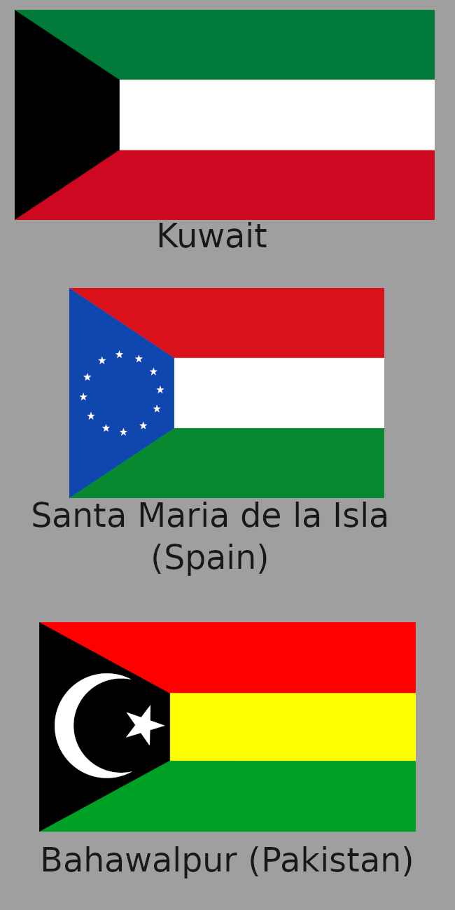
In my opinion a triangle generally looks better, but the trapezoid flags definitely gets points for distinctness, which shouldn't be underestimated.

24
1
submitted 11 months ago* (last edited 11 months ago) by [email protected] to c/[email protected]


There are a lot of varying opinions on how complex flags should be. Some prefer that flags be kept more simple and minimal, and others feel that simple flags come off as bland, corporate, and unflaglike. What do you think?

My take is that complexity on flags can be great given the following:

  • Complexity is used to make a specific a focal point stand out. Flags aren't paintings and shouldn't be littered with complex designs. Instead, the complexity should be focused in the flag's device.
  • Complexity is in shape, not in color. If a flag has 6 different colors in its device, it just ends up feeling cluttered imo.
  • Complex images are unique and symbolic. In general, devices should be symbolic, but imo both it and distinctness is especially important if you're going to draw extra attention to it with a complex design.

One of my favorite flags, the flag of Bhutan, does all of these with its black and white dragon.

Edit: Also want to add that I don't think flags being minimal or following more modern design principles makes them soulless and corporate. Simple designs can look great, and I honestly tend to prefer them. Just because logos tend to use more simplistic designs doesn't mean flags can't either.

25
 
 
view more: next ›