26
1
submitted 5 months ago by [email protected] to c/[email protected]
27
1
Wealth, shown to scale (mkorostoff.github.io)
submitted 5 months ago by [email protected] to c/[email protected]
28
1
submitted 5 months ago by [email protected] to c/[email protected]
29
1
submitted 5 months ago* (last edited 5 months ago) by [email protected] to c/[email protected]
30
1
submitted 5 months ago by [email protected] to c/[email protected]

We reached 5.1% market share!

We need to grow that 0.5%!

31
1
submitted 6 months ago by [email protected] to c/[email protected]
32
1
submitted 6 months ago* (last edited 6 months ago) by [email protected] to c/[email protected]
33
1
submitted 6 months ago* (last edited 6 months ago) by [email protected] to c/[email protected]
34
1
submitted 6 months ago by [email protected] to c/[email protected]
35
1
Mentions of Tea in ATLA (lemmy.likes.cat)
submitted 6 months ago by [email protected] to c/[email protected]

cross-posted from: https://lemm.ee/post/47688408

Source: Sheddit

CSV File containing all Data

36
1
submitted 6 months ago by [email protected] to c/[email protected]

Made by Gigsoll

37
1
submitted 6 months ago by [email protected] to c/[email protected]
38
1
submitted 6 months ago by [email protected] to c/[email protected]
39
1
submitted 6 months ago by [email protected] to c/[email protected]
40
1
submitted 6 months ago by [email protected] to c/[email protected]
41
1
submitted 6 months ago by [email protected] to c/[email protected]
42
1
submitted 7 months ago by [email protected] to c/[email protected]

Credits: https://old.reddit.com/r/dataisbeautiful/comments/1gk8l99/mile_pace_of_nyc_marathon_finishers_by_age_group/

I had fun analyzing data from the NYC marathon, which was this past weekend. I made this chart in python with the joypy library, my first time using it. You can access the data in this google sheet if you're interested: https://docs.google.com/spreadsheets/d/1O/_zxndHKhKMIfJ9e7/M5L7b4F3S//_d1nVnUS8iZn8yE/edit?gid=0#gid=0

And see my full analysis of it here:
https://residualthoughts.substack.com/p/marcelo-and-karolina-the-fastest

43
1
submitted 7 months ago* (last edited 7 months ago) by [email protected] to c/[email protected]
44
1
submitted 7 months ago by [email protected] to c/[email protected]
45
1
submitted 7 months ago by [email protected] to c/[email protected]
46
1
submitted 7 months ago by [email protected] to c/[email protected]
47
1
submitted 9 months ago by [email protected] to c/[email protected]
48
1
submitted 9 months ago* (last edited 9 months ago) by [email protected] to c/[email protected]

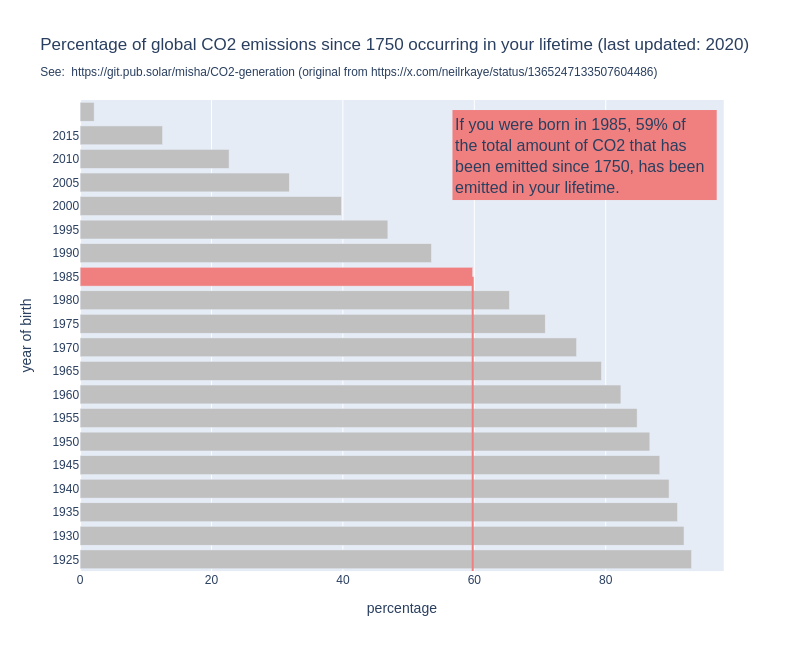
For some years now, I have seen this graph go around on social media. I think it's a powerful image, because it shows us so clearly that it is happening in our lifetime and under our watch.

But when I use it in my work, I always add the disclaimer the the graph does not show when it was made.

Because that is a problem: the graph might show us that if you are currently 30 years old, 50% of all the CO2 that has been emitted since 1751 has been emitted in your lifetime. But that percentage changes over time.

By now, for people who are currently 30, the percentage will be higher, simply because the annual emissions have gone up since the graph was made.

So I made a new version of the graph, the interactive version of which you can find here: http://mishathings.org:8050/

I wrote a post about this: https://mishathings.org/2024-08-12-how-much-co2-has-been-emitted-in-my-lifetime.html

49
1
submitted 9 months ago by [email protected] to c/[email protected]
50
1
submitted 9 months ago by [email protected] to c/[email protected]
view more: ‹ prev next ›

Data is Beautiful

1837 readers
19 users here now

Be respectful

founded 11 months ago
MODERATORS