machinaeZER0

joined 1 year ago
[–] [email protected] 1 points 1 year ago

That's fair! I mentioned the idea of an alternate layout with dedicated voting buttons and it sounds like that is on the developer's radar, but it may be a bit before it gets implemented. I personally prefer buttons so I'm hopeful it'll happen eventually!

[–] [email protected] 4 points 1 year ago

Bless you, I am so excited for that update!!

[–] [email protected] 1 points 1 year ago (2 children)

Huge fan of Thunder - it's still in alpha so it's missing features, but it's slick as heck and the developer is crunching out great updates already based on feedback on the GitHub page/their community page! Using Jerboa mostly for now, but likely will be using Thunder as my main in a few weeks :)

[–] [email protected] 4 points 1 year ago

Thunder is spectacular and it's still in alpha! Dev seems super nice. I'm still mostly using Jerboa, but Thunder will likely be my daily driver once it hits beta :) it's just so slick!

[–] [email protected] 4 points 1 year ago (1 children)

Another one I forgot to mention was another feature from Boost - that app also has the up/down arrows to let you quickly navigate the parent threads on a post's comment view, with the handy additional feature that long-pressing on the up arrow zooms you back up to the top of the page. Always appreciated that feature!


Hi! Loving Jerboa and Lemmy in general, and the latest updates have really improved the experience for me. I had two thoughts for potential improvements that I figured I'd float, and could make a GitHub ticket if they seemed like good things to implement:

  • I love the list view, but I find very often that if the post title is only one line tall it is very easy to accidentally click whatever is directly below it. If it's possible, a little extra padding to the selectable area for the post title would be great (even if it's not visible padding and just some coding trickery)
  • I wouldn't mind an option to hide community and user icons on a post within my feed (for a cleaner/more compact look), while still showing user icons once I'm in comment view (maybe I missed this option?)
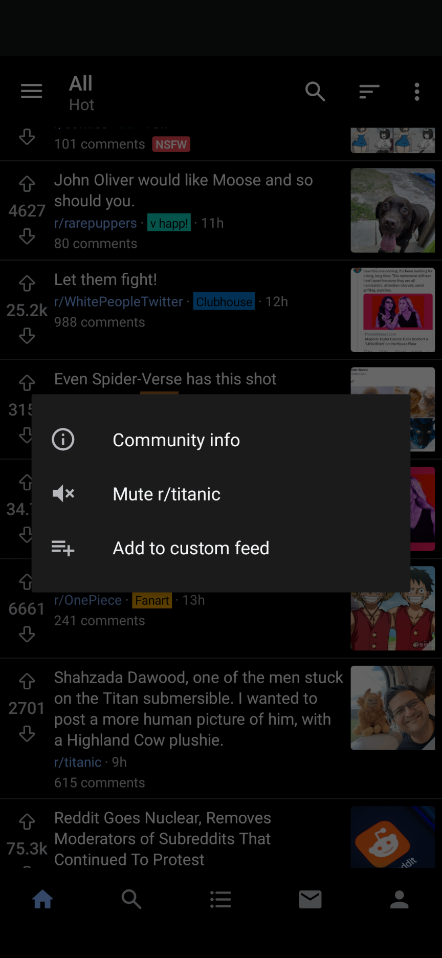
  • One of my most used features coming from Boost for Reddit was the ability to long-press the community for a given post and get a popup menu, from which I could block/mute said community from my feeds without having to actually click through. If this is possible to implement that would be AMAZING. Screenshot attached:

If it's better to file these in GitHub I can do that :) thanks again for a great app!

[–] [email protected] 3 points 1 year ago

I believe this was Lemmynade originally!

[–] [email protected] 1 points 1 year ago

Man, I know it's a different app but I'd be so thrilled if the Boost dev decided to jump ship and make a Lemmy app. I tried so many reddit apps and Boost ended up being everything I wanted and more.

[–] [email protected] 1 points 1 year ago

They were too beautiful for this world

[–] [email protected] 2 points 1 year ago

I'm surprised I never really noticed this, but it explains why my brain freezes up for a moment every time I go to search for something in a streaming service, haha. Very odd, very unintuitive!