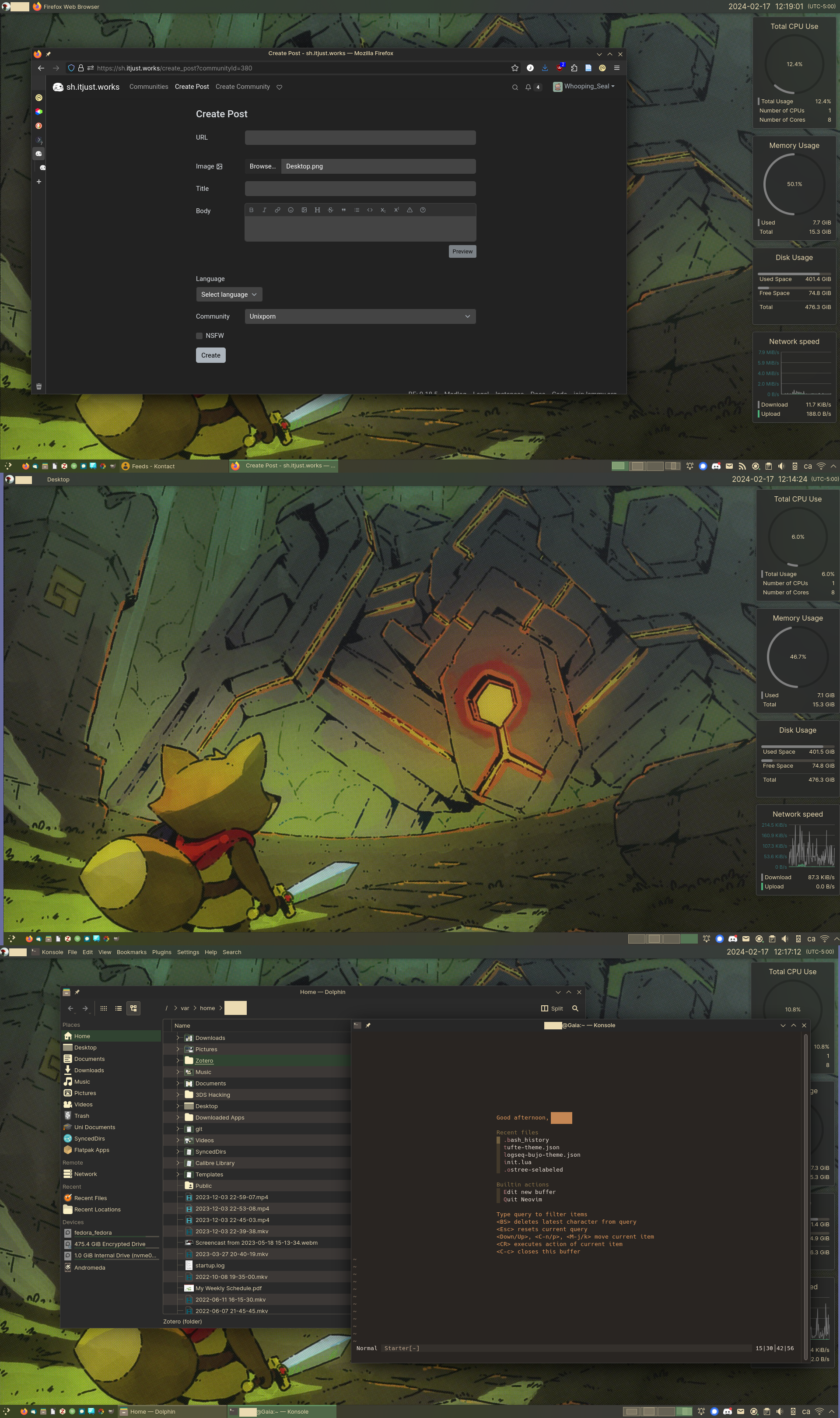
Hi. Great looking UI! ...just wanted to pop by and remind any who will listen that GRUVBOX IS THE ABSOLUTE BEST cheers.
Unixporn
Unixporn
Submit screenshots of all your *NIX desktops, themes, and nifty configurations, or submit anything else that will make themers happy. Maybe a server running on an Amiga, or a Thinkpad signed by Bjarne Stroustrup? Show the world how pretty your computer can be!
Rules
- Post On-Topic
- No Defaults
- Busy Screenshots
- Use High-Quality Images
- Include a Details Comment
- No NSFW
- No Racism or use of racist terms
Man, I love this. To my naïve eye it still looks a bit like a Windows install, but completely customized to suit your taste. This experience is what I want when I finally make the switch :P
It definitely is rather reminiscent of older Windows versions with the seperate application launchers, fully expanded task bar entries that show the name of an app that are ungrouped (until necessary). And the widgets are very reminiscent of Rainmeter.
But I also bring some things from macOS that I enjoyed such as the global menu on the top (sadly Firefox flatpak does not support), virtual desktops with the pager widget on the bottom, and I use Krunner a lot (plasma's equivalent to macOS "Spotlight")
I hope your switch to Linux goes well if / when you switch!
That wallpaper is so great
What plugin is this that you're using on VIM?
The plugin that brings the "starter" / "welcome" screen when nvim is called without a file is mini.starter, a lua module of the mini plugin. My primary use case for neovim is closer to a feature complete text editor rather than a full fledged IDE, although there definitely is some overlap in my setup.
My set of plugins are roughly as follows
vim-plug, I will likely replace this one withpackerat some pointgoyo.vimandlimelight.vimfor distraction free viewing and editingnnn.nvimto integrate thennnfile manager into neovimmini.nvimaccording to the Github, "Library of 35+ independent Lua modules improving overall Neovim (version 0.7 and higher) experience with minimal effort. They all share same configuration approaches and general design principles."mini.surroundfeature rich surround actionsmini.statuslinea very simple no-frills statuslinemini.starteraformentioned start screenmini.pairsinserts the paired character, e.g typing(will automatically place)behind the cursorsmini.movemove selectionsmini.maphas a little map of the file similar to VScode among many other IDEs & text editors
barbar.nvimTabbar plugin- a whole bunch of LSP / autocomplete engines / snippets / git commit messages & signs
nvim-treesitterfor syntax highlighting
And the remaining things in my init.lua file are just keybindings, setting up the plugins, and disabling the swapfile etc. when editing my password secrets in gopass among other 'secret' files
This looks awesome - love the vibe.
What are the performance indicators on the left?
I don't see any on the left. Those on the right are plasma widgets.
Apparently I still don't know what left and right is! Thanks a bunch!
How did you make Firefox look THAT similar to Breeze? Anyways 10/10 would daily drive
