this post was submitted on 28 Jun 2023
15 points (100.0% liked)

Lemmy Apps

5455 readers
2 users here now

A home for discussion of Lemmy apps and tools for all platforms.

RULES:


An extensive list of Lemmy apps is available here:

LemmyApps.com

or lemmyapps.netlify.app


Visit our partner Communities!

Lemmy Plugins and Userscripts is a great place to enhance the Lemmy browsing experience. [email protected]

Lemmy Integrations is a community about all integrations with the lemmy API. Bots, Scripts, New Apps, etc. [email protected]

Lemmy Bots and Tools is a place to discuss and show off bots, tools, front ends, etc. you’re making that relate to lemmy. [email protected]

Lemmy App Development is a place for Lemmy builders to chat about building apps, clients, tools and bots for the Lemmy platform. [email protected]

founded 1 year ago
MODERATORS
 

For me it would be:

  • Monet icon and Material UI design.
  • Mark read post while scrolling.
  • A button to hide such read posts.

I know there are more critical functions which most of the apps are lacking like going straight to the comment from a reply, it wasn't a big deal before because there were not many comments, but now it is becoming harder to find the context!

So far only Jerboa and Thunder qualifies the first "needs" for me!

Please share yours!

top 16 comments
sorted by: hot top controversial new old
[–] [email protected] 4 points 1 year ago* (last edited 1 year ago)
  1. Stability (no random 502s, go away with refresh - sounds like backend trouble?)
  2. Performance/efficiency
  3. Viewing all communities in an instance
  4. Open in app (YouTube, Play Store, etc)

Came from RIF and currently using Liftoff, it's my favorite client so far!

[–] [email protected] 4 points 1 year ago

A button at the bottom right of the screen to skip to the next top-level comment.

[–] [email protected] 3 points 1 year ago* (last edited 1 year ago)
  1. Ability to log in to accounts on multiple instances This one is common, but I'm specifying it for #2 & #3.
  2. Optional sync community subscriptions between accounts I'm too locked-in to an instance after subscribing to many communities. Make it easy for me to migrate by keeping my subscriptions in sync between accounts.
  3. Optional publish alt account links to Bio To make migration easier, if I'm syncing subscriptions between my @[email protected] account and my @[email protected] accounts, then modify my @[email protected] Bio to say "aka @[email protected]" and vice-versa.
  4. Shared inbox for all accounts If I get a fourth then this would be it.
[–] [email protected] 3 points 1 year ago

Might be controversial, but I personally want the option to turn off swipe gestures for votes. I keep giving people downvotes on accident when I'm trying to go back to the previous screen. Every iOS app I've tried has this feature and it's inconvenient imo.

[–] [email protected] 3 points 1 year ago

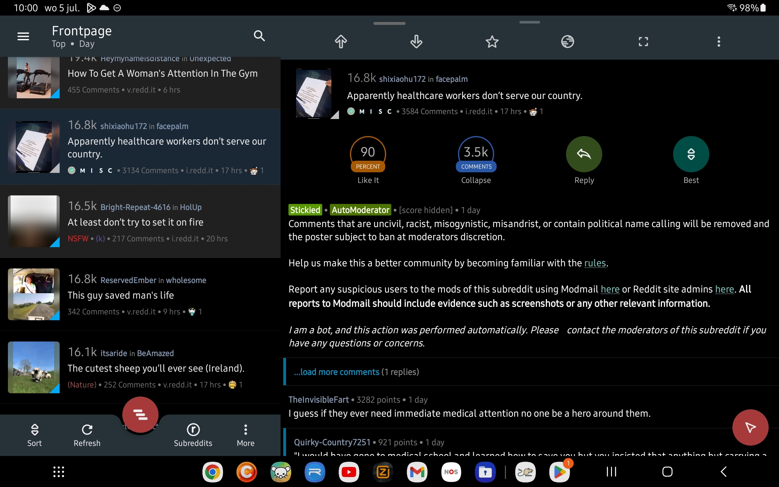
I'm using my tablet to browse Lemmy and haven't found an app yet that has all the posts on the left side and the content of a single post on the right.

The screenshot shows an example.

Also, mark a post as read when you have opened the media and ability to hide read posts.

[–] [email protected] 2 points 1 year ago (1 children)

What's a Monet icon and what's good about it?

[–] [email protected] 1 points 1 year ago

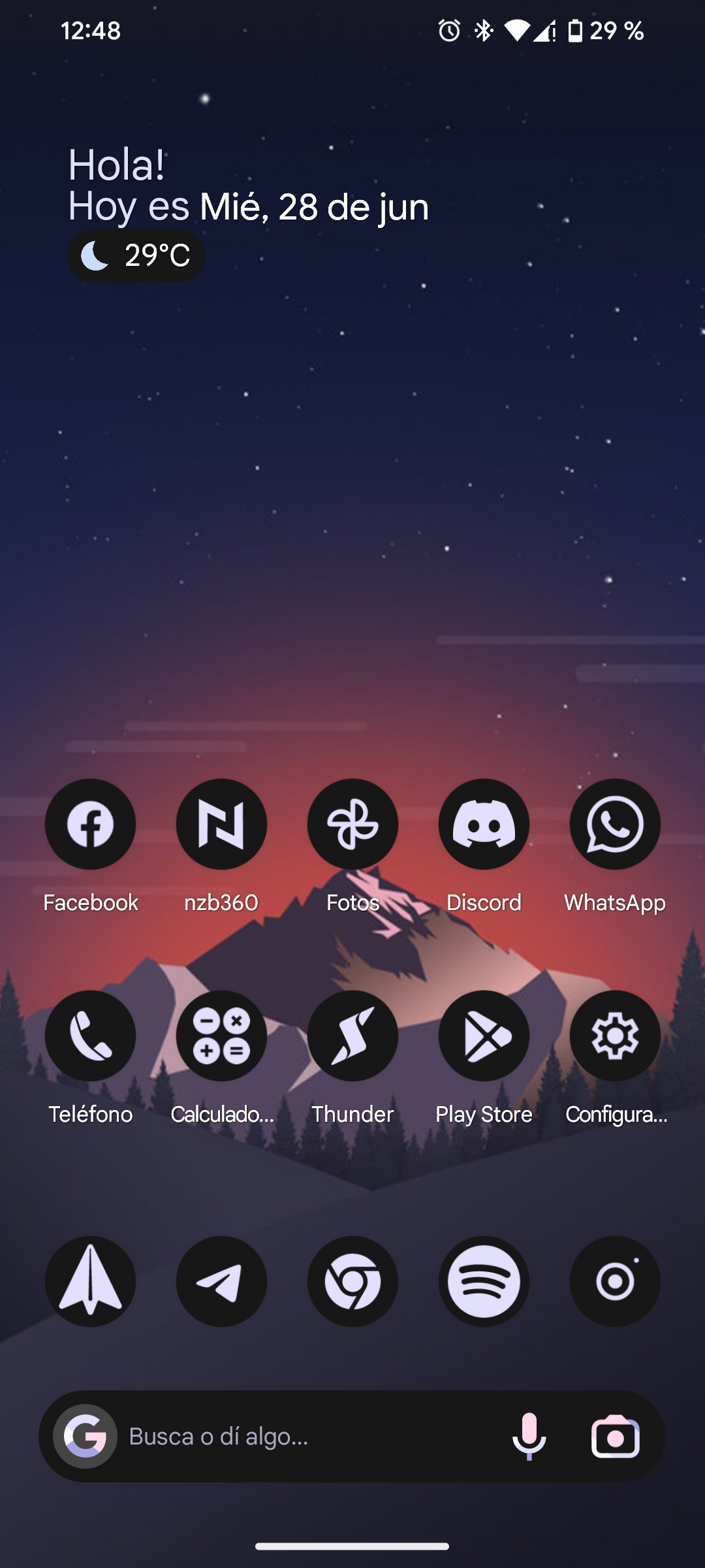
I personally like how it looks like, the icons get a monochromatic theme based on the color of your wallpaper.

Here is home my home screen looks like.

[–] [email protected] 2 points 1 year ago

-Community aggregation (multi-communities) -Easy back and forth nav between the post scroll and threads -occasional random substitution of a sports game score/summary instead of the thread I clicked to read.

Ok, not that last one, but I couldn’t think of a good third one off the top of my head.

[–] [email protected] 1 points 1 year ago

Pressing and holding to see a larger view of media. aka Peeking.

[–] [email protected] 1 points 1 year ago* (last edited 1 year ago)

Using Liftoff right now and so far looks like the best. At the very least, the most mature.

With that said, a few things in mind:

  • Long pressing a comment suppresses it, but tapping does nothing. The tap action could be used to suppress (what long press does now) and long press should show action buttons for the comment (that should be hidden as default)
  • When searching for a community, sort by number of subscribers or active subscribers or number of posts. It seems to be random now, maybe? Maybe alphabetical order? Can't recall, but prioritizing larger/more active communities is a good thing and concentrates things a bit more. (For example, search for "movies" on Jerboa and you'll see the largest community that your account can see first and go from there. But on Liftoff, the first results aren't that relevant). Also, show number of users/posts as in other apps in the community search page.
  • "Go to post" button doesn't work. It fails to load (yours or anyone's)
  • Pressing "back" button should open a popup to confirm if I want to exit the app instead of a banner asking to press again to exit. Just QOL.
  • Communities tab doesn't show my subscriptions correctly? Don't know if there's a problem in Lemmy itself, tho, but I'm subscribed to some communities that aren't showing up there and some that I'm subscribed to are duplicated.
[–] [email protected] 1 points 1 year ago (1 children)
  1. Uses RIF for inspiration.
  • Great battery life + interplay with android ecosystem
  • Information density
  • Customizability without being overwhelming
  1. Works well with larger Lemmy, Threadiverse, & Fediverse communities
  • Upstream major improvements up to base Lemmy + ActivityPub platforms. Ideally there'd be some cooperation between open source apps to reuse existing tools and extract shared functionality to new libraries for further reuse, especially in terms of Lemmy API consumption, security, android/ios/etc platform quirks, emojis, etc.
  • Multiple accounts / platform access
  • Allow workflows to share between platforms. Kbin combining micro+forums is neat, but I think separating microblogging and link aggregation/forums makes more sense. It'd be neat to share things that I like find as microblogging posts. Vice versa sometimes I think masto posts would be great discussion items for communities and woudl like to create a post from there.
  1. Open source
  • I know RIF wasn't, but ideally there'd at least be an open core (which fits in with my first point under #2)
  • Cooperates with other open platforms, preferably using web + other free standards where appropriate to make contributions easier.
  • If fully open, eventually backed/incorporated by larger FOSS players like Mozilla Foundation, Apache, or FSF.
[–] [email protected] 0 points 1 year ago (1 children)

I never used RIF, not that I remember though.

Only used Relay, Boost and Sync for Reddit, do you know if it was very different to those?

[–] [email protected] 0 points 1 year ago (1 children)

I only briefly tried other apps. RIF was older (and hardened, so super performant + stable), and kept the information density high (less whitespace) similar to old.reddit. Lots of internal integrations with other sites so my reddit browsing didn't affect my feeds on other sites (particularly YouTube). https://www.androidpolice.com/best-reddit-apps/ has a good comparison of the main apps.

[–] [email protected] 2 points 1 year ago

Oh I see, sadly most of those apps are gonna die, devs deserved better.

[–] [email protected] 1 points 1 year ago

Swipe navigation, I'm coming from relay for Reddit, and using a left swipe to go back was really handy.

I keep trying it in jerboa and thunder ... So a lot of unintentional upvotes in thunder and nothing happens in jerboa.

Next is embedded imgur/redgifs opening, which I was also accustomed to.

[–] [email protected] 1 points 1 year ago* (last edited 1 year ago)

Clear posts that I've already read, but be able to see them again with refresh. Not completely gone like with the settings option. This is what I miss the most of my old Reddit client.

Sorting, if I sort by new it's really really similar to hot right now, just one article or two different. In fact I get hot articles that are 8 mins old, something isn't right.

Link/image handleing is hit and miss right now, sometimes they don't expand when I "click" on them.

load more comments
view more: next ›