all 40 comments

sorted by: hot top controversial new old
[–] 89 points 1 year ago (7 children)

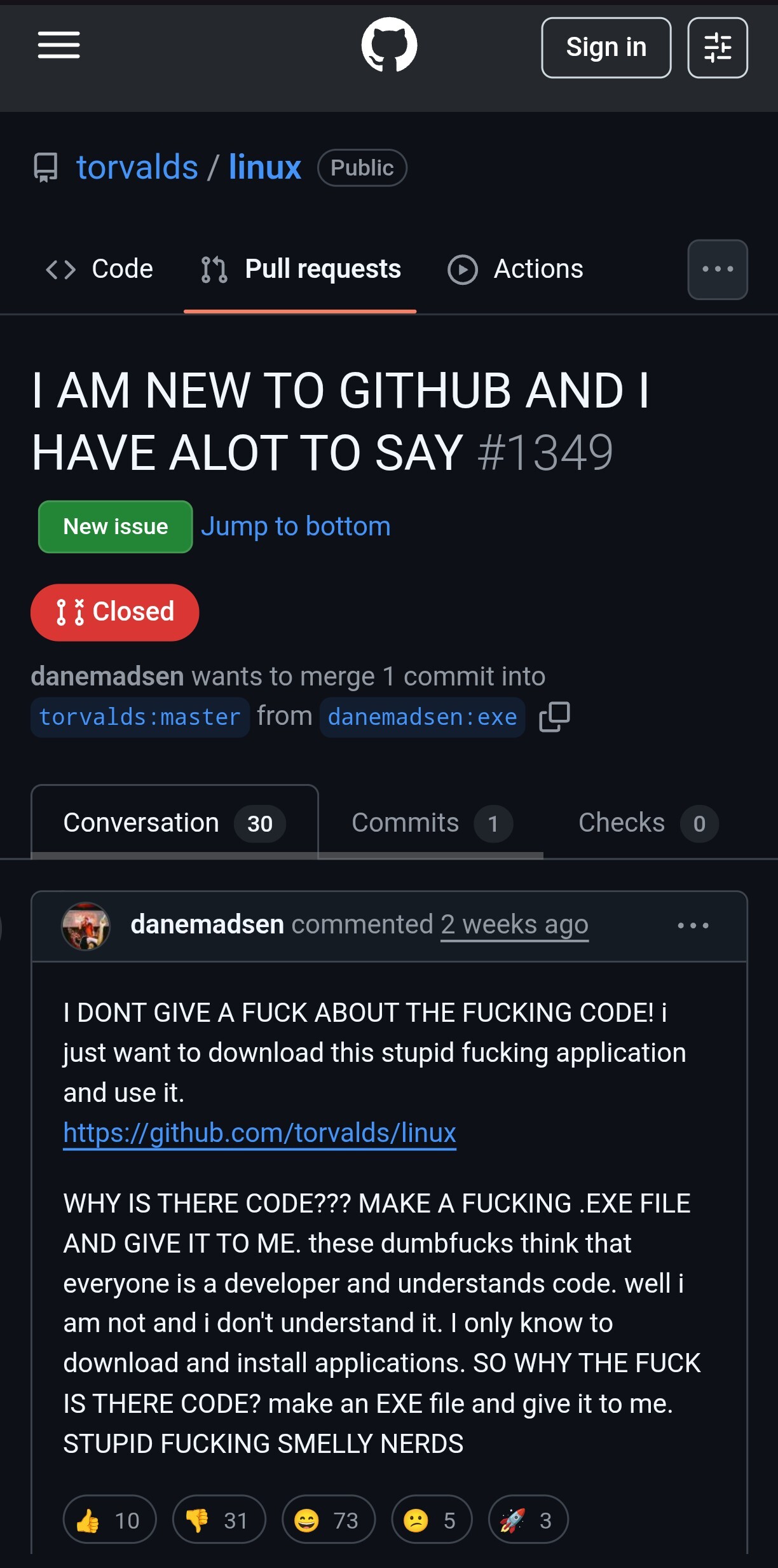
Would have been funny if it was original. Just randomly wasting peoples time with copy-pasta is not cool.

  • source
  • hideshow 7 child comments
  • [+] -11 points 1 year ago (4 children)

    By complaining about copypastas you are just making it worse. Can't you see that? Every time you comment and complain about people posting the same comments each time just adds to the incentive for people who think they are funny to continue. I am willing to bet that this comment will turn into a *** copypasta at this point just because of how "funny" and "ironic" it would be to make a copypasta out of a comment complaining about copypastas.

    Source: https://www.twitchquotes.com/copypastas/1810

  • source
  • parent
  • hideshow 4 child comments
  • [–] 8 points 1 year ago (2 children)

    By complaining about people complaining about copypastas you are just making it worse.

  • source
  • parent
  • hideshow 2 child comments
  • [–] 4 points 1 year ago

    By complaining about copypastas you are just making it worse. Can't you see that? Every time you comment and complain about people posting the same comments each time just adds to the incentive for people who think they are funny to continue. I am willing to bet that this comment will turn into a *** copypasta at this point just because of how "funny" and "ironic" it would be to make a copypasta out of a comment complaining about copypastas.

    Source: https://www.twitchquotes.com/copypastas/1810

  • source
  • parent
  • [–] 44 points 1 year ago* (19 children)

    It is really hard to find application releases on Github though. That is something that could be improved.

  • source
  • hideshow 19 child comments
  • [–] 52 points 1 year ago (11 children)

    GitHub's layout is strange to me. Why isn't releases in the top nav bar with Code, Issues, PR, etc.

  • source
  • parent
  • hideshow 11 child comments
  • [–] 13 points 1 year ago*

    I know it doesn't address the issue for most people, but that and other things can be "fixed" with the refined GitHub extension.

    The worst part IMO is that there used to be a "releases" button somewhere that got nuked. While "projects" is usually there, even though repos rarely use it.

  • source
  • parent
  • [–] 9 points 1 year ago (7 children)

    It's not just GitHub. Gitlab, Forgejo, etc., they all have releases hidden in a rather small tab instead of in a big obvious place where one might expect to see them.

  • source
  • parent
  • hideshow 7 child comments
  • [–] 6 points 1 year ago (2 children)

    Interesting. Maybe they don't want to be an application hosting site to non-developer types by making releases easy to use.

  • source
  • parent
  • hideshow 2 child comments
  • [–] 6 points 1 year ago

    They need to make it actively harder then because most devs with a site seem to just link direct to the release page. IMO, if that's the thought process then either make it intuitive or commit and lock it down to contributors or something.

  • source
  • parent
  • [–] 6 points 1 year ago (2 children)

    Forgejo has it exactly where @BootLoop@sh.itjust.works is saying, though.

    Like, yeah, it is still primarily a code hosting platform, but that doesn't mean the releases have to be in the most awkward place possible.

  • source
  • parent
  • hideshow 2 child comments
  • [–] 5 points 1 year ago (3 children)

    How would you make it easier? Currently it's on the sidebar with a big "Releases" heading and the link to the most recent release. From there you just look at Assets and download your file. The only way I can see it being easier is if it showed an annoying pop-up for all non-logged in or new users.

  • source
  • parent
  • hideshow 3 child comments
  • [–] 7 points 1 year ago* (last edited 1 year ago) (1 child)

    If I remember correctly, they used to be in a tab in the top navigation, together with "Code", "Issues", "Pull requests", etc. which was a lot easier to find for people who are not familiar with GitHub's UI. Edit: it was a separate bar right above the file list, together with the number of commits and branches: https://web.archive.org/web/20180610234228/https://github.com/rails/rails

    Same problem with forks / network. In earlier revisions of GitHub's UI, they were relatively easy to find. Now you have to know that you can click the "59.7k forks" sidebar text which is in no way styled like a link or button. You can just infer it from the fact that there are also "Readme" and "View license" in the same list.

  • source
  • parent
  • hideshow 1 child comment
  • [–] 9 points 1 year ago

    Looking back, I find every single aspect of the 2018 design more accessible than the current one. Releases are above the fold, the list of forks is reachable by clicking the number next to the fork button, the explore link is right there in the top navigation. Sure, having three levels of horizontal navigation doesn't look very clean but there must be a better solution than hiding everything in hamburger menus and sidebars where you can only find them if you already know they exist.

  • source
  • parent
  • [–] 16 points 1 year ago (1 child)

    People joke about linux.exe, but there was such a thing as andLinux/coLinux

  • source
  • hideshow 1 child comment
  • [–] 13 points 1 year ago (1 child)

    The GitHub PR section is a shitshow of different freaks trying to get attention from other freaks

  • source
  • hideshow 1 child comment
  • [–] 8 points 1 year ago* (last edited 1 year ago) (5 children)

    To be fair, the github.cum/author/project/releases subsection of a isn't exactly the first thing that you find, nor is there a very visible link that stands out.

    I must've stumbled across it at some point as I know of its existence, but I don't know how to get there so I usually just manually add it to the URL.

  • source
  • hideshow 5 child comments
  • [–] 8 points 1 year ago

    You have to click a random heading in the info section to the right of the code listing (or below it on mobile).

    I do also find GitHub's URLs are much more user-friendly than the GUI, though.

  • source
  • parent
  • [–] 8 points 1 year ago

    I thought the issues on the Linux github repo became a dating service

  • source
  • [–] 8 points 1 year ago