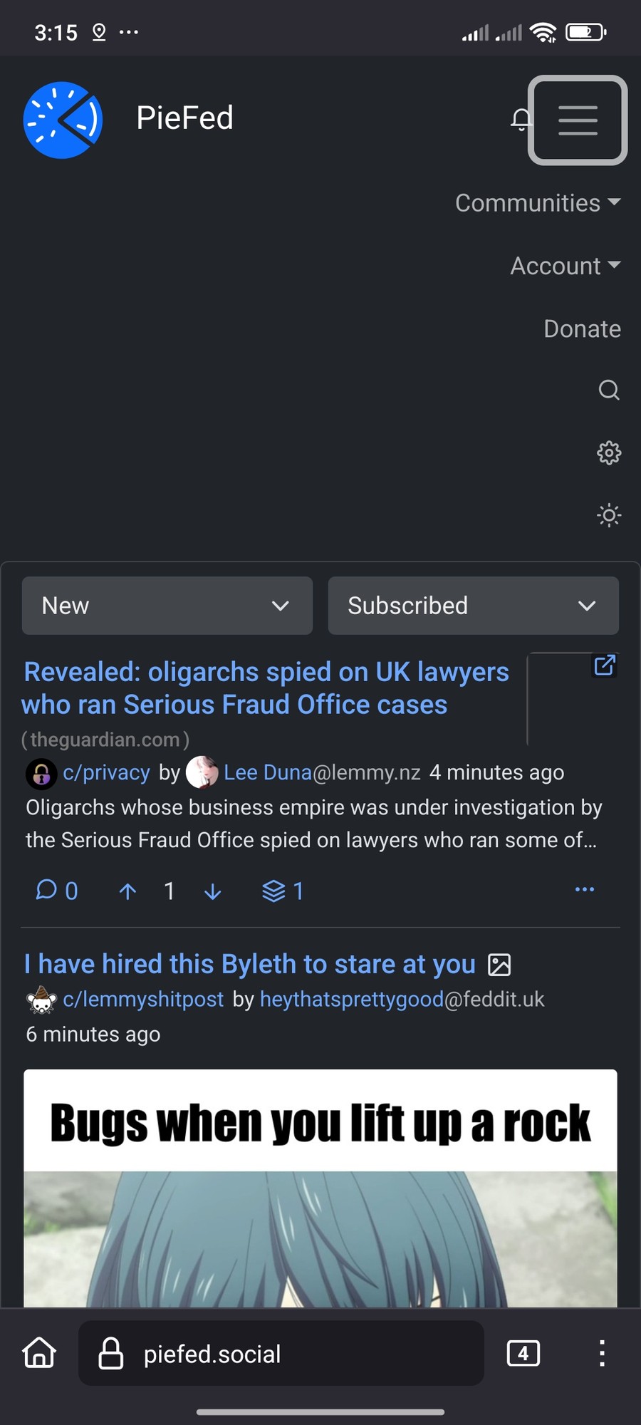
Rather than try to rescue the hamburger menu, I created a new always-there bottom menu which is only shown on mobile devices.
Please give it a try on https://crust.piefed.social/ if you're on a mobile when you read this.
Rather than try to rescue the hamburger menu, I created a new always-there bottom menu which is only shown on mobile devices.
Please give it a try on https://crust.piefed.social/ if you're on a mobile when you read this.
Is there a way to turn it off
Sure.
Go to https://piefed.social/user/settings and find the field 'Additional CSS'. Paste this into it then save the form:
.mobilenav { display: none; }
Thank you
It's very nice
It's great!
Yes. The icons are too small.
Could you elaborate some, and what do you mean by verticle pill.
for example the account section on PC in piefed https://imgur.com/a/wDjJ3wH
Oh, yeah I see what you mean now. I agree, that style of sub menu would look better instead of the expanding section within the page like it currently is. I also think that one or two of the icons could be separated from the menu and included next to the hamburger menu (the search icon, and the settings icon perhaps).
I wish it was bigger, I wish the icons had some text right next to them to make it easier to tap on, and also, if we're going with the expansion style like it is right now instead of a more like bubble menu I guess, I wish there was an option to put the text on the right.
Yes, I agree. Will sort it out.
Discuss PieFed project direction, provide feedback, ask questions, suggest improvements, and engage in conversations related to the platform organization, policies, features, and community dynamics.