23
Who asked for this exactly?
(programming.dev)

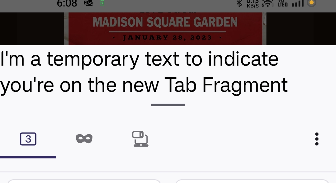
The photo is from Firefox beta for Android.

I think your firefox might be bugged, I'm on nightly and it looks like this for me:

I think OP has a bigass font size.
So, once again, more ~~white~~ "grey" space and less content. Yay boo.

Wait, did the dev finally come back and fix sync for lemmy?
Hey this looks kinda cool. Can't wait for it to be stable.
Oh wow. Why is your font so big?
Why not?
Because it looks too crowded and busy.
Looks awesome. Can't wait for it to be released. 👍
Yeah Im not opposed. It's different but they keep playing around with it on nightly and beta.
Tbf, if I'm interacting with the menu I don't mind it being big and separated.
Exactly. Large tap targets ftw, but also Fitts's Law, of course.

You beat me to it
Hate the new menu with a passion. There's one feature I used a lot, "open in regular tab", that has been removed.
I think the worst part is the multi line text, it looks bad. They should stick to a condensed icon only view or a more spaced out view with text.
A community for discussion about Mozilla Firefox.