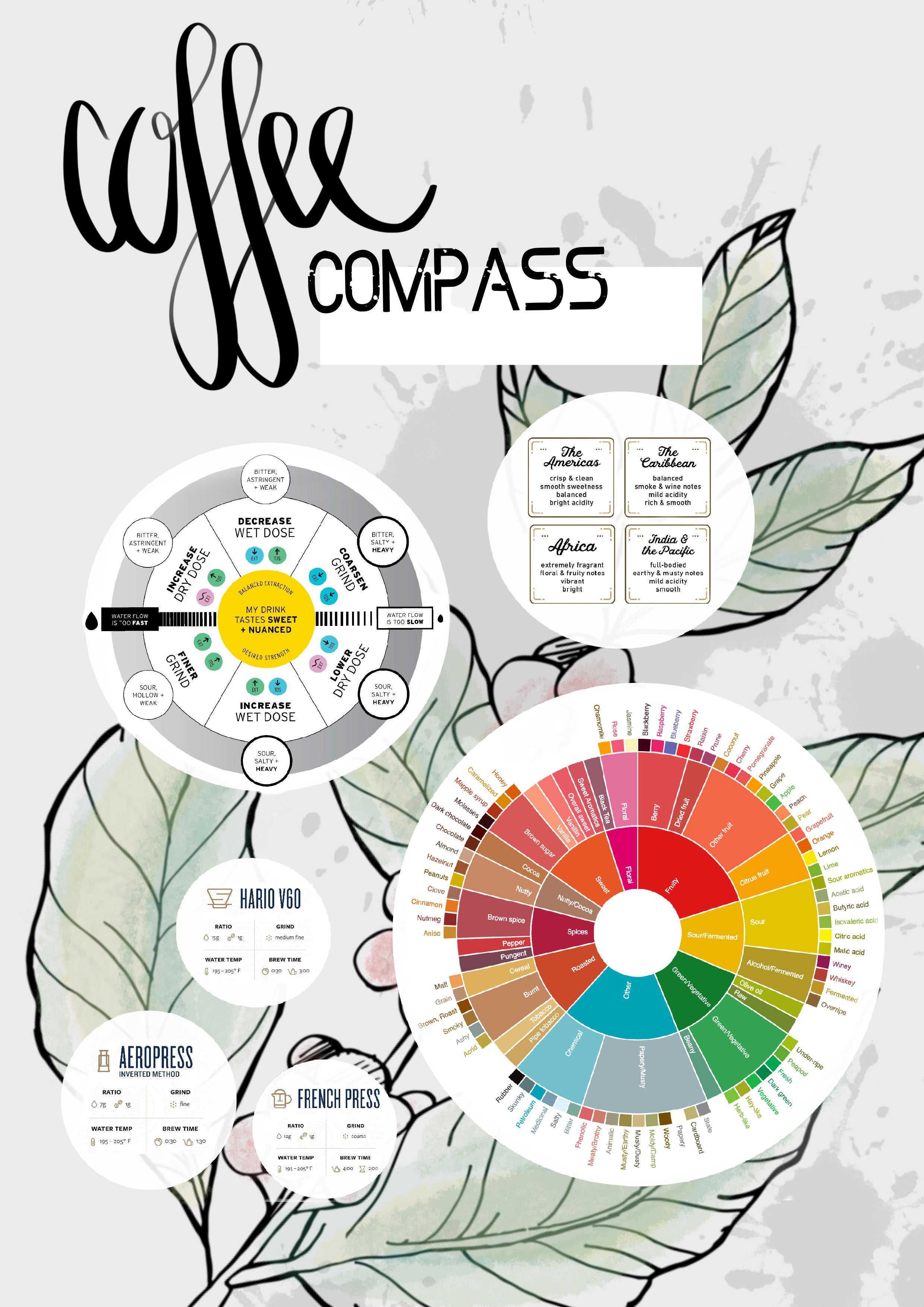
I wish it had higher resolution
Coffee
☕ - The hot beverage that powers the world!
Coffee gadgets - It's always great to learn about new gadgets. Please share your favorite hardware or full setups. It might inspire newcomers to experiment!
Local businesses - Please promote your local businesses. If you are not the owner of the business you are promoting, kindly ask the owner if it's okay. It would be great if the business has a physical store to include an exterior or interior shot.
Is this due to Lemmy recompressing it?
I want to believe OP wouldn’t do this to us…
I promise I did not do this on purpose. I like potatoes but not potato quality.
Uploaded via memmy which maybe did some jpeg compression. Still getting used to the new world. Need to figure out a better image upload/hosting pattern
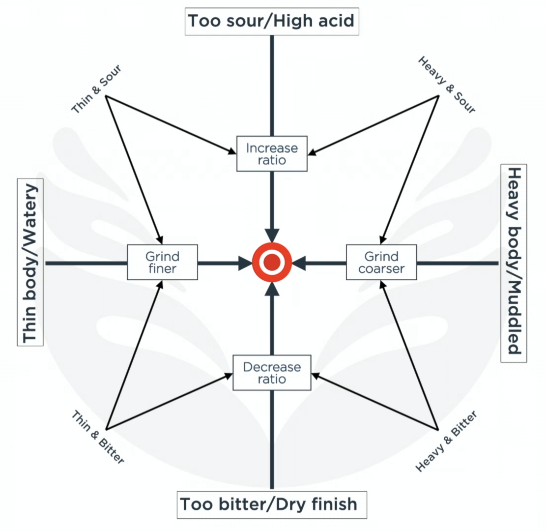
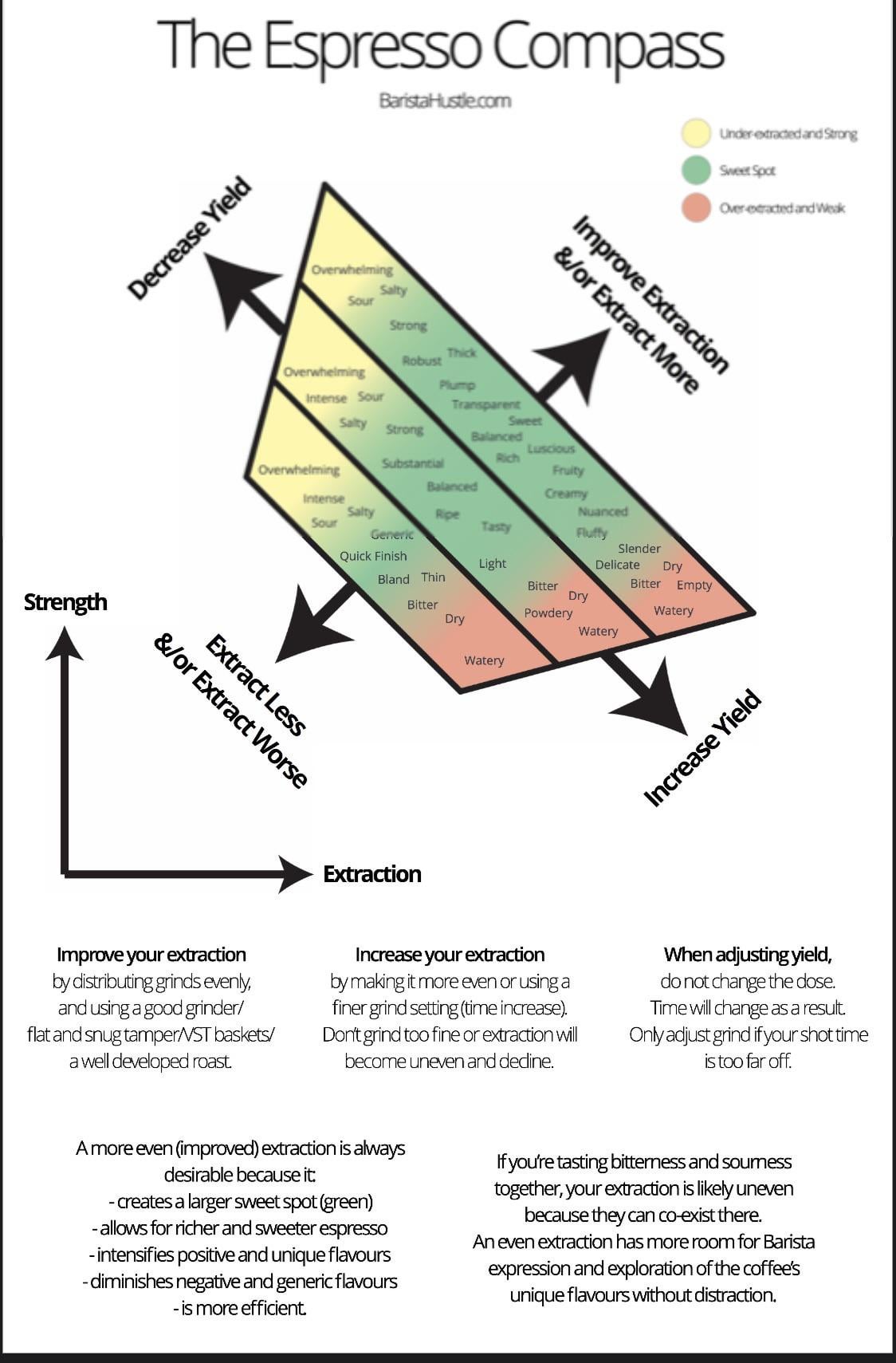
Here's a few I've saved over time, all variations on the same thing. Unfortunately I haven't saved the sources alongside them: apologies to the creator as I know at least one of them was made by someone on Reddit


Do you have this at a higher resolution? It's better than the other graphics to the same effect but so small I can barely read it.
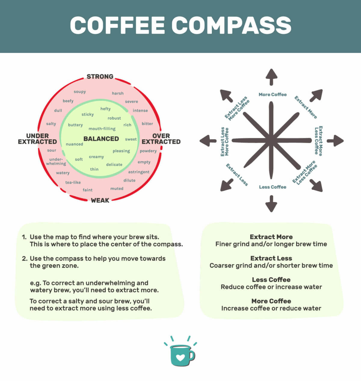
Fixed, similar graphic from different source with higher res uploaded
Thank you! I stumbled on this once and couldn’t find it again.
How can someone standardise "sour" or "bitter" or etc? Every person has their own perception of tastes.
I don't mean to be salty (pun intended), but it still confused me...
a non-problematic source.
Plagiarism seems pretty problematic to me, but then, so does racism so 🤷♂️
Where’s the plagiarism here?
The original image was (presumably) Barista Hustle's coffee compass. The 'non-problematic' replacement is just a straight copy of it, word for word and almost identical in design. Not a big deal but ehhhh
