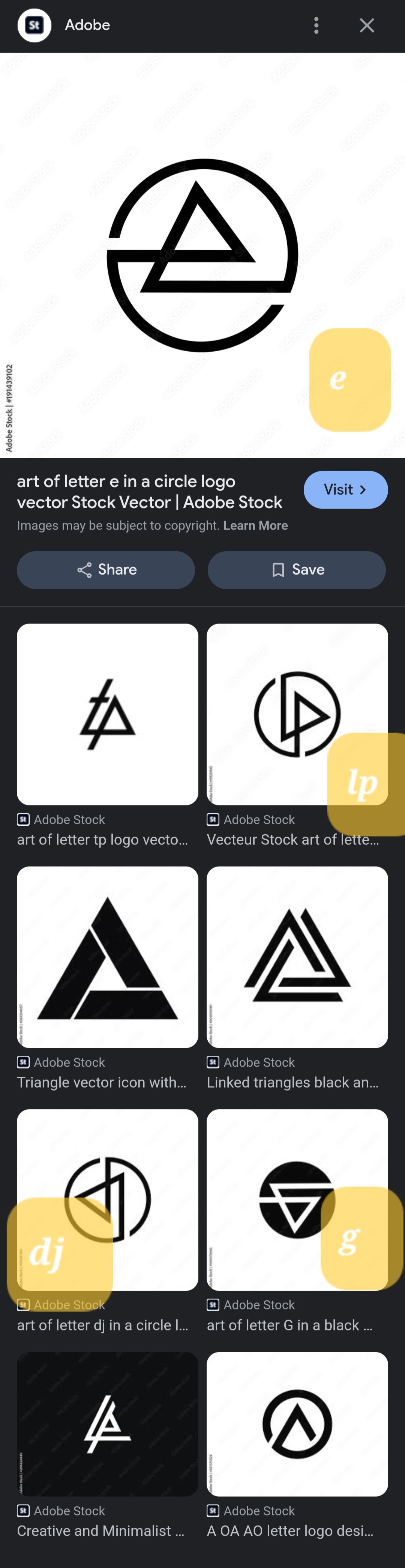
They're all the same. Rotated 90° for each one. Except for the 'e', they flipped that one.
Pictures, Videos, Articles showing just how boring it is to live in a dystopic society, or with signs of a dystopic society.
Rules (Subject to Change)
--Be a Decent Human Being
--Posting news articles: include the source name and exact title from article in your post title
--Posts must have something to do with the topic
--Zero tolerance for Racism/Sexism/Ableism/etc.
--No NSFW content
--Abide by the rules of lemmy.world
They're all the same. Rotated 90° for each one. Except for the 'e', they flipped that one.
Is it just me or do they really closely resemble the Linkin Park logo?
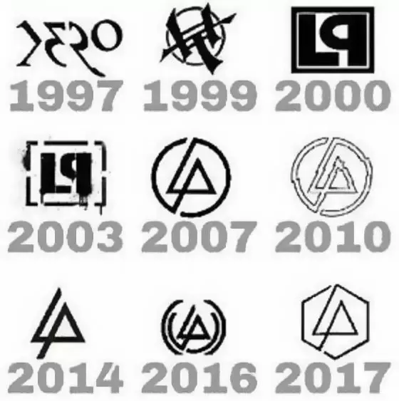
These are all rip offs of the Linkin Park logo. One is literally the 2008 logo rotated. I thought this was a Linkin Park post when I saw it

Good shout, I was thinking the Audio Technica logo but LP logo is closer
I swear one of them is literally just the Abstergo logo
Possibly exactly. I'm suspicious these were all made with AI based on copyrighted logos, at which point almost everything it'll spit out is a copyrighted logo.
So we've got six Linkin Park ripoffs, the postmarketOS logo, and a valknut? Not sure what the last one is, but I'd be surprised if it were original.
Fuck Adobe.
So, I think some dude try to split their work so it is more likely to hit on Search bar, and make a sale.