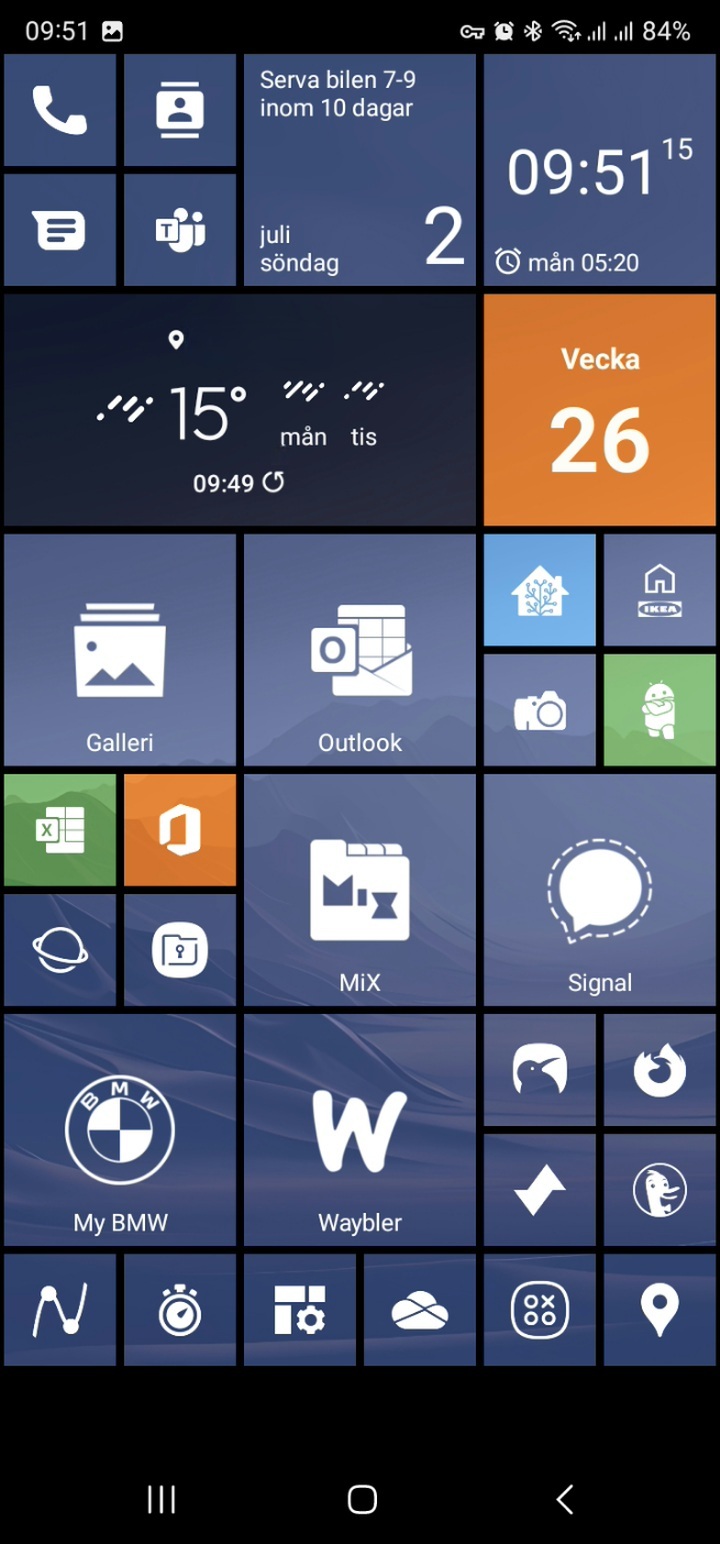
Oh God. This is horrific.
I can appreciate that you made this. But I also gotta do “why”
Well, this is what I like. My lumia was pretty solid and I miss the ui
Those lumias were ahead of their times.
My Samsung Omnia 7 was friggin awesome. Metro was kicking iOS and Androids butt.
I miss that too and think that it would have been great to have three ecosystems. Only having two things to choose from is not good. Does this launcher behave like wp? With flipping tiles that show you a brief overview?
They have some custom tiles that do like calender, photo slider, clock. Folders also have animations
LUMIA oh man I miss that phone. Served me terrific right up until I face planted it in a parking lot.
It might feel busy for some but that's because you see it for the first time. When it's on your phone, you see it like 50 times a day you realize that you got so much information at a glance.
Or maybe you need to be an old WP user to appreciate it 😁

Definitely need to have used wp before to appreciate this
I still miss my 920 and 950xl. If they made a modern WP again, I'd switch back in a heartbeat.
Looks great! Makes me want to reinstall the launcher I used before switching to Pixel
YouTube Vanced got replaced by Revanced BTW, different team and not just an app you just download, you have to patch YouTube yourself, (similar to xmanager) but that isn't not too hard. The YouTube Revanced's Official discord can be found here
Is there a reason people go through all these steps for patching YouTube when you could just use NewPipe or LibreTube to browse YouTube without any ads, with background play, ability to download videos, and so on?
You can log in to ReVanced.
I prefer the gestures and UI of the stock YouTube app, so having a patched app is the best of both worlds.
Google account login
Dear lord that is so busy
Yet incredibly clean compared to your average home screen.
I'd spend $600 on a 2023 windows phone
For sure, with my eyes closed. My 520 and 720 were by far the most aesthetically pleasing phones I've ever used.
I had the 925, it was reall nice, the screen aspect ratio was great, the phone felt premium, camera was good. It got a bit sluggish towards the end, but Android phones at the time did as well. I wasn't a fan of WP10 though, so if they released a new WP today who knows what kind of experience it would actually have, probably something in-between WP10 and Android.
I agree. I was so upset when the line was discontinued.
I fucking loved Windows Mobile OS. I want my tiles back.
It was pretty awesome man. Especially the native apps and the consistency in UI between apps. Android only NOW has introduced something similar with material you. It was ahead of it's time
It was ahead in many ways. Iirc, windows was the first phone OS to include in built swipe typing.
You can emulate the old Windows phone look with Square Launcher.
https://play.google.com/store/apps/details?id=com.ss.squarehome2
I can't believe nobody in this thread mentioned launcher10 yet. I have to admit I haven't tried square yet, but launcher10 scratches my WP user experience itch for sure.
https://play.google.com/store/apps/details?id=com.nfwebdev.launcher10
I don't like how it handles resizing. I really can't deal with it for every app. Plus square launcher has more features
Windows Phone had a gorgeous UI, especially on OLED devices. Your colours are a little off and the gaps could be a bit bigger, but it still looks quite nice. I don't know how much of this is tweakable though. Did you make this yourself? Or which launcher are you using?
Reddit icon instead of Lemmy. WTF
I loved my windows phone, everything was neatly organized and insane good muscle memory, I don't know if it is my nostalgia or if it genuinely is a good as I remember
this is disgusting, good job
I still miss WM10 :(
Looks awesome!
I liked the Windows Phone home screen but damn this is over stimulus lmao.
To each its own i guess
SquareHome?
Yeah
Android
DROID DOES
Welcome to the droidymcdroidface-iest, Lemmyest (Lemmiest), test, bestest, phoniest, pluckiest, snarkiest, and spiciest Android community on Lemmy (Do not respond)! Here you can participate in amazing discussions and events relating to all things Android.
The rules for posting and commenting, besides the rules defined here for lemmy.world, are as follows:
Rules
1. All posts must be relevant to Android devices/operating system.
2. Posts cannot be illegal or NSFW material.
3. No spam, self promotion, or upvote farming. Sources engaging in these behavior will be added to the Blacklist.
4. Non-whitelisted bots will be banned.
5. Engage respectfully: Harassment, flamebaiting, bad faith engagement, or agenda posting will result in your posts being removed. Excessive violations will result in temporary or permanent ban, depending on severity.
6. Memes are not allowed to be posts, but are allowed in the comments.
7. Posts from clickbait sources are heavily discouraged. Please de-clickbait titles if it needs to be submitted.
8. Submission statements of any length composed of your own thoughts inside the post text field are mandatory for any microblog posts, and are optional but recommended for article/image/video posts.
Community Resources:
We are Android girls*,
In our Lemmy.world.
The back is plastic,
It's fantastic.
*Well, not just girls: people of all gender identities are welcomed here.
Our Partner Communities:
