this post was submitted on 18 Jul 2023
652 points (96.0% liked)
Voyager
5673 readers
3 users here now
The official lemmy community for Voyager, an open source, mobile-first client for lemmy.
Rules
- Be nice.
- lemmy.world instance policy
Sponsor development! 👇
💙
founded 1 year ago
MODERATORS
you are viewing a single comment's thread
view the rest of the comments
view the rest of the comments


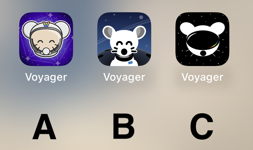
A, is good but I don't like the brown fur (I would try grey or blue), grey around the face/chin (I would darken it with black or a dark blue), and stark white of the ears (needs shading, a thicker line, something to add visual weight). I like the overall composition best, just needs tweaks.
B, I love the contrast and unified feeling of the lemming and background. I wish he had a clear helmet. Best choice IMO.
C, not enough visual distinction, especially as a smaller size icon. shape, detail and color pallette too simple for me.