1448
you are viewing a single comment's thread
view the rest of the comments
view the rest of the comments
this post was submitted on 17 Feb 2024
1448 points (96.3% liked)
Technology
84502 readers
3606 users here now
This is a most excellent place for technology news and articles.
Our Rules
- Follow the lemmy.world rules.
- Only tech related news or articles.
- Be excellent to each other!
- Mod approved content bots can post up to 10 articles per day.
- Threads asking for personal tech support may be deleted.
- Politics threads may be removed.
- No memes allowed as posts, OK to post as comments.
- Only approved bots from the list below, this includes using AI responses and summaries. To ask if your bot can be added please contact a mod.
- Check for duplicates before posting, duplicates may be removed
- Accounts 7 days and younger will have their posts automatically removed.
Approved Bots
founded 2 years ago
MODERATORS

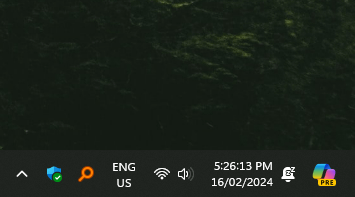
I work in IT, and every time I do an install (sometimes new computers, sometimes not) for someone I see Microsoft's little News widget they put on the Taskbar, the one that pops up a huge window if you mouse over it. Every time I see that, I ask the person if they ever use it, and they always say no. Then I ask them if they want it gone, and they always say yes, usually with some kind of relief. It's a matter of two clicks to do it, easier than going into the settings menu like your screenshot, but every computer I haven't been on previously has it. Now, I'd wonder why Microsoft would put something on the Taskbar that is, in my experience, universally disliked. To me it reeks of the pathetic, groveling, "I'll suck your dick" energy they have when someone installs Chrome.
Windows 10 changed a lot over the course of its lifetime, and while some feature are good, like Dark Mode, they're mostly useless or downright bad. So putting something that most people will never use and will greatly confuse and annoy the average user in a place that has been dedicated to a single function for at the very least Windows 10's entire lifetime (I think it's there in 8 and maybe 7 also) for seemingly no reason other than to fuck with people's muscle memory is just one more move very worthy of griping about, no matter how easy it is for users to turn off. Because 99% of users just won't, because they aren't confident enough to go futzing around in the settings. But they'll still get whatever god awful popup this button shows every time they try to show desktop like they've been doing for over a decade. It's yet another change that nobody asked for, nobody will use, and that the user will have to remember that it's different now for no reason.