this post was submitted on 02 Feb 2024
561 points (100.0% liked)
196
16509 readers
2298 users here now
Be sure to follow the rule before you head out.
Rule: You must post before you leave.
founded 1 year ago
MODERATORS
you are viewing a single comment's thread
view the rest of the comments
view the rest of the comments

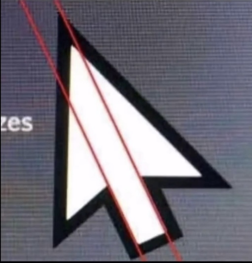
Someone pls explain?
i believe it's just pointing out the misalignment of the graphic. people may be under the impression that something like a cursor has mathematically precise proportions, but it does not.
And it’s by design. Because if it was absolutely precise the edge wouldn’t have been straight
https://www.makeuseof.com/windows-default-cursor-why-asymmetrical-tilted/
yeah it has kind of an optical balance to it. i don't mind that it's not mathematically perfect because it appears proportional. optics are all that matters, especially in pixel art.
(edit: i guess 'pixel art' isn't correct anymore because it's a vector graphic, but it used to be pixels!)