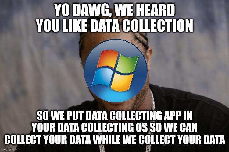
▲ 958 ▼ Yo Dawg, new Outlook just dropped (linux.community) submitted 2 years ago by ExLisper@linux.community to c/memes@lemmy.ml 65 comments fedilink hide all child comments
[–] abfarid@startrek.website 37 points 2 years ago (16 children) Gotta point out, that hasn't been the Microsoft logo since Win7. permalink fedilink source hideshow 16 child comments replies: [–] SnotFlickerman@lemmy.blahaj.zone 55 points 2 years ago (2 children) *leans hard on cane: Ya got a problem with crusty old memes, kid? The important thing was that I had an onion on my belt, which was the style at the time. permalink fedilink source parent hideshow 2 child comments replies: [–] KingJalopy@lemm.ee 5 points 2 years ago In my day kids respected their elder memes... They regularly shitposted them and people were grateful for those crusty memes. permalink fedilink source parent [–] pimeys@lemmy.nauk.io 1 point 2 years ago Abe gets the upvote. permalink fedilink source parent [–] TimeSquirrel@kbin.social 34 points 2 years ago* (1 child) Fine then: https://i.imgur.com/2V7ZVlD.png permalink fedilink source parent hideshow 1 child comment replies: [–] terminhell@lemmy.world 7 points 2 years ago Perfection permalink fedilink source parent [–] user224@lemmy.sdf.org 32 points 2 years ago (2 children) At least it's recognizable. Windows 12 will probably be just a single blue square. permalink fedilink source parent hideshow 2 child comments replies: [–] jubilationtcornpone@sh.itjust.works 10 points 2 years ago* (last edited 2 years ago) (1 child) "It's a single pane window. A single pane of glass. It symbolizes the synergy between man and machine. Window 12 offers an enhanced user experience with greater simplicity and clarity. Also, we've revamped our mobile and iOT OS lines which we're calling 'Porthole 12' and 'Peephole 12' respectively." -Microsoft, Probably permalink fedilink source parent hideshow 1 child comment replies: [–] thecrotch@sh.itjust.works 1 point 2 years ago Microsoft doesn't give things new names. It reuses the same name for a vastly different product to keep everyone confused. Outlook. Outlook (the hosted email service). Outlook express. Skype. Skype for business. Teams. Teams professional. Etc etc. permalink fedilink source parent [–] JustARegularNerd@lemmy.world 16 points 2 years ago (1 child) If you really want to be pedantic.. that's not even the Microsoft logo to begin with. Microsoft didn't use the Windows logo for their own company logo, at least during that time period. Oh, and that's Windows Vista's logo anyway. permalink fedilink source parent hideshow 1 child comment replies: [–] abfarid@startrek.website 4 points 2 years ago That's fair, I should've said "That logo hasn't been used by MS since Win7". But it's still the same logo, minus the backdrop. permalink fedilink source parent [–] Edgarallenpwn@midwest.social 8 points 2 years ago (1 child) Gotta point out, that meme template has been around before then. permalink fedilink source parent hideshow 1 child comment replies: [–] marcos@lemmy.world 2 points 2 years ago As long as the same text continues relevant... permalink fedilink source parent [–] ExLisper@linux.community [S] 6 points 2 years ago (1 child) Sorry, I think the last Windows I had installed anywhere was XP. I was like "which windows logo is that? should I look it up?" but then I was like "nah, fuck it". permalink fedilink source parent hideshow 1 child comment replies: [–] abfarid@startrek.website 2 points 2 years ago They used to go for the Distort tool. Then, the Skew tool was all the rage. And now, they realized that Photoshop subscriptions are a ripoff and stopped using it altogether. permalink fedilink source parent [–] MY_ANUS_IS_BLEEDING@lemm.ee 2 points 2 years ago (1 child) The meme itself must be a good 15 years old too permalink fedilink source parent hideshow 1 child comment replies: [–] ExLisper@linux.community [S] 2 points 2 years ago No, I just made it myself. It's brand new and shiny. permalink fedilink source parent
[–] SnotFlickerman@lemmy.blahaj.zone 55 points 2 years ago (2 children) *leans hard on cane: Ya got a problem with crusty old memes, kid? The important thing was that I had an onion on my belt, which was the style at the time. permalink fedilink source parent hideshow 2 child comments replies: [–] KingJalopy@lemm.ee 5 points 2 years ago In my day kids respected their elder memes... They regularly shitposted them and people were grateful for those crusty memes. permalink fedilink source parent [–] pimeys@lemmy.nauk.io 1 point 2 years ago Abe gets the upvote. permalink fedilink source parent
[–] KingJalopy@lemm.ee 5 points 2 years ago In my day kids respected their elder memes... They regularly shitposted them and people were grateful for those crusty memes. permalink fedilink source parent
[–] TimeSquirrel@kbin.social 34 points 2 years ago* (1 child) Fine then: https://i.imgur.com/2V7ZVlD.png permalink fedilink source parent hideshow 1 child comment replies: [–] terminhell@lemmy.world 7 points 2 years ago Perfection permalink fedilink source parent
[–] user224@lemmy.sdf.org 32 points 2 years ago (2 children) At least it's recognizable. Windows 12 will probably be just a single blue square. permalink fedilink source parent hideshow 2 child comments replies: [–] jubilationtcornpone@sh.itjust.works 10 points 2 years ago* (last edited 2 years ago) (1 child) "It's a single pane window. A single pane of glass. It symbolizes the synergy between man and machine. Window 12 offers an enhanced user experience with greater simplicity and clarity. Also, we've revamped our mobile and iOT OS lines which we're calling 'Porthole 12' and 'Peephole 12' respectively." -Microsoft, Probably permalink fedilink source parent hideshow 1 child comment replies: [–] thecrotch@sh.itjust.works 1 point 2 years ago Microsoft doesn't give things new names. It reuses the same name for a vastly different product to keep everyone confused. Outlook. Outlook (the hosted email service). Outlook express. Skype. Skype for business. Teams. Teams professional. Etc etc. permalink fedilink source parent
[–] jubilationtcornpone@sh.itjust.works 10 points 2 years ago* (last edited 2 years ago) (1 child) "It's a single pane window. A single pane of glass. It symbolizes the synergy between man and machine. Window 12 offers an enhanced user experience with greater simplicity and clarity. Also, we've revamped our mobile and iOT OS lines which we're calling 'Porthole 12' and 'Peephole 12' respectively." -Microsoft, Probably permalink fedilink source parent hideshow 1 child comment replies: [–] thecrotch@sh.itjust.works 1 point 2 years ago Microsoft doesn't give things new names. It reuses the same name for a vastly different product to keep everyone confused. Outlook. Outlook (the hosted email service). Outlook express. Skype. Skype for business. Teams. Teams professional. Etc etc. permalink fedilink source parent
[–] thecrotch@sh.itjust.works 1 point 2 years ago Microsoft doesn't give things new names. It reuses the same name for a vastly different product to keep everyone confused. Outlook. Outlook (the hosted email service). Outlook express. Skype. Skype for business. Teams. Teams professional. Etc etc. permalink fedilink source parent
[–] JustARegularNerd@lemmy.world 16 points 2 years ago (1 child) If you really want to be pedantic.. that's not even the Microsoft logo to begin with. Microsoft didn't use the Windows logo for their own company logo, at least during that time period. Oh, and that's Windows Vista's logo anyway. permalink fedilink source parent hideshow 1 child comment replies: [–] abfarid@startrek.website 4 points 2 years ago That's fair, I should've said "That logo hasn't been used by MS since Win7". But it's still the same logo, minus the backdrop. permalink fedilink source parent
[–] abfarid@startrek.website 4 points 2 years ago That's fair, I should've said "That logo hasn't been used by MS since Win7". But it's still the same logo, minus the backdrop. permalink fedilink source parent
[–] Edgarallenpwn@midwest.social 8 points 2 years ago (1 child) Gotta point out, that meme template has been around before then. permalink fedilink source parent hideshow 1 child comment replies: [–] marcos@lemmy.world 2 points 2 years ago As long as the same text continues relevant... permalink fedilink source parent
[–] marcos@lemmy.world 2 points 2 years ago As long as the same text continues relevant... permalink fedilink source parent
[–] ExLisper@linux.community [S] 6 points 2 years ago (1 child) Sorry, I think the last Windows I had installed anywhere was XP. I was like "which windows logo is that? should I look it up?" but then I was like "nah, fuck it". permalink fedilink source parent hideshow 1 child comment replies: [–] abfarid@startrek.website 2 points 2 years ago They used to go for the Distort tool. Then, the Skew tool was all the rage. And now, they realized that Photoshop subscriptions are a ripoff and stopped using it altogether. permalink fedilink source parent
[–] abfarid@startrek.website 2 points 2 years ago They used to go for the Distort tool. Then, the Skew tool was all the rage. And now, they realized that Photoshop subscriptions are a ripoff and stopped using it altogether. permalink fedilink source parent
[–] MY_ANUS_IS_BLEEDING@lemm.ee 2 points 2 years ago (1 child) The meme itself must be a good 15 years old too permalink fedilink source parent hideshow 1 child comment replies: [–] ExLisper@linux.community [S] 2 points 2 years ago No, I just made it myself. It's brand new and shiny. permalink fedilink source parent
[–] ExLisper@linux.community [S] 2 points 2 years ago No, I just made it myself. It's brand new and shiny. permalink fedilink source parent