this post was submitted on 07 Jul 2023
37 points (95.1% liked)
Data Is Beautiful
6847 readers
1 users here now
A place to share and discuss data visualizations. #dataviz
(under new moderation as of 2024-01, please let me know if there are any changes you want to see!)
founded 3 years ago
MODERATORS
you are viewing a single comment's thread
view the rest of the comments
view the rest of the comments

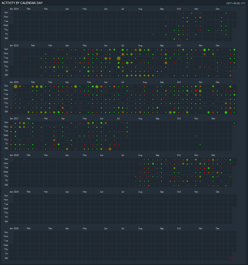
haha I didn't even rush to get this out. Just casually strolling through my screenshot folder