Found in this great toot
Discussion of climate, how it is changing, activism around that, the politics, and the energy systems change we need in order to stabilize things.
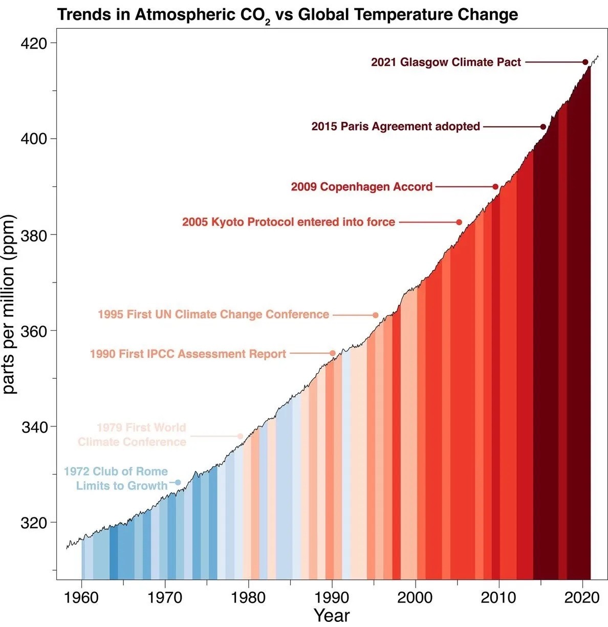
As a starting point, the burning of fossil fuels, and to a lesser extent deforestation and release of methane are responsible for the warming in recent decades:

How much each change to the atmosphere has warmed the world:

Recommended actions to cut greenhouse gas emissions in the near future:

Anti-science, inactivism, and unsupported conspiracy theories are not ok here.
Found in this great toot
Wheres the scale for temperture change, yeah the colors indicate a trend from cold to warm but how warm isnt shown
this wasn't my exact complaint, but it's similar; the graph starts at 320 and goes up to 420, meaning the slope is intentionally exaggerated. if you want to show us how much worse things have become, give us comparison to earlier CO2 levels, otherwise this just gets dismissed as alarmist propaganda.
The slope isn't exaggerated - it shows a linear trend, and it choses the only reasonable limits in order to illustrate this in the period. Starting the graph at zero would make no sense - you could easily illustrate the stability of global temperature by showing a graph of average temperatures starting at zero Kelvin.
What is true is that atmospheric CO2 is hard for most of us to interpret substantially. However, the graph is not setting out to effectively illustrate how much CO2 there is in the atmosphere, but rather the linear growth of atmospheric CO2 levels in spite of various efforts.
If the Y axis was secretly log transformed or something like that, there would be reason to worry. But it's linear, and the story told by the graph is accurate.
The instinct of checking the limits of the Y axis is a good one though.
by focusing on a smaller numerical range, the slope of a linear graph will become steeper. if the graph went from 0 to 420, the entire range of this graph would have to be compressed into about 1/4 the space, so its y range proportional to x will be only 1/4, and since that is what determines the slope, that will be substantially flatter.
I'm not attempting to dismiss or minimise what is shown on the graph, I just think that it needs the added context of what earlier CO2 levels were.
Of course selecting a range that shows the variation makes the variation more visible, but that doesn't mean it's exaggerated. There's nothing about 0 making it the natural point of comparison - some CO2 in the atmosphere is normal. What is important is the shape of the slope - the continued linear growth.
The graph does not give us enough information to substantially interpret what an increase of 100 PPM CO2 in the atmosphere actually means in the greater scheme of things, but that's hardly a fault of the graph - answering that would be a much bigger question. What it does show is that growth has not halted since the 1980s.
I guess it's also worth mentioning that this doesn't mean our efforts have come to naught - for all we know the growth would have been exponential, and we successfully made it merely linear. What's safe to say based on the graph is, however, that what we have been doing is probably not enough.
Also, it's kind of unfair to be equating each of those items because not all of them were actual actions taken to address the problem, and the actions are not equivalent or involve every country. The most substantial actions have only been taken recently, and no one promised that this train could be stopped in a few years.
But it shows us that these big climate summits don't really do anything, apart from generate even more pollution from private jets... They are just a big show to create the illusion of governments giving a shit.
Another interesting factoid, is that the USA does not include it's military emissions in its annual emissions reports, as that would reveal "classified information"..... The military industrial complex must fall, but that's most of the US government lol.
It's not just the numerical range, it's also the time scale. What I'm getting from the graph is that they wanted to convey instances of humanity saying "this is a problem and we should do something." Meanwhile the problem just compounded. Expanding the time and count scales would show the start of the rapid upswing that came with the Industrial Revolution, for instance. This is useful for context (and has been done many times over), but leaves no room to pick out the events noted.
I’m fairly certain this is showing an exponential trend in CO2 emissions, not a linear trend. The slope changes as a function of time. Linear isn’t really a good fit for the data.
The slope isn't exaggerated at all, the increments are same as if you showed the full graph from zero. But zero isn't a useful baseline, and zooming out to fit it into your screen would give a false impression of a flat change at the top of a narrow section of history. What would fix that is a longer x-axis showing further back in time. Then you'd see a relatively flat line with some rises and dips, then at the end a sudden spike.
What I’ve found as an average the change isn’t much.
What I’ve noticed watching daily trends there is a big difference.
Weird things like I can wear shorts in winter when before I needed a heavy coat.
If the earth isn’t warming than I am.
Could you maybe stop? It's affecting all of us, too.
My work computer has that thing in the taskbar telling you about news and the weather. I swear it tells me about a record high temperature for this day several times a week.
I know many people who deny the climate is changing. They will use a freak snow storm to show the weather is the same.
When I was a kid it started to get cold in October, it would snow in December and be there till February in most cases. I have years of photos, so it's not just my memory.
Now, if it snows, it lasts a few days tops. In December, i can be out side grilling in shorts. I don't mind people having different opinions as to the cause or the way to fix it, but to deny it is even happening is mind-blowing.
no, it is not just your memory...
The climate is really complex, and is the poster child for chaos theory. One of the weird things is that more snow storms and unseasonally cold weather is an expected result of global average temparature rises.
It's one of the reasons it's better to say "climate change" instead of "global warming", to help ease the confusion.
But see, scientists changed the messaging, which means that they don't know what they're talking about! Also, they used to be worried about global cooling! How can you trust someone that keeps changing their story when they get new information?!?
Signed,
Dullards
I love the term "scientists", because it's so poorly defined it can mean whoever you want it to mean.
My favorite is all the predictions were wrong.
We can’t ever figure out the weather accurately in a local region. So yeah, figuring out the global weather is going to much harder.
I don’t deny climate change. I don’t know if it man, the sun or something else. I have opinions but I think the debate is still. We need to first all agree things are changing which to me is obvious but we can’t get agreement on that.
https://showyourstripes.info/c
I was about to ask the same
Like I get it’s getting warmer but what’s the trend vs the PPM
Here's a chart at the beginning of the global average surface temps, so you can compare from 1960 and see a similar trend. Lower down you can also find the IPCC projected paths and see the same. RCP8.5 was considered no action and business as usual...more or less where we still are.