568
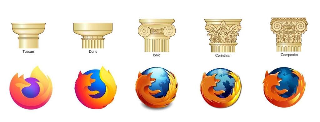
ancient Greek Firefox rule
(lemmy.dbzer0.com)
Behavior rules:
Posting rules:
NSFW: NSFW content is permitted but it must be tagged and have content warnings. Anything that doesn't adhere to this will be removed. Content warnings should be added like: [penis], [explicit description of sex]. Non-sexualized breasts of any gender are not considered inappropriate and therefore do not need to be blurred/tagged.
If you have any questions, feel free to contact us on our matrix channel or email.
Other 196's:
Salty old designer’s 2¢
I think the new icon scales much better. The fox’s head has turned, and the snoot is easier to see when it’s small / far away. Also, the tail flame is more exaggerated, and it is also more apparent at a small scale.
The globe is kind of lost now. It just feels like a random purple ball, but scaling that down allowed the designers to play up the tail flame.
All in all, I dig it. Complex gradients and shapes are not great for logos. Never has been. That stuff is hard to work with when you start putting logos on signage, fav icons, etc. Simple logos have always been more practical.
And that said, simple is very very hard to do well. It’s clear that they spent a LOT of time on every little curve and detail with this thing. I think the designer did a nice job of preserving the history while giving Mozilla’s design team something that will be easier to work with.
absolute buffoon's 2¢ here
fox cute
uwu