this post was submitted on 29 Sep 2023
21 points (70.6% liked)
Jerboa
10313 readers
48 users here now
Jerboa is a native-android client for Lemmy, built using the native android framework, Jetpack Compose.
Warning: You can submit issues, but between Lemmy and lemmy-ui, I probably won't have too much time to work on them. Learn jetpack compose like I did if you want to help make this app better.
Built With
Features
- Open source, AGPL License.
Installation / Releases
Support / Donate
Jerboa is made by Lemmy's developers, and is free, open-source software, meaning no advertising, monetizing, or venture capital, ever. Your donations directly support full-time development of the project.
Crypto
- bitcoin:
1Hefs7miXS5ff5Ck5xvmjKjXf5242KzRtK - ethereum:
0x400c96c96acbC6E7B3B43B1dc1BB446540a88A01 - monero:
41taVyY6e1xApqKyMVDRVxJ76sPkfZhALLTjRvVKpaAh2pBd4wv9RgYj1tSPrx8wc6iE1uWUfjtQdTmTy2FGMeChGVKPQuV - cardano:
addr1q858t89l2ym6xmrugjs0af9cslfwvnvsh2xxp6x4dcez7pf5tushkp4wl7zxfhm2djp6gq60dk4cmc7seaza5p3slx0sakjutm
Contact
founded 2 years ago
MODERATORS
you are viewing a single comment's thread
view the rest of the comments
view the rest of the comments

Some quick unrefined feedback (my remarks, no bad ill intended):
UX:
UI:
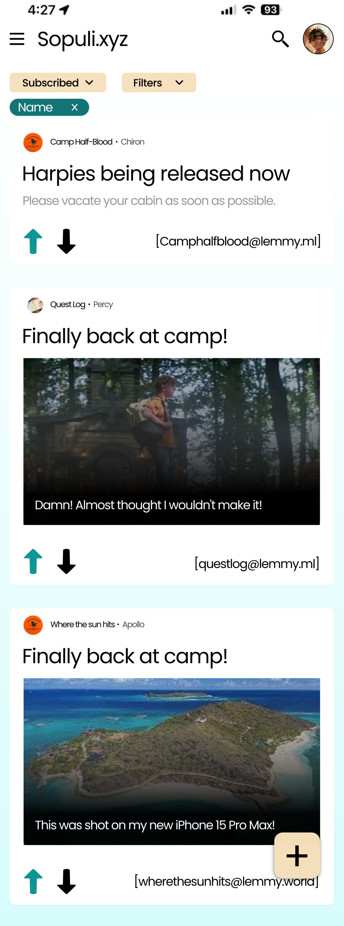
Interesting filter prototype at the top there? This scrolls with the feed I assume, so once you scrolled a bit and you want to change the filter you have to scroll all the way up again? And if it popups like the topbar, then it would take up more than 10% of your screen each time
UI/UX Design is hard, definitely what I struggle the most with while contributing to Jerboa. UI wise you can't please everyone ,ppl have preferences. (The real reason why full search + filters isn't implemented yet, haven't had the time yet to prototype it, which is the biggest time sink, the actually functionality is rather simple)
I agree with all points, thanks for writting them down. Current UI is great for me.