this post was submitted on 10 Sep 2023
140 points (93.8% liked)
Fediverse
30183 readers
784 users here now
A community to talk about the Fediverse and all it's related services using ActivityPub (Mastodon, Lemmy, KBin, etc).
If you wanted to get help with moderating your own community then head over to [email protected]!
Rules
- Posts must be on topic.
- Be respectful of others.
- Cite the sources used for graphs and other statistics.
- Follow the general Lemmy.world rules.
Learn more at these websites: Join The Fediverse Wiki, Fediverse.info, Wikipedia Page, The Federation Info (Stats), FediDB (Stats), Sub Rehab (Reddit Migration), Search Lemmy
founded 2 years ago
MODERATORS
you are viewing a single comment's thread
view the rest of the comments
view the rest of the comments


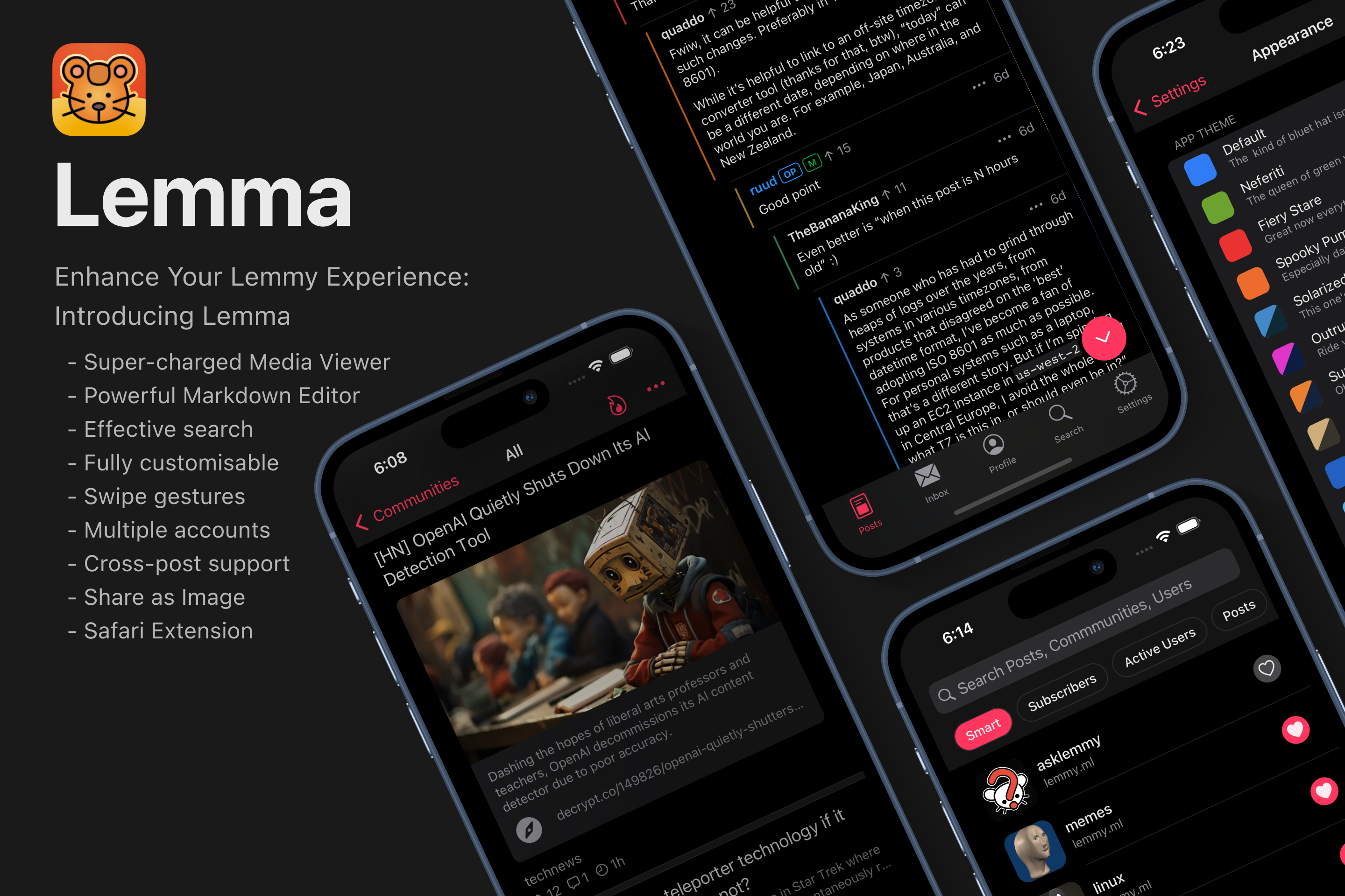
This looks like an exact copy of Voyager. What’s different about it?
Which is basically an exact copy of Apollo.
Big difference appear to be that this looks like it’s proper native, not fancy web app.
Voyager is in het iOS App Store as well. Works just fine native.
The core of the App Store of the same Ionic app code that you can also load in Safari. It’s basically just in a wrapper that allows it to be posted in the App Store, and soon, allows it to get notifications.
The core or the app isn’t proper native. Nothing wrong with that. There are big benefits to that, but there are some issues with ionic that this developer won’t have with swift. Example: Swipe based navigation is notoriously buggy with voyager.
The more you know…
I found the App Store wrapped app to be much more responsive when swiping. And I like the haptic feedback a lot.
Right, but it’s claimed to be a “from the ground up” build, where it’s an almost exact carbon copy. At least Voyager claimed to be trying to clone Apollo.
OP is just saying that it’s not a fork of an existing codebase. It’s all new code.
But yeah, the UX is a shameless Apollo clone.
Although Mlem, Avelon, Lemmios, and Memmy are all a little shameless about ripping off various Apollo patterns. A lot of the iOS Lemmy developers aren’t taking the time to think about what lemmy-specific UX problems need to be solved. All the iOS lemmy apps are feeling like Gru’s Minons. All super similar, but with slight variations.
It can still be built from the ground up but still uses the same design. If it's a native app written in Swift not a PWA like Voyager I'd say that from the ground up still applies. Because you still need to code everything from scratch.
It’s written in React Native, with some Swift modules here and there. I wrote down some more in depth behind the scenes in a previous post.
When Apollo shut down I really missed it in my day to day use, so initially this project started out as a personal project to see if I could replace that Apollo craving. Since then the development was going so well that I wanted to share it with the rest of the community as well.
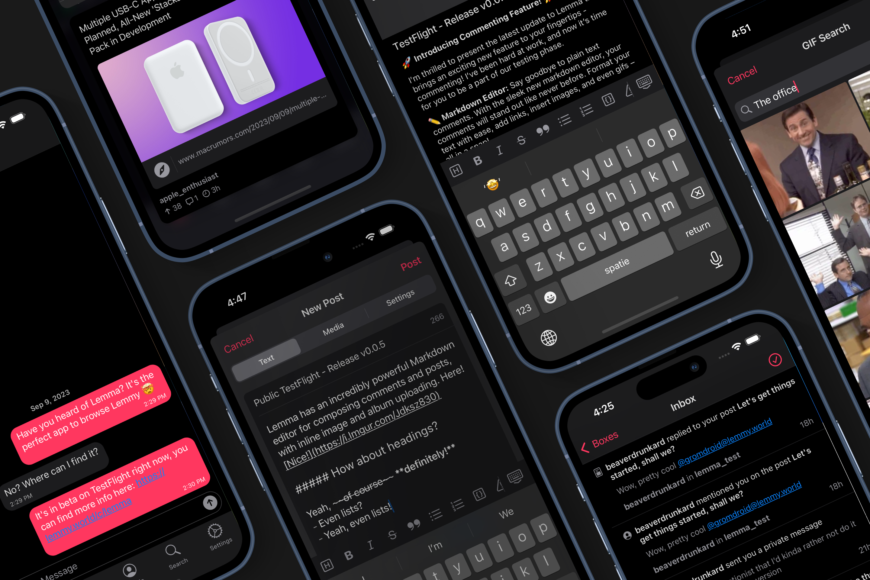
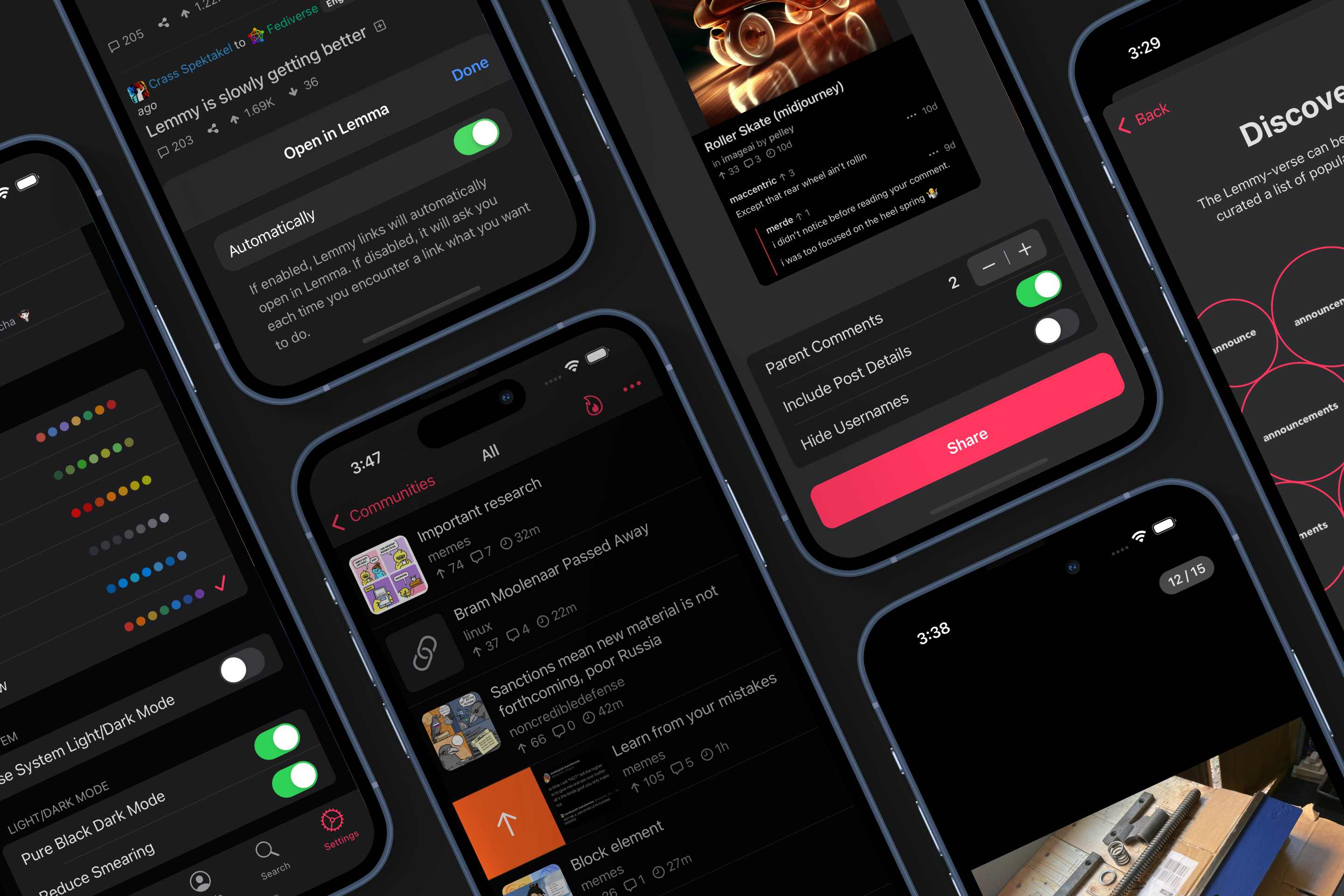
Since then I’ve also build some things that imho are an improvement, for example:
It’s been really fun to work on, but now that the basis is quite stable I’ll look into features that make it more tailored to Lemmy
Thank you for clarifying, and for your awesome work!
The comment sharing option and the embedded media playing looks good.