4
LagerHuset
(feddit.nu)
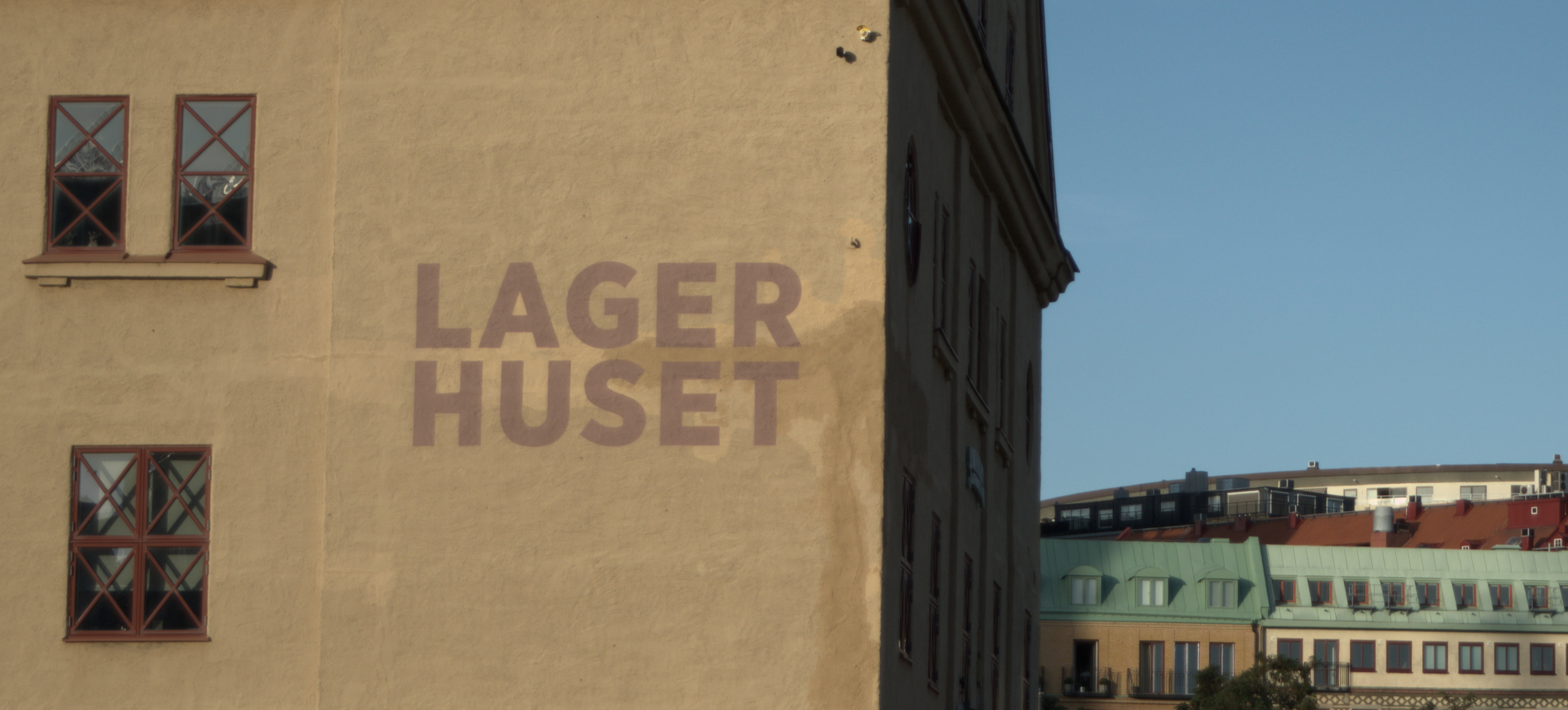
Looking back, I wish I had taken some steps to the left so that I wouldn't have gotten the shady side of the house and also making the corner of the house straight relative to the framing. Right now I have rotated the framing in order to level the text properly.
Any other advice is welcome!
Ah, I can now see that interpretation, and now understand why you so dislike the shadowed bit.
I passed by again today and got "the good angle". Turned out that had its downsides as well. I don't like that edge ruining the contrast between the building wall and the sky. Once again, perspective is messing with me.
At least it is a little better than the first attempts.
Glad you got a chance to retry - though sometimes the perfect shot just isn't there.
Yeah, it's better, but not perfect