TenForward: Where Every Vulcan Knows Your Name
/c/TenFoward: Your home-away-from-home for all things Star Trek!
Re-route power to the shields, emit a tachyon pulse through the deflector, and post all the nonsense you want. Within reason of course.
~ 1. No bigotry. This is a Star Trek community. Remember that diversity and coexistence are Star Trek values. Any post/comments that are racist, anti-LGBT, or generally "othering" of a group will result in removal/ban.
~ 2. Keep it civil. Disagreements will happen both on lore and preferences. That's okay! Just don't let it make you forget that the person you are talking to is also a person.
~ 3. Use spoiler tags. This applies to any episodes that have dropped within 3 months prior of your posting. After that it's free game.
~ 4. Keep it Trek related. This one is kind of a gimme but keep as on topic as possible.
~ 5. Keep posts to a limit. We all love Star Trek stuff but 3-4 posts in an hour is plenty enough.
~ 6. Try to not repost. Mistakes happen, we get it! But try to not repost anything from within the past 1-2 months.
~ 7. No General AI Art. Posts of simple AI art do not 'inspire jamaharon'
~ 8. No Political Upheaval. Political commentary is allowed, but please keep discussions civil. Read here for our community's expectations.
Fun will now commence.
Sister Communities:
Want your community to be added to the sidebar? Just ask one of our mods!
Honorary Badbitch:
@[email protected] for realizing that the line used to be "want to be added to the sidebar?" and capitalized on it. Congratulations and welcome to the sidebar. Stamets is both ashamed and proud.
Creator Resources:
Looking for a Star Trek screencap? (TrekCore)
Looking for the right Star Trek typeface/font for your meme? (Thank you @kellyaster for putting this together!)
view the rest of the comments

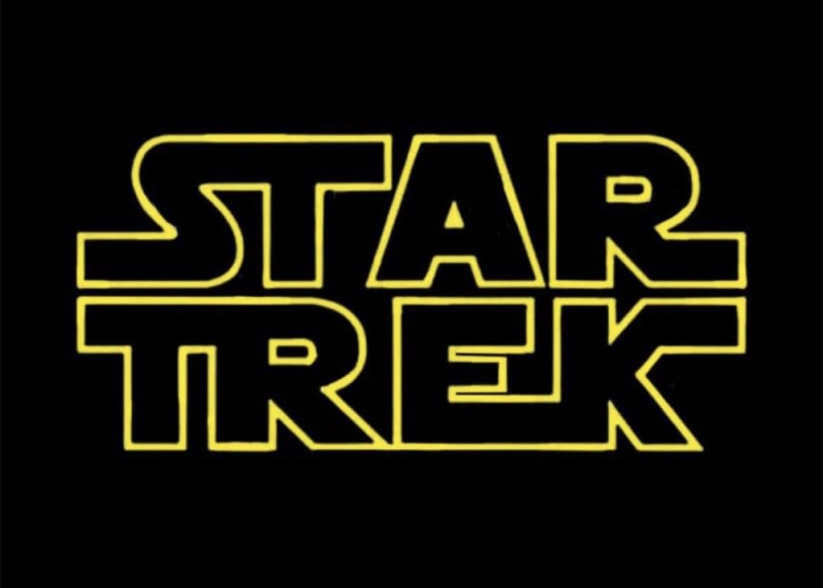
I know that, but it just looks weird. Though on second thought, maybe the issue is the connection between E and K. Star Wars has the R and S connected, but there it looks like a natural extension of the strokes made when writing the letters. Here it doesn't work nearly as well, and the second line already has two connected letters with T and R anyway. So after thinking about it a bit more, I think I'd just cut the connection between E and K. The K still looks a little odd, but it conforms to the SW logo, and at least the entire bottom right corner doesn't stick out like a sore thumb.
Font nerds?! In my Trek nerds shitpost??
Well! Harrumph.