this post was submitted on 29 Jul 2024
522 points (97.5% liked)
Map Enthusiasts
3463 readers
75 users here now
For the map enthused!
Rules:
-
post relevant content: interesting, informative, and/or pretty maps
-
be nice
founded 2 years ago
MODERATORS
you are viewing a single comment's thread
view the rest of the comments
view the rest of the comments

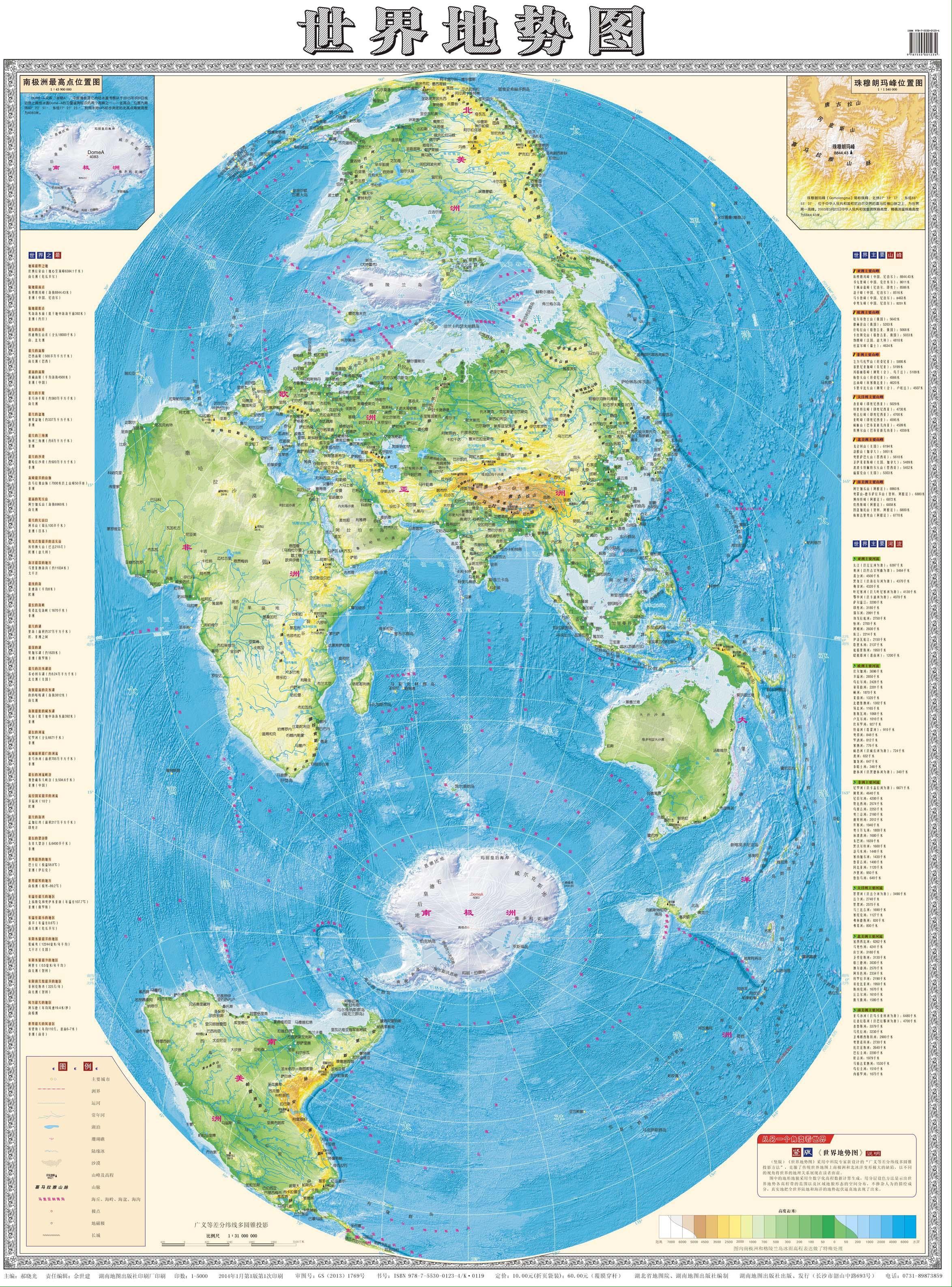
Africa is huge- many people underestimate it, although in this case it is a bit too large compared to India in the middle. Also the colorscale makes Sahara and other low desert areas too green - the habitable part is not so great.
I can't read Chinese, but looks like the colors represent elevation, not how green an area is.
Oh I know … I noted it as a positive of the map … probably makes Africa feel appropriately big compared to the rest of the world.