The trouble with going back further is that there wasn't global coverage of people keeping accurate records of temperatures in times past. So they have to look at things like tree rings and make comparisons with historical records. Obviously it gets a little fuzzy going back more than a century. But here's an xkcd that gives a summary of what we know about historical (and pre-historical) global temperatures.
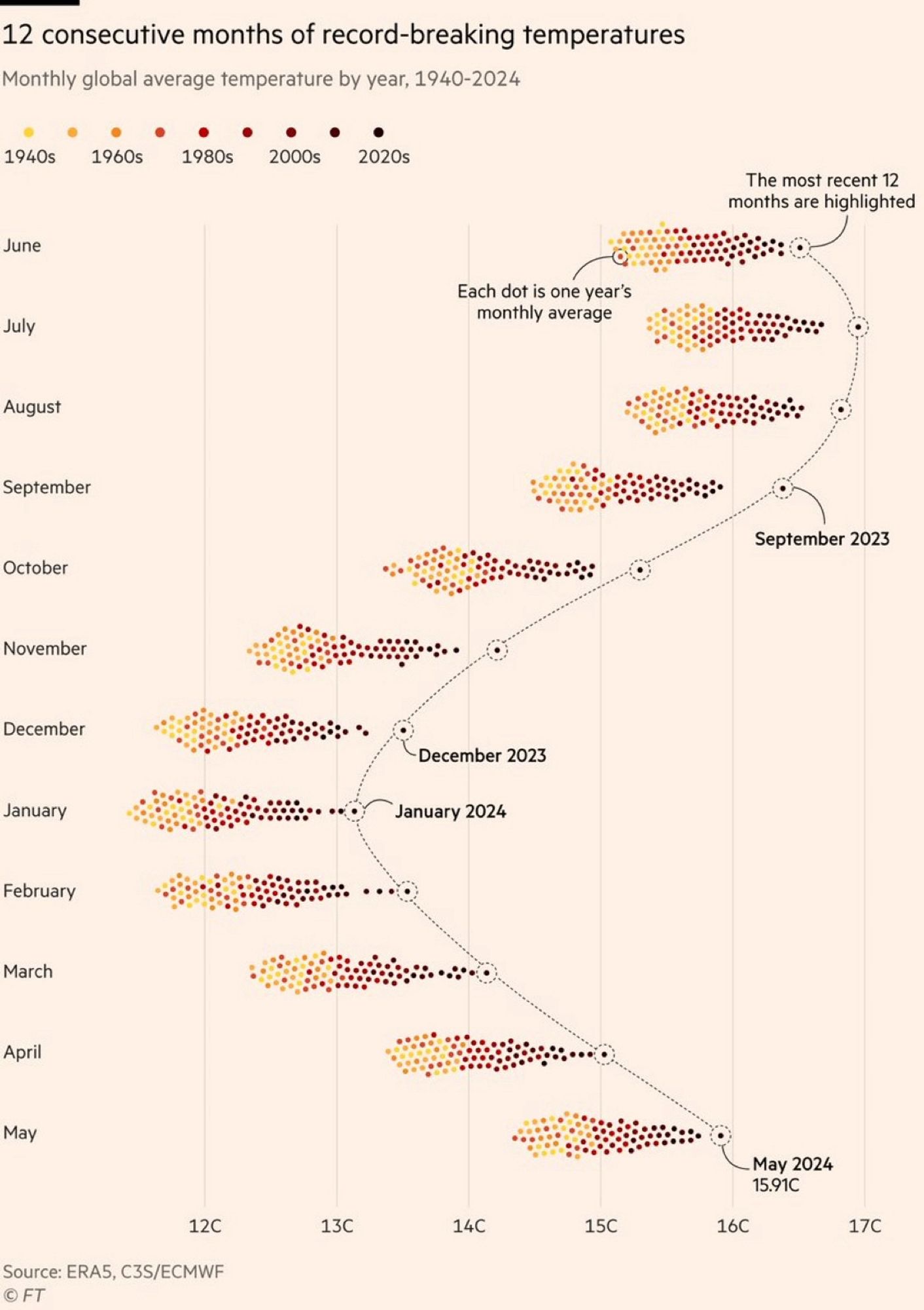
It took me a while to read that chart, meybe the heat I don't know.
But what I got is roughly 1.5°C increase in the last 80 years, is that correct? Would be nice to see this compared to the previous 80 years.
Closer to 1C at the moment, but here's a graph if you want to compare temperature changes over the last century.
https://climate.nasa.gov/vital-signs/global-temperature/?intent=121
The trouble with going back further is that there wasn't global coverage of people keeping accurate records of temperatures in times past. So they have to look at things like tree rings and make comparisons with historical records. Obviously it gets a little fuzzy going back more than a century. But here's an xkcd that gives a summary of what we know about historical (and pre-historical) global temperatures.
https://xkcd.com/1732/