this post was submitted on 20 Jul 2023
7 points (100.0% liked)
Connect for Lemmy App
2675 readers
1 users here now
A community for the mobile app Connect for Lemmy.
Links
founded 1 year ago
MODERATORS
you are viewing a single comment's thread
view the rest of the comments
view the rest of the comments

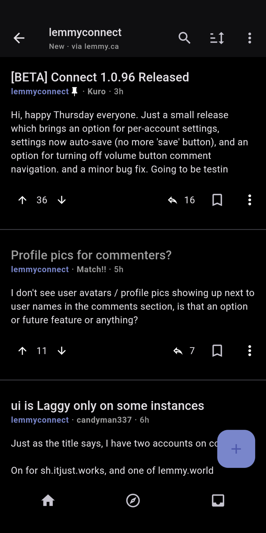
It's there, it's the number next to the arrow on the right.
Oh my bad! Didn't even notice that.
Think I much prefer the previous display on the left.
Thanks for pointing it out.
The developer must be left handed is my major takeaway. Given upvotes are on the left now
As @Aussimandeus said, it is moved next to the reply icon. The reply button is also confusing imho. I've never get used to reply and forward icon found in icons pack. A comment icon box would be more natural for me.